

THE BLOG
Author Book Marketing & Website Design Tips
Book Launch Strategy That Works: A Step-by-Step Guide for Self-Published Authors
A practical, step-by-step book launch strategy that helps self-published authors build momentum, reviews, and sales.
You probably already know that writing your book is only half the battle. Getting people to actually read it is where most authors hit a wall. A book launch strategy that works combines early planning, reader engagement, and consistent marketing effort—starting at least 3 to 4 months before your publish date. Without a plan, your book can get buried under the thousands of titles released every single day.
Think of your book launch less like a single event and more like a campaign. You're not just announcing that your book exists. You're building excitement, connecting with readers who will love your work, and creating momentum that carries your book beyond week one. The good news? You don't need a huge budget or a marketing degree to pull this off.
This guide walks you through a book launch strategy that actually works—one that's based on planning ahead, staying consistent, and focusing on the tactics that move the needle. Whether you're self-publishing or working with a small press, these steps will help you launch with confidence and give your book the attention it deserves.
Want a beautiful author website without spending weeks designing it from scratch? These Squarespace website templates for authors are designed to showcase your books, grow your email list, and look professional instantly.

Here’s how real authors are using these Squarespace author website templates:


AUTHOR WEBSITE EXAMPLES

Why You Need a Book Launch Strategy
Most authors skip the strategy part. They hit publish and hope readers will find them. But hope isn't a plan.
A book launch strategy gives your book the best shot at success. It builds awareness before your book is even available. It creates buzz that turns into early sales, reviews, and word-of-mouth.
Without a strategy, your book disappears fast. With one, you control the narrative and stay visible long after launch day.
When to Start Your Book Launch Strategy
Start planning your book launch at least 3 to 4 months before your publish date. That gives you time to build your audience, line up reviews, and create content that builds excitement.
If your book is already published, don't worry. You can still run a relaunch or use these tactics to boost visibility moving forward.
The key is consistency. A launch isn't one day—it's a series of touchpoints that keep your book in front of readers.
Step 1: Set Your Launch Goals
Before you do anything else, get clear on what you want your launch to accomplish. Do you want to hit a bestseller list? Get 50 reviews in the first month? Build your email list? Sell a certain number of copies?
Your goals will shape your strategy. If you want reviews, you'll focus on getting advance reader copies out early. If you want sales, you'll prioritize launch day promotions and ads.
Write down 2 to 3 specific goals. Make them measurable so you can track your progress.
Step 2: Build Your Launch Team
Your launch team is a group of readers who get early access to your book in exchange for honest reviews, social shares, and word-of-mouth support. These are your biggest fans—the people who will champion your book when it goes live.
Start recruiting your launch team at least 6 to 8 weeks before launch. Reach out to your email list, social media followers, and any book groups you're part of.
Send them a digital advance copy. Give them clear instructions on what you're asking for (a review, a social post, etc.). Make it easy for them to help you.
The bigger your launch team, the more momentum you create on day one.
Step 3: Build Your Email List Early
Your email list is the most valuable marketing tool you have. These are people who already said yes to hearing from you. They're more likely to buy, review, and share your book than anyone else.
If you don't have a list yet, start building one now. Offer a free short story, a chapter sampler, or bonus content in exchange for email signups.
Use your email list to share updates, tease your book, and build excitement leading up to launch. Send at least one email per week in the month before your book goes live.
Email subscribers convert better than social media followers every single time.
Step 4: Create a Pre-Launch Content Plan
Start talking about your book before it's available. Share behind-the-scenes content, character insights, cover reveals, and sneak peeks.
Create a content calendar that maps out what you'll post and when. Mix it up—use social media, blog posts, video, and email to reach different audiences.
The goal is to stay visible and keep your book top of mind. Don't wait until launch day to start marketing.
Pre-launch buzz builds anticipation. When your book finally drops, people are ready to buy.
Step 5: Get Your Book Up for Pre-Order
Pre-orders are a game changer. They let readers commit to buying your book before it's even available. And all those pre-orders count as day-one sales, which can boost your ranking and visibility.
Set up your pre-order on Amazon, Apple Books, or wherever you're publishing at least 4 to 6 weeks before launch. Promote it in your emails, on social media, and on your website.
Consider offering a pre-order bonus—a free short story, a printable, or early access to exclusive content. This gives readers an extra reason to buy now instead of waiting.
Pre-orders also help you gauge interest and adjust your marketing if needed.
Step 6: Plan Your Launch Week
Launch week is when all your prep work pays off. This is when you go all in with promotion, engagement, and visibility.
Schedule posts every day. Send multiple emails. Ask your launch team to post reviews and share on social media. Run a giveaway or a limited-time discount to create urgency.
If you're running ads, this is the time to turn them on. Facebook, Amazon, or BookBub ads can drive traffic and sales when paired with organic promotion.
Stay active and responsive. Reply to comments, thank people for sharing, and keep the momentum going.
Step 7: Get Book Reviews Fast
Reviews are social proof. They tell new readers that your book is worth their time. The more reviews you have, the more credible your book looks.
Ask your launch team to leave reviews as soon as the book goes live. Reach out to book bloggers, bookstagrammers, and BookTokers who read in your genre.
You can also use services like NetGalley or BookSirens to get your book in front of reviewers. Just make sure you're targeting people who actually read your type of book.
Aim for at least 20 to 30 reviews in your first month. That's enough to build trust and boost discoverability.
Step 8: Leverage Social Media the Right Way
Social media is free marketing—but only if you use it strategically. Don't just post random updates. Create content that gets people excited about your book.
Share quotes, graphics, videos, and reader reactions. Tag people who help promote your book. Use relevant hashtags like #booklaunch.
Step-by-Step Book Launch Strategy That Works
A successful book launch requires careful planning across three phases: pre-launch preparation, launch week execution, and post-launch momentum. You need to start building your audience weeks before release day, optimize every piece of your online presence, and keep marketing long after your book goes live.
Clarify Your Goals and Define Success
Before you dive into tactics, you need to know what success looks like for your launch. Are you aiming for bestseller status on Amazon? Building your email list? Getting 50 reviews in the first month? Your goals will shape every decision in your book launch plan.
Write down 3-5 specific, measurable goals. For example: "Get 100 pre-orders," "Reach 1,000 email subscribers by launch week," or "Secure 3 podcast interviews." These numbers give you something concrete to track.
Think about your timeline too. Most successful launches need 4-6 weeks of preparation. If you're self-publishing through KDP, you have control over your release date. Use that flexibility to give yourself enough runway.
Your definition of success might also include building your author platform or creating momentum for your next book. Not every launch needs to hit bestseller lists to be valuable.
Build Your Author Platform and Email List Early
Your email list is the most important asset you have as an author. You own it, unlike your social media followers. Start building it months before your book launch, not weeks.
Create a reader magnet (also called a lead magnet) to attract subscribers. This could be a free short story, a deleted chapter, character interviews, or a prequel to your book. Make it relevant to your upcoming release so you're attracting your ideal readers.
Set up a simple landing page on your author website with a clear offer. Include what they'll get, why they should care, and a sign-up form. Tools like Squarespace make this easy with built-in email integration.
Post consistently about your writing journey on at least one social media platform. You don't need to be everywhere. Pick where your readers hang out—whether that's BookTok, Bookstagram, or Goodreads—and show up regularly.
Join Goodreads and complete your author profile. Add your book early (even before it's available) so readers can add it to their "want to read" lists. This builds anticipation and helps the Amazon algorithm later.
Craft an Irresistible Book Description and Create a Reader Magnet
Your book description is sales copy, not a summary. You have seconds to hook a potential reader browsing Amazon. Start with a compelling hook that presents the core conflict or question of your book.
Use short paragraphs and formatting to make it scannable. Bold key phrases. Add white space. End with a call to action or a question that makes readers want to know what happens next.
Study book descriptions in your genre that work. Notice patterns in how bestselling authors structure theirs. They typically follow a formula: hook, expand on the stakes, introduce the character's dilemma, and leave readers wanting more.
Your reader magnet should complement your book launch. If you're launching a fantasy novel, offer a prequel short story. For non-fiction, create a workbook or checklist that extends your book's value.
Make sure your reader magnet is professionally formatted and edited. It represents your writing quality. A sloppy freebie will hurt your credibility more than help your list growth.
Assemble Your Launch Team and Beta Readers
Your launch team is your first wave of support. These are readers who commit to buying, reading, and reviewing your book during launch week. Start recruiting them 6-8 weeks before release.
Beta readers are different. They read your manuscript before it's finalized and give feedback on plot, characters, and pacing. You should finish beta reading well before launch, ideally during your editing phase.
Create a simple application form for your launch team. Ask why they want to join, where they'll post their review, and if they're active on social media. This helps you find committed members, not just freebie seekers.
Offer your launch team an ARC (advance review copy) 2-3 weeks before launch day. This gives them time to read and post reviews when your book goes live. Early reviews are critical for social proof and the Amazon algorithm.
Keep your team engaged with a private Facebook group or email updates. Share behind-the-scenes content, cover reveals, and thank them regularly. These are your biggest supporters—treat them well.
Plan Your Pre-Launch Buzz and Teaser Campaign
Pre-launch buzz starts building 4-6 weeks out. This is when you shift from building your platform to actively promoting your specific book. Your goal is to create anticipation and get people talking.
Run a cover reveal 3-4 weeks before launch. Ask your email list and launch team to share it. Create shareable graphics using tools like Book Brush for Instagram, Facebook, and BookTok.
Share teaser content like character profiles, mood boards, playlist links, or short excerpts. Give readers a taste without giving away the story. Instagram Reels and TikTok videos work great for visual teasers.
Consider opening preorders if you're self-publishing through Amazon KDP. Preorders build momentum and count toward your launch day sales ranking. However, make sure your book is fully ready—you can't miss your delivery date.
Host a Goodreads giveaway to build awareness. Even a small giveaway (5-10 copies) can get your book in front of hundreds of potential readers. Winners often become reviewers and fans.
Set Up Your Book Assets: KDP, Paperback, Audiobook, and Amazon Author Central
Upload your book to Amazon KDP at least two weeks before launch. This includes your ebook, paperback, and potentially audiobook if you're using ACX. Don't wait until the last minute—technical issues happen.
Your ebook formatting needs to be clean and professional. Use Vellum, Atticus, or KDP's built-in tools. Test it on multiple devices before publishing. Bad formatting kills reader experience and leads to negative reviews.
Set up your paperback version even if you expect most sales to be digital. Many readers prefer physical books, and having both options increases your potential audience. Book formatting for print is different from ebook formatting—pay attention to margins, bleeds, and trim size.
Claim your Amazon Author Central profile and fill it out completely. Add your author bio, photos, and connect your blog if you have one. This profile appears on all your book pages and builds your author brand.
If you're doing an audiobook, ACX connects you with narrators. This process takes longer than ebook or paperback, so start early. Audiobooks expand your reach to a broader audience.
Frequently Asked Questions
Authors planning a book launch often have questions about timing, promotion methods, and how to stand out in a crowded market. The answers below address common concerns about tactics, events, planning, creative ideas, social media use, and building campaigns that get results.
What are effective tactics for launching a book?
Start building your audience at least three months before your release date. This gives you time to create buzz without rushing or burning out.
Send advance review copies to bloggers, book reviewers, and influencers in your genre. Reviews posted on launch day boost visibility and give potential readers social proof that your book is worth their time.
Create a launch team of engaged readers who receive early access to your book. In exchange, they post reviews, share on social media, and spread word-of-mouth recommendations during your launch week.
Use email marketing to stay in direct contact with your readers. Your email list is the most valuable asset you have because you own it—unlike social media followers who depend on algorithms you can't control.
Price your book strategically during launch week. Many authors use a lower introductory price or run a limited-time discount to encourage quick sales and boost rankings on retailer charts.
How can I make my book launch event stand out?
Choose a venue that matches your book's theme or genre. A cozy bookstore works for literary fiction, while a trendy cafe might suit contemporary romance or self-help titles.
Offer something interactive beyond a simple reading and signing. Host a Q&A session, run a themed trivia game, or include activities that connect to your book's content.
Create a signature drink or snack inspired by your book. This gives guests something memorable to talk about and share on social media.
Partner with local businesses or other authors to expand your reach. Co-hosting splits costs and brings in both audiences, giving everyone more visibility.
Set up a photo backdrop with your book cover or theme. Guests will share photos on their social channels, giving you free promotion that extends beyond the event itself.
What should I include in my book launch party checklist?
Confirm your venue booking and arrival time at least two weeks before the event. Double-check if you need insurance, permits, or special accommodations.
Order enough books to cover expected attendance plus extras. Running out of books at your own launch party is a missed opportunity for sales and momentum.
Prepare your reading selection in advance. Choose a compelling excerpt that's three to five minutes long—short enough to hold attention but long enough to showcase your writing.
Bring all necessary supplies including pens, bookmarks, signage, and a cash box if you're handling sales yourself. Create a checklist the day before so you don't forget small but important items.
Arrange for someone to take photos and videos during the event. You'll be too busy hosting to document everything, and you'll want this content for social media and future promotion.
Test any tech you're using beforehand. If you're doing a presentation, playing music, or using a microphone, arrive early to troubleshoot problems before guests show up.
What are some unique book launch ideas I can implement?
Host a virtual launch party on Zoom or YouTube Live if your audience is spread across different locations. This lets readers from anywhere join in, and you can replay the recording for those who missed it.
Create a limited-edition version of your book available only during launch week. This could include signed bookplates, character art, bonus chapters, or special formatting that makes early buyers feel like VIPs.
Run a social media challenge tied to your book's theme. Ask readers to share photos, videos, or stories using a specific hashtag, then feature the best submissions on your platforms.
Partner with a charity that connects to your book's message. Donate a portion of launch week sales and tell your audience about it—readers love supporting authors who give back.
Launch a book box or merchandise bundle. Include your book plus themed items like candles, bookmarks, stickers, or other small products that enhance the reading experience.
Organize a blog tour where you guest post on different sites throughout launch week. Each post reaches a new audience and drives traffic back to your book's sales page.
How can I use social media to promote my new book effectively?
Start teasing your book at least six weeks before launch. Share cover reveals, behind-the-scenes writing moments, character introductions, and short excerpts to build anticipation.
Post consistently but don't spam your followers with constant sales pitches. Follow the 80/20 rule—80% valuable or entertaining content, 20% promotional posts about your book.
Use video content whenever possible. Short videos get more engagement than static images on most platforms, whether it's a quick book flip-through, a reading, or just you talking about your story.
Engage with your audience by responding to comments and messages. Social media works best when it's actually social, not just a one-way broadcast channel.
Create platform-specific content rather than posting the same thing everywhere. Instagram favors visual posts and Stories, Twitter works for quick updates and threads, and Facebook is good for longer posts and community building.
Use relevant hashtags to help new readers find your content. Research popular book hashtags in your genre, but don't overload posts with too many—five to eight targeted hashtags usually work best.
What steps should I take to create an impactful book launch campaign?
Define your goals before you start planning anything else. Are you aiming for bestseller rankings, a certain number of sales, building your email list, or getting media attention? Your goal shapes every decision that follows.
Identify your target readers and where they spend time online. Marketing works better when you focus on specific platforms and communities rather than trying to be everywhere at once.
Build your email list starting now if you haven't already. Your subscribers are your most engaged audience and the people most likely to buy on launch day.
Create a content calendar that maps out your promotional activities week by week. This prevents last-minute scrambling and ensures you maintain consistent visibility leading up to launch.
Set up tracking for your campaigns so you know what's working. Use unique links for different promotional channels, monitor which emails get the best open rates, and pay attention to which social posts drive actual sales.
Plan your budget in advance and allocate funds strategically. You might spend on ads, promotional materials, review copies, or event costs—knowing your limits helps you make smart choices about where to invest.
Ready to launch your author website?
Explore my Squarespace website templates designed specifically for authors — easy to customize, beautifully designed, and built to help you sell more books.

SHOP THE AUTHOR WEBSITE TEMPLATES
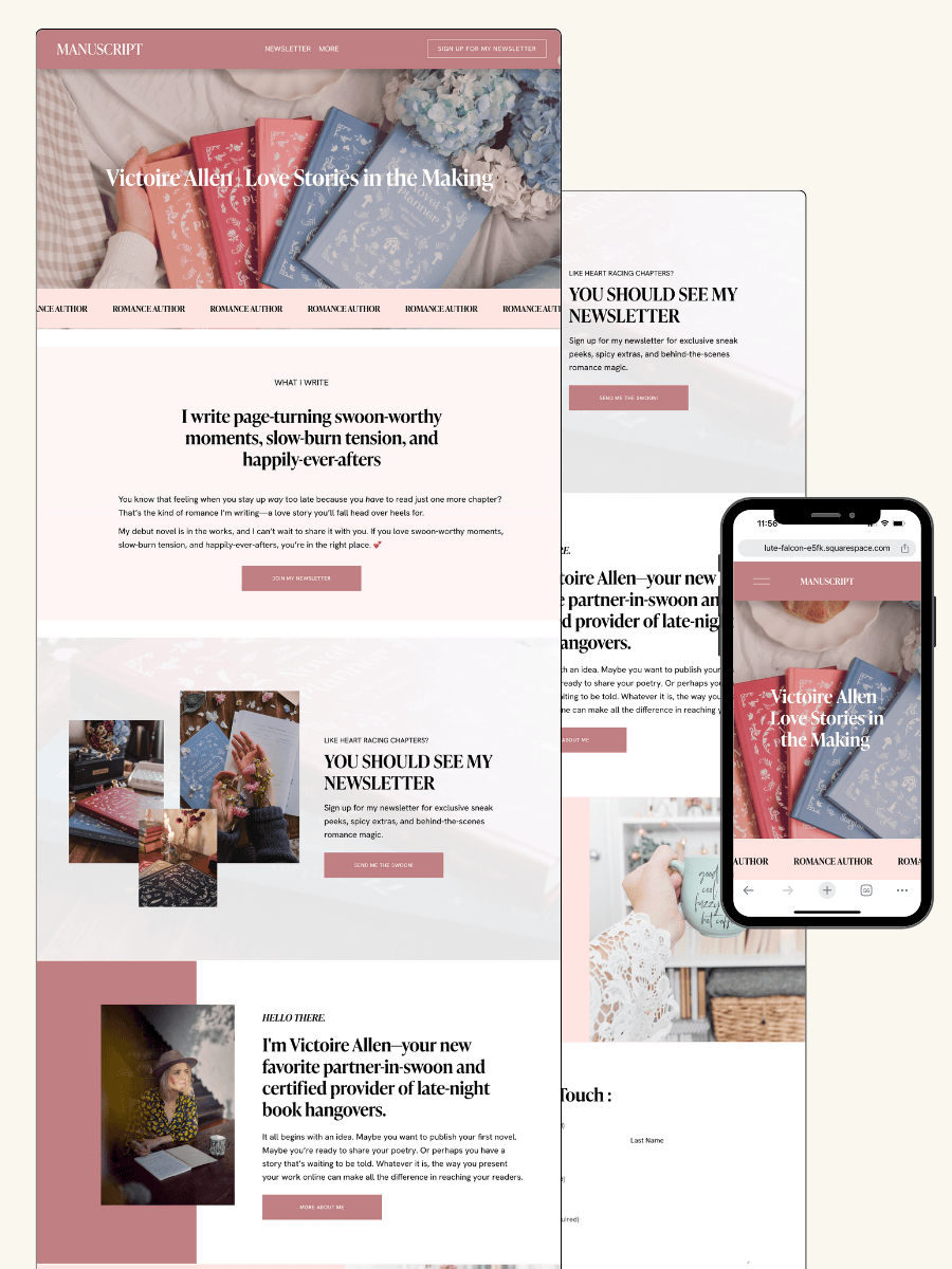
THE MANUSCRIPT AUTHOR WEBSITE TEMPLATE — perfect for authors launching their first professional website with a simple, polished layout
THE DEBUT AUTHOR WEBSITE TEMPLATE — designed to highlight your first book, build your email list, and grow an audience from day one
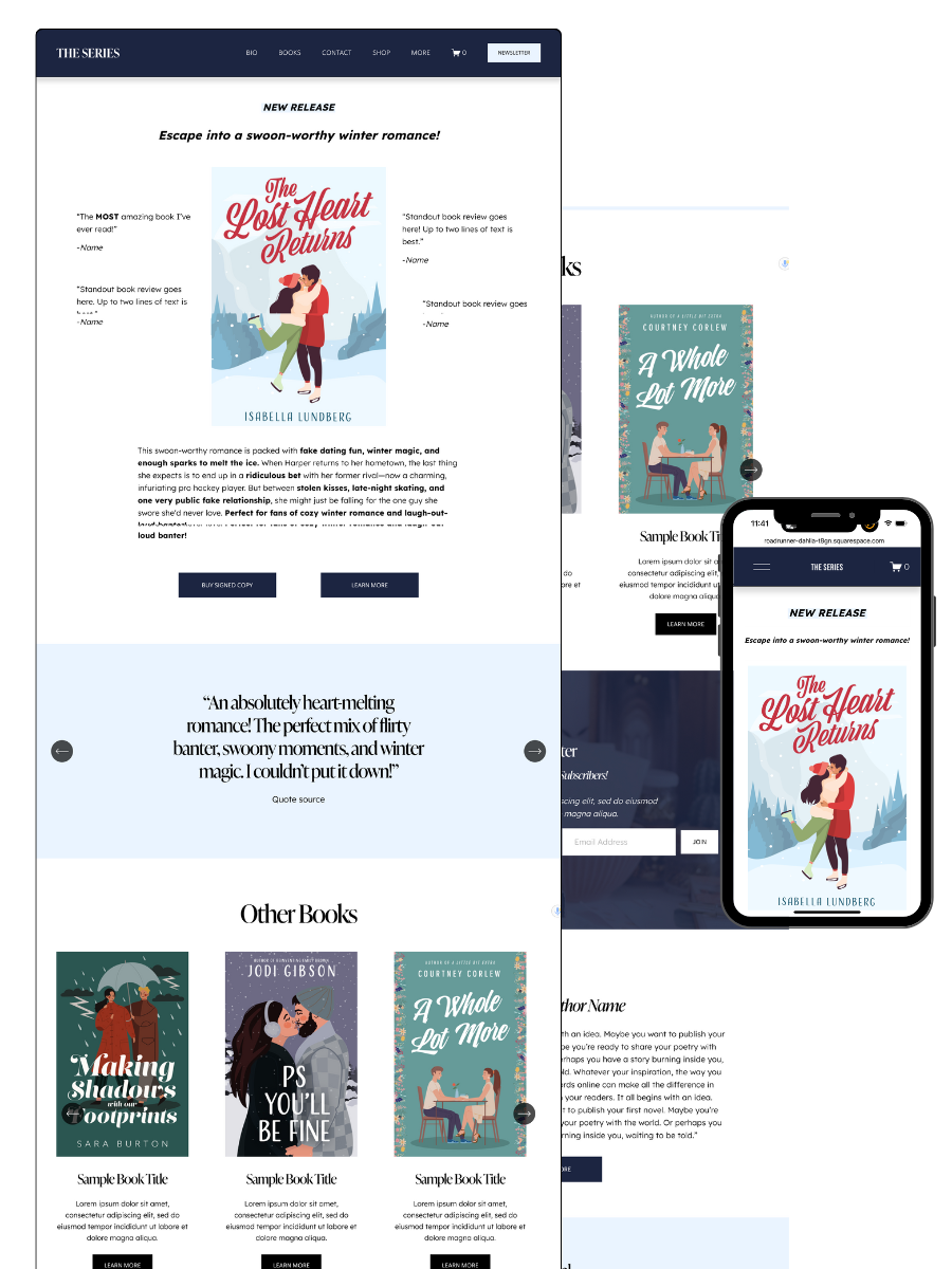
THE SERIES AUTHOR WEBSITE TEMPLATE — ideal for showcasing multiple books with clear series pages and strong reader flow
THE ONE-PAGE AUTHOR AUTHOR WEBSITE TEMPLATE — a streamlined one-page site for authors who want something beautiful, fast, and easy
THE DONE-FOR-YOU AUTHOR WEBSITE EXPERIENCE — your author website built for you so you can launch without touching design or tech
MOST POPULAR BLOG POSTS
Authors Guide to Website Design & Branding
Squarespace Email Campaigns: A Guide for Authors
How to Create an Author Website on Squarespace (Step-by-Step)
How to Promote Your Book Online: A Complete Step-by-Step Guide for Authors
A step-by-step guide to promoting your book online using proven, budget-friendly strategies that actually reach readers.
You've written your book, but now comes the hard part—getting people to actually read it. The good news? You don't need a big budget or a marketing team to promote your book online successfully. All you need is the right strategy and a willingness to show up where your readers are.
Promoting your book online means using digital tools and platforms to reach readers, build buzz, and drive sales. It includes everything from social media posts and email newsletters to guest blog appearances and podcast interviews. The key is consistency and choosing methods that feel authentic to you.
This guide walks you through practical, budget-friendly ways to promote your book online step by step. You'll learn which platforms matter most, how to connect with readers directly, and what actually works in 2026. No fluff, no complicated jargon—just straightforward advice you can start using today.
Key Takeaways
Online book promotion uses digital platforms to connect with readers and increase visibility without requiring a large budget
Success comes from consistent effort across multiple channels like social media, email lists, and guest content opportunities
Focus on authentic connection and providing value to readers rather than just selling your book
Want a beautiful author website without spending weeks designing it from scratch? These Squarespace website templates for authors are designed to showcase your books, grow your email list, and look professional instantly.
Here’s how real authors are using these Squarespace author website templates:
AUTHOR WEBSITE EXAMPLES
How to Promote Your Book Online: Step-by-Step for Authors
Successfully promoting your book online requires a strategic approach across multiple channels. From building your author website and optimizing your Amazon listing to leveraging social media, growing your email list, and using paid ads, each step works together to boost visibility and drive book sales.
Build a Professional Author Website
Your author website is the foundation of your online presence. It's where readers discover your work, sign up for your newsletter, and connect with you directly.
Start with a clean, professional design that reflects your author brand. Include dedicated book pages for each of your titles with cover images, book descriptions, and buy links. Make sure your author bio is clear and engaging—readers want to know who you are and what drives your writing.
Add a press kit section with high-resolution images, your author photo, book cover designs, and interview questions. This makes it easy for book bloggers and media to feature you. Include a prominent newsletter signup form on every page so visitors can join your mailing list.
Consider using templates designed for authors that already include these essential elements. Your website should load quickly and look good on mobile devices since many readers browse on their phones.
Optimize Your Amazon Book Listing
Your Amazon book listing is often the first place potential readers encounter your work. Optimizing it can significantly impact your book sales.
Claim your Amazon Author Central profile immediately. This free tool lets you add your author bio, photos, and links to your blog or website. It creates a professional author page that builds trust with readers.
Write a compelling book description that hooks readers in the first two sentences. Use short paragraphs, bold text for key phrases, and focus on the emotional appeal of your story. Include relevant keywords naturally without stuffing.
Choose your categories carefully using tools like Publisher Rocket to find less competitive niches where your book can rank higher. Select up to seven keywords that readers actually search for.
Get your cover design right—it should look professional and clearly communicate your genre at thumbnail size. Consider A/B testing different covers if your sales are slow. Add editorial reviews and blurbs from other authors to build credibility.
If you're enrolled in KDP Select, use your free promotion days strategically to boost visibility and get on best seller lists in your categories.
Leverage Social Media for Book Promotion
Social media helps you connect directly with readers and build your author platform. Focus on platforms where your target readers actually spend time.
Short-form video on platforms like TikTok (BookTok) and Instagram Reels drives significant book discovery. Create quick videos showing your book, sharing writing tips, or discussing themes from your story. You don't need fancy equipment—authenticity matters more than polish.
Instagram and Bookstagram work well for visual book promotion. Share your cover reveals, behind-the-scenes writing moments, and reader testimonials. Use Instagram Live to host Q&As or read excerpts from your book.
Build genuine connections rather than just promoting constantly. Comment on other authors' posts, engage with book influencers, and participate in reading community conversations. Use a Linktree or similar tool in your bio to direct followers to your books, newsletter, and website.
Post consistently but don't burn out. Two to three quality posts per week beats daily low-effort content. Save time by repurposing the same content across multiple platforms with platform-specific adjustments.
Grow Your Email List with Reader Magnets
Your mailing list is the most valuable marketing asset you own. Unlike social media followers, you control direct access to your subscribers.
Offer a reader magnet—a free short story, bonus chapter, deleted scene, or exclusive content—in exchange for email signups. Make sure it's relevant to your published books so you attract the right readers.
Use services like BookFunnel to deliver your reader magnet professionally. It handles file delivery across all devices and makes the process smooth for readers.
Place newsletter signup forms prominently on your author website, especially on your homepage and book pages. Mention your reader magnet in your social media bios and author bio on retail sites.
Try newsletter swaps with other authors in your genre. You promote their reader magnet to your list, and they promote yours to theirs. This exposes both of you to new readers who already enjoy similar books.
Send regular emails to your subscribers—at least monthly. Share updates about your writing, recommend books you've enjoyed, and offer exclusive content. When you have a book launch or promotion, your engaged email list will be your biggest sales driver.
Engage Readers with Book Reviews and Influencers
Reviews and influencer support provide social proof that encourages new readers to try your book.
Line up ARC reviewers (Advance Review Copy readers) before your book launches. Send free copies to readers who commit to posting honest reviews on launch day. Use platforms like BookSprout, NetGalley, or BookFunnel to manage your ARC distribution.
Reach out to book bloggers who review your genre. Send a personalized pitch explaining why your book fits their audience. Offer a free ebook or signed copy in exchange for an honest review.
Connect with book influencers and Bookstagrammers who have engaged followings. Micro-influencers (1,000-10,000 followers) often have better engagement rates than larger accounts. Send them free copies and ask if they'd consider featuring your book.
List your book on Reedsy Discovery to get reviews from their community of readers. Editorial reviews from established reviewers carry extra weight and can be featured on your Amazon listing.
Join online book clubs and participate authentically in discussions. When appropriate, mention your book if it's relevant to conversations, but focus more on being a helpful community member.
Utilize Book Promotion Services and Paid Ads
Paid promotion helps you reach readers actively looking for new books in your genre.
BookBub is the most effective book promotion service, but Featured Deals are competitive and require meeting their standards. Start building your BookBub author profile and followers early. If accepted, a BookBub Featured Deal can sell thousands of copies.
Try more accessible services like FreeBooksy, Bargain Booksy, and The Fussy Librarian for daily ebook deals. These work especially well when you discount your first book in a series.
Amazon Ads let you target readers searching for books like yours. Start with automatic campaigns to discover which keywords convert, then create manual campaigns targeting those winners. Set a small daily budget ($5-10) while learning.
Facebook Ads can work for book promotion but require more setup. Create lookalike audiences based on your email list or target readers of similar authors. Test different ad images and copy to find what resonates.
BookBub Ads run on the BookBub platform and tend to be cheaper than Amazon or Facebook. They work well for building your BookBub followers and promoting discounted books.
Frequently Asked Questions
Authors often wonder how to make the most of their online promotion efforts without wasting time or money. These questions address the most practical concerns about building visibility, connecting with readers, and turning promotional activities into actual book sales.
What social media strategies are effective for authors to engage with their audience and promote their books?
You need to show up where your readers already are. If you write romance, that might be BookTok or Instagram. If you write business books, LinkedIn could be your best bet.
Post content that's about more than just "buy my book." Share writing tips, behind-the-scenes looks at your process, or short excerpts that hook readers. People follow accounts that offer value, not just ads.
Engage authentically with your followers. Reply to comments, ask questions, and join conversations in your genre's community. This builds trust and keeps you visible in feeds.
Use Stories and Reels to show your personality. Readers connect with people, not logos. Let them see the human behind the book.
Post consistently but don't burn yourself out. Three quality posts a week beats seven rushed ones. Pick one or two platforms and do them well rather than spreading yourself too thin.
How can authors leverage book bloggers and influencers to boost their online visibility?
Start by finding bloggers and influencers who actually read your genre. A romance book sent to a thriller blogger won't help anyone.
Follow them first. Engage with their content genuinely before you pitch. Comment on posts, share their reviews, and build a real connection.
When you're ready to reach out, personalize your message. Mention specific reviews they've written or posts you enjoyed. Show you've done your homework.
Offer them a free review copy or ARC. Make it easy for them by providing all the info they need—book description, your author bio, and high-quality cover images.
Don't expect immediate results or demand positive reviews. Bloggers and influencers value their credibility with their audience. Give them creative freedom to share honest opinions.
Track which partnerships bring traffic or sales. Use custom links or ask where new readers found you. This helps you focus on relationships that actually work.
What are the best practices for setting up a successful virtual book tour?
Plan your tour at least six to eight weeks before launch. This gives hosts time to schedule you and build anticipation.
Choose a mix of formats. Include blog posts, podcast interviews, Instagram takeovers, and Facebook Live events to reach different audiences.
Create a tour schedule document with all your stops, dates, and links. Share this on your website and social media so readers can follow along.
Prepare engaging content for each stop. Don't just repeat the same interview answers everywhere. Tailor your message to each platform's audience.
Offer giveaways or exclusive content at tour stops. This encourages participation and gives hosts something valuable to share with their audience.
Promote each stop on your own channels. Don't expect hosts to do all the work. Share their content, tag them, and drive your audience to their platforms.
Thank hosts publicly and privately. A simple thank-you post or email goes a long way and keeps the door open for future collaborations.
Can email marketing campaigns help authors increase book sales, and if so, how should they structure their campaigns?
Email marketing gives you direct access to readers who've already shown interest in your work. These people are more likely to buy than random social media followers.
Build your list by offering something valuable. A free short story, a character guide, or exclusive chapters work well as reader magnets.
Send regular emails but don't spam. Once or twice a month keeps you visible without annoying subscribers.
Structure your emails with a clear purpose. Are you announcing a new release, sharing a sale, or just connecting with readers? Each email should have one main focus.
Use a conversational tone that matches your author voice. Write like you're talking to a friend, not delivering a corporate memo.
Include clear calls to action. Tell readers exactly what you want them to do—pre-order your book, leave a review, or share with friends.
Segment your list when possible. Readers who love your fantasy series might not care about your contemporary romance launch. Send targeted emails to interested groups.
How important is a well-designed author website in online book promotion, and what elements should it include?
Your author website is your home base online. Social media platforms can change their rules or disappear, but your website belongs to you.
Include a clear homepage that tells visitors who you are and what you write. Don't make people hunt for basic information.
Create a dedicated books page with covers, descriptions, and buy links. Make it easy for readers to find and purchase your work.
Set up an email signup form on every page. This is how you turn casual visitors into long-term readers.
Add an about page that connects with readers. Share your author photo, bio, and what makes you tick. People buy books from authors they feel they know.
Include a blog or news section where you share updates. This gives readers a reason to come back and helps with search engine visibility.
Make sure your site works on phones. Most people will visit from mobile devices, so test how it looks on different screen sizes.
Use professional design that matches your genre. A thriller author's site should feel different from a cozy mystery writer's site.
What are the most cost-effective online advertising platforms for authors looking to promote their latest book?
Amazon Ads target readers who are already shopping for books. You can start with a small daily budget of five to ten dollars and test what works.
Facebook and Instagram ads let you target by interests, demographics, and reading preferences. These platforms work especially well for fiction authors building awareness.
BookBub Ads reach engaged readers at lower costs than social media. You pay per click, so you only spend when someone shows interest.
Start small and test before scaling up. Run ads for a week or two, track your results, and adjust based on what converts.
Focus on one platform at a time. Learn how it works and get profitable before adding another advertising channel.
Target specific keywords or audiences that match your genre. Broad targeting wastes money on people who'll never read your book.
Track your advertising cost versus book sales. If you spend twenty dollars to make fifteen dollars in royalties, you need to adjust your strategy.
Consider your book's price point when budgeting. A 99-cent ebook needs more sales to break even on ads than a $4.99 book.
Ready to launch your author website?
Explore my Squarespace website templates designed specifically for authors — easy to customize, beautifully designed, and built to help you sell more books.
SHOP THE AUTHOR WEBSITE TEMPLATES
THE MANUSCRIPT AUTHOR WEBSITE TEMPLATE — perfect for authors launching their first professional website with a simple, polished layout
THE DEBUT AUTHOR WEBSITE TEMPLATE — designed to highlight your first book, build your email list, and grow an audience from day one
THE SERIES AUTHOR WEBSITE TEMPLATE — ideal for showcasing multiple books with clear series pages and strong reader flow
THE ONE-PAGE AUTHOR AUTHOR WEBSITE TEMPLATE — a streamlined one-page site for authors who want something beautiful, fast, and easy
THE DONE-FOR-YOU AUTHOR WEBSITE EXPERIENCE — your author website built for you so you can launch without touching design or tech
MOST POPULAR BLOG POSTS
Authors Guide to Website Design & Branding
Squarespace Email Campaigns: A Guide for Authors
How to Create an Author Website on Squarespace (Step-by-Step)
Marketing for Self-Published Authors: A Step-by-Step Guide to Building Your Reader Base
Learn proven marketing strategies self-published authors use to build readers, sell books, and grow visibility over time.
You finally finished writing your book. You poured months or years into your story. Now comes the part that makes many self-published authors feel stuck: getting readers to actually find and buy it.
Marketing your self-published book doesn't require a huge budget or special degree—it just needs a clear plan and consistent effort. The truth is, even the best book won't sell if nobody knows it exists. But the good news? You don't need to do everything at once or spend thousands on ads. You just need to understand which strategies work and how to use them in a way that fits your schedule and goals.
This guide walks you through the most effective marketing strategies for self-published authors. You'll learn how to build your author platform, connect with readers, and create a marketing system that keeps working long after your launch day ends.
Key Takeaways
Marketing is essential for self-published authors because great books need visibility to reach readers
Effective book marketing combines multiple strategies like email lists, social media, and reader engagement
A consistent marketing plan matters more than a big budget or complicated tactics
Want a beautiful author website without spending weeks designing it from scratch? These Squarespace website templates for authors are designed to showcase your books, grow your email list, and look professional instantly.
Here’s how real authors are using these Squarespace author website templates:
AUTHOR WEBSITE EXAMPLES
Proven Strategies for Marketing for Self-Published Authors
Marketing your self-published book requires a clear plan and consistent action across multiple channels. The strategies below will help you build visibility, connect with readers, and drive sales from pre-launch through your book's long-term promotional cycle.
Define Your Target Audience
You can't market effectively if you don't know who you're writing for. Your target audience includes specific reader demographics, genre preferences, and reading habits that match your book's content.
Start by identifying age range, gender, interests, and where your ideal readers spend time online. If you write cozy mysteries, your readers might be women aged 35-65 who love book clubs and browse Goodreads groups. Thriller readers might hang out on BookTok or follow book bloggers who review fast-paced fiction.
Look at reviews for books similar to yours on Amazon and Goodreads. What do readers love? What do they complain about? This tells you exactly what your audience wants.
Create a simple reader profile. Write down three specific things: what they read, where they discover books, and what problems your book solves for them. This profile guides every marketing decision you make, from your book description to your social media content.
Develop an Author Brand
Your author brand is how readers recognize and remember you. It includes your writing style, the topics you cover, your visual identity, and the personality you show online.
Pick 3-5 words that describe your writing and author personality. Maybe you're "dark, twisty, and atmospheric" or "heartwarming, funny, and uplifting." Use these words to guide your tone across all platforms.
Your visual brand matters too. Choose consistent colors, fonts, and imagery that match your genre and vibe. Romance authors might use soft colors and script fonts. Sci-fi writers might go bold and modern.
Create an author bio that connects with your target audience. Include relevant credentials, what you write, and one personal detail that makes you relatable. Keep it updated across your author website, Amazon Author Central, Goodreads, and social media profiles.
Show up consistently with the same voice, look, and message. When readers see your posts or books, they should instantly recognize it's you.
Build a High-Converting Author Website
Your author website is your home base online. It's where you control the message, collect email addresses, and sell books directly to readers.
Choose a clean template that puts your books front and center. Include these essential pages: Home, Books, About, and Contact. Add a blog if you plan to do content marketing regularly.
Your homepage needs three things: who you are, what you write, and a clear call to action. That action might be "Join my newsletter" or "Read my latest book." Don't make visitors hunt for what to do next.
Create individual pages for each book with professional photos of your book cover, a compelling book description, buy links, and reader reviews. Make it easy to purchase with buttons that link to Amazon, your direct store, or wherever you sell.
Add a newsletter signup form on every page. Offer a freebie like a short story, deleted chapter, or reading guide to encourage signups. Tools like ConvertKit or MailerLite integrate easily with most website platforms.
Make sure your site works on phones. Most readers will find you on mobile devices. Test every page, button, and form on your phone before you launch.
Craft an Engaging Book Description
Your book description is sales copy, not a summary. It needs to hook readers emotionally and make them want to buy right now.
Start with a compelling opening line that drops readers into conflict or intrigue. Don't waste words on setup. "When Sarah finds her husband's secret phone, her perfect life shatters" beats "Sarah is a marketing manager living in Seattle."
Focus on stakes and conflict. What does your main character want? What's stopping them? What happens if they fail? These questions drive reader interest.
Use formatting to make it scannable. Break it into 2-3 short paragraphs. Add bold text for key phrases. Some authors use bullet points to highlight unique elements.
End with a hook or question that creates urgency. "But can she uncover the truth before it's too late?" or "One choice will change everything."
Study book descriptions for bestsellers in your genre on Amazon. Notice patterns in length, tone, and structure. Borrow what works and adapt it for your book.
Test different versions using Amazon A+ Content if you're in KDP. Small changes in your book description can significantly impact book sales.
Use Email Marketing to Grow Your Reader Base
Your email list is the most valuable marketing asset you own. Unlike social media followers, you control direct access to these readers.
Start building your list before your book launch. Offer a reader magnet—a free short story, prequel, or bonus content related to your book. Use BookFunnel or StoryOrigin to deliver digital files easily.
Choose an email service provider that fits your needs and budget. ConvertKit works well for authors who want automation and tagging. MailerLite offers strong features at lower prices. Pick one and learn it well.
Send regular newsletters that provide value, not just sales pitches. Share behind-the-scenes updates, reading recommendations, or exclusive content. Aim for at least monthly contact, weekly if you're actively launching.
Segment your list based on reader preferences. Tag subscribers by genre interest, whether they've bought from you, or what freebies they downloaded. Send targeted messages to each group.
Try newsletter swaps with authors in your genre. You recommend their book to your list, they recommend yours to theirs. This grows both lists with targeted readers.
Always include a clear call to action in every email. Want them to preorder? Leave a review? Click to read your latest blog post? Make it obvious and easy.
Leverage Social Media Platforms
Social media helps you connect with readers where they already spend time. You don't need to be on every platform—pick 1-2 that match your target audience and commit to showing up consistently.
BookTok works for fiction authors, especially YA, romance, fantasy, and thriller. Create short videos showing your book, talking about your writing process, or reacting to reviews. Authenticity matters more than production quality.
Bookstagram (Instagram for book lovers) thrives on beautiful book cover photos and reader engagement. Post your book alongside props that match your story's vibe. Use genre-specific hashtags and engage with book bloggers who share similar content.
Facebook still works for certain genres, especially if you join and participate in Goodreads groups or genre-specific book clubs. Don't just spam your book—contribute genuinely to conversations.
Post consistently but don't burn out. Three quality posts per week beat daily rushed content.
Frequently Asked Questions
Self-published authors often face similar challenges when it comes to marketing their books. You need clear answers on promotion strategies, social media tactics, launch planning, getting reviews, budget-friendly options, and building your reader email list.
What are effective strategies for marketing a self-published book?
Start by defining your target audience before you spend a single dollar on marketing. You need to know who your ideal reader is, where they spend time online, and what kind of books they already buy.
Build an author platform that includes a professional website and active social media presence. Your website serves as your home base where readers can learn about you and your books. Social media lets you connect directly with potential readers and build relationships over time.
Optimize your book's metadata on retailer sites like Amazon. This includes your title, subtitle, book description, categories, and keywords. When you get these elements right, more readers can discover your book through search.
Get book reviews early and often. Reviews build credibility and help convince new readers to take a chance on your book. Reach out to book bloggers, use services like NetGalley, or offer advance reader copies to your email list.
Use paid advertising once you have your basics in place. Amazon Ads, Facebook Ads, and BookBub Ads can all drive sales when you target the right readers with compelling ad copy.
How can I promote my self-published book on social media effectively?
Pick one or two social media platforms where your readers actually spend time. You don't need to be everywhere at once. Focus on mastering one platform before you expand to others.
Share a mix of content that goes beyond just "buy my book" posts. Talk about your writing process, share behind-the-scenes glimpses, discuss books you're reading, and engage with other authors and readers. The 80/20 rule works well—80% valuable or entertaining content, 20% promotional.
Use relevant hashtags to help new readers find your content. Research which hashtags book lovers and readers in your genre use most often. Mix popular hashtags with more specific ones to reach both broad and targeted audiences.
Post consistently but don't burn yourself out. Three quality posts per week beat seven rushed ones. Create a simple content calendar to plan your posts in advance.
Engage with your followers by responding to comments and messages. Social media works both ways—you need to build real connections, not just broadcast to an audience.
What are the best practices for setting up a book launch for a self-published title?
Start your launch planning at least six weeks before your publication date. This gives you time to build buzz and coordinate all your marketing activities without rushing.
Build an advance reader team who will read your book early and leave reviews on launch day. Aim for 20-50 dedicated readers who love your genre and are willing to help spread the word.
Create a launch week plan with specific goals for each day. Day one might focus on getting reviews posted, day two on a social media blitz, day three on a newsletter announcement, and so on.
Price your book strategically for launch. Many authors use a discounted launch price (like $0.99 or $2.99) for the first few days to drive more sales and boost your book's ranking on retailer sites.
Schedule social media posts in advance so you're not scrambling during launch week. Use a scheduling tool or write your posts ahead of time so you can focus on engagement and responding to readers.
Plan a virtual launch event like a Facebook Live, Instagram Live, or Zoom gathering. This gives your readers a way to celebrate with you and creates exciting content you can repurpose later.
How can I get book reviewers interested in my self-published book?
Research book bloggers and reviewers who actually read your genre. Don't waste time pitching to reviewers who only cover romance if you write thrillers. Make a list of 30-50 potential reviewers who are a good fit.
Write a professional, personalized pitch email for each reviewer. Mention something specific about their blog or recent reviews to show you've done your homework. Keep it short—three paragraphs maximum.
Offer a free digital copy of your book in the format they prefer. Make it easy for them to say yes by removing any barriers or costs.
Be clear about what you're asking for. Tell them you're seeking an honest review and provide your preferred timeline, but make it clear there's no obligation or pressure.
Follow up once if you don't hear back after two weeks. Reviewers are busy, and emails get buried. A polite follow-up is fine, but don't pester them.
Use services like NetGalley, BookSirens, or Hidden Gems to reach more reviewers at once. These platforms connect authors with readers who want advance copies in exchange for honest reviews.
What are some cost-effective marketing tactics for self-published authors?
Build your email list from day one. Email marketing costs very little and gives you direct access to your most engaged readers. Use a free or low-cost email service provider until your list grows.
Create a reader magnet like a free short story or the first book in your series. Give it away in exchange for email signups. This builds your list with people who are already interested in your writing.
Participate in free book promotion sites that don't charge listing fees. Sites like Freebooksy and Bargain Booksy offer free listings alongside their paid options.
Network with other authors in your genre. Join Facebook groups, participate in author forums, and build genuine relationships. Cross-promotion with other authors costs nothing and exposes you to new readers.
Use free social media platforms to connect with readers. You don't need paid ads to build an audience if you're willing to invest time instead of money.
Write guest posts for book blogs or contribute to writing publications. This builds your credibility and exposes your name to new readers without spending money.
Optimize your book description and metadata yourself. Learning how to write compelling book descriptions and choose the right keywords costs nothing but time.
How can self-published authors build an email list for book marketing?
Add email signup forms to your website in multiple locations. Put one in your header, footer, sidebar, and as a pop-up for first-time visitors. Make it easy for readers to join your list no matter where they land on your site.
Create a compelling reader magnet that your target audience actually wants. A free prequel novella, a character guide, deleted scenes, or the first book in a series all work well. Make sure it's high quality—this is often a reader's first experience with your writing.
Promote your reader magnet on social media regularly. Don't assume everyone has seen it. Share about it weekly and include a direct link to your signup page.
Add a call-to-action about joining your email list in the back matter of all your books. Include a link or QR code that takes readers to your opt-in / newsletter signup.
Ready to launch your author website?
Explore my Squarespace website templates designed specifically for authors — easy to customize, beautifully designed, and built to help you sell more books.
SHOP THE AUTHOR WEBSITE TEMPLATES
THE MANUSCRIPT AUTHOR WEBSITE TEMPLATE — perfect for authors launching their first professional website with a simple, polished layout
THE DEBUT AUTHOR WEBSITE TEMPLATE — designed to highlight your first book, build your email list, and grow an audience from day one
THE SERIES AUTHOR WEBSITE TEMPLATE — ideal for showcasing multiple books with clear series pages and strong reader flow
THE ONE-PAGE AUTHOR AUTHOR WEBSITE TEMPLATE — a streamlined one-page site for authors who want something beautiful, fast, and easy
THE DONE-FOR-YOU AUTHOR WEBSITE EXPERIENCE — your author website built for you so you can launch without touching design or tech
MOST POPULAR BLOG POSTS
Authors Guide to Website Design & Branding
Squarespace Email Campaigns: A Guide for Authors
How to Create an Author Website on Squarespace (Step-by-Step)
Digital Products Authors Can Sell: A Complete Guide to Monetizing Your Expertise Online
Explore digital products authors can sell to build passive income beyond books, including courses, templates, and writing resources.
You've written a book. You've built your author platform. Now what? Authors can sell digital products like ebooks, workbooks, courses, audiobooks, and templates to create ongoing income streams beyond book sales. These products let you connect with readers in new ways while building a business that doesn't require inventory, shipping, or reprinting costs.
Digital products are perfect for authors because you already have the skills to create them. You know how to write, teach, and share ideas. Your readers trust your expertise. Why not give them more ways to learn from you while earning passive income? Whether you're teaching writing craft, sharing research from your nonfiction book, or offering bonus content for your fiction readers, digital products turn your knowledge into revenue.
The best part? You can start small. Pick one product type that fits your existing content and audience. Set it up once, sell it forever, and watch it work for you while you focus on writing your next book.
Key Takeaways
Digital products provide authors with passive income opportunities beyond traditional book sales
You can leverage your existing writing skills and expertise to create valuable products readers want
Starting with one simple digital product helps you test the market before expanding your offerings
Want a beautiful author website without spending weeks designing it from scratch? These Squarespace website templates for authors are designed to showcase your books, grow your email list, and look professional instantly. SHOP pages available!
Here’s how real authors are using these Squarespace author website templates:
AUTHOR WEBSITE EXAMPLES WITH OPTIONAL SHOP PAGES
Essential Digital Products Authors Can Sell
Authors can expand their income beyond book sales by offering digital products that complement their expertise and connect with readers on a deeper level. Ebooks, templates, courses, and writing resources create multiple revenue streams while building your authority in your niche.
Ebooks and Guides
You can create and sell ebooks independently through platforms like Amazon Kindle Direct Publishing, Apple Books, Google Play Books, Kobo Writing Life, and Barnes & Noble Press. These services handle global distribution and let you keep a larger share of royalties compared to traditional publishing.
Draft2Digital simplifies the process by distributing your ebook to multiple retailers at once, including library distribution networks. If you price your book between $2.99 and $9.99 on Amazon, you'll earn 70% royalties. Kindle Unlimited adds another income stream through page reads.
LeanPub works well for educational content and nonfiction guides. You can publish in-progress work and update it over time while readers pay what they want within your set price range.
Short guides work just as well as full-length books. Think topic-specific how-tos, quick reference materials, or companion guides to your published works. These smaller digital downloads often convert better because they solve one specific problem for your reader.
Templates and Printables
Printables and planners give your readers tools they can use right away. You might create writing planners, goal-setting worksheets, character development sheets, or reading trackers that align with your books or author brand.
Canva templates make it easy to design professional-looking products even without graphic design skills. You can sell these as digital downloads through Shopify, Podia, or the Digital Downloads app on Squarespace.
Popular printable products include:
Writing planning worksheets
Book club discussion guides
Reading journals and tracking sheets
Goal-setting planners for writers
Character or plot development templates
Print-on-demand services let you offer physical versions without holding inventory, but digital downloads provide pure passive income since customers get instant access after purchase. Use PDF stamping to add buyer information and protect your digital products from unauthorized sharing.
Online Courses and Workshops
Online courses let you teach your expertise at scale. You might create a course on your writing process, your book's topic, or skills you've mastered in your author journey.
Platforms like Teachable, Udemy, and Podia handle hosting, payment processing, and student management. Teachable gives you the most control over branding and pricing. Udemy brings built-in traffic but takes a larger commission and limits your pricing.
Your course doesn't need dozens of modules to be valuable. A focused mini-course solving one problem often sells better than an overwhelming program. Think "How to Outline Your Novel in One Week" instead of "Complete Novel Writing Masterclass."
Workshops work well as live or recorded sessions. You can sell access to recorded workshops as digital products, creating content once and selling it repeatedly. Pair video lessons with worksheets and templates to increase perceived value.
Use email marketing and content marketing to promote your courses. Share free tips that demonstrate your expertise, then invite readers to go deeper with your paid program.
Worksheets and Writing Resources
Writing templates and worksheets serve other writers in your community. If you've developed systems that work for your writing process, other authors will pay for those shortcuts.
You might sell scene templates, query letter guides, book launch checklists, or marketing plan worksheets. These digital product ideas leverage your author experience while helping others succeed.
Writing resources you can create:
Plot structure templates
Character profile worksheets
Chapter planning sheets
Marketing timeline templates
Social media content calendars for authors
Package related worksheets together for higher-value bundles. A "Complete Novel Planning Kit" commands a better price than individual worksheets sold separately.
Affiliate marketing tools and email marketing resources also appeal to author audiences. If you've built a successful author platform, share the templates and systems that got you there.
Sell these through your Squarespace site using the Digital Downloads app, or use dedicated platforms like Shopify or Podia. Most authors find success combining free samples with paid premium resources—the free version builds trust while demonstrating value.
Frequently Asked Questions
Authors who sell digital products often have similar questions about pricing, platforms, protection, and profitability. The right approach depends on your audience size, product type, and technical comfort level.
What are the best types of digital products for authors to create and sell?
Ebooks and guides work best when you're just starting out. They require minimal technical skills and let you package your existing knowledge into a downloadable format. You can write about your genre, craft tips, character development, or research methods.
Online courses and workshops bring in higher revenue per sale. You can teach writing skills, genre-specific techniques, or share your publishing journey. These work well if you enjoy teaching and have an engaged audience.
Templates and workbooks appeal to writers who want practical tools. Think plotting templates, character sheets, revision checklists, or marketing planners. These take less time to create than full courses but still provide real value.
Exclusive content and membership access create recurring income. You might offer bonus chapters, deleted scenes, early access to new releases, or monthly writing prompts. This works best when you already have loyal readers.
How can authors price their digital products for maximum profitability?
Start with lower prices for your first products. Test the $7 to $27 range for guides and templates. This helps you build proof and gather testimonials without scaring away potential buyers.
Courses and comprehensive programs can command $97 to $297 or more. Your pricing should reflect the transformation or outcome your product delivers, not just the content included.
Bundle related products together for higher perceived value. Offer a workbook with a mini-course, or package multiple templates at a discount. This increases your average order value without creating entirely new products.
Consider your audience's budget and buying behavior. Romance readers might happily pay $15 for exclusive content packs, while indie authors learning craft might invest $200 in a comprehensive course.
What are the most effective platforms for authors to sell their digital creations?
Your own website gives you the most control and highest profit margins. Platforms like Squarespace, Shopify, and WordPress with WooCommerce let you sell directly without hefty platform fees. You keep the customer relationship and their email address.
Gumroad and Payhip work well for beginners. These platforms handle payments, delivery, and basic marketing tools. They charge per transaction but require zero technical setup.
Etsy reaches buyers actively searching for digital products. You'll pay listing fees and transaction costs, but you tap into existing marketplace traffic. This works especially well for templates, planners, and printables.
Teachable and Thinkific specialize in online courses. They provide student dashboards, progress tracking, and drip content features. The monthly fees make sense once you're consistently making sales.
What are the key strategies for marketing digital products as an author?
Email marketing remains your most powerful tool. Build your list through free samples or lead magnets, then promote your paid products to subscribers who already trust you. Send value-focused emails, not just sales pitches.
Social media works best when you show behind-the-scenes content. Share snippets from your products, customer wins, and practical tips. Focus on one or two platforms where your ideal buyers spend time.
Content marketing through blog posts and videos attracts new audiences. Answer common questions your readers have, then mention your relevant digital products as solutions. This builds authority while driving organic traffic.
Collaborations with other authors expand your reach. Do bundle sales, guest appearances, or affiliate partnerships. You'll access established audiences who already buy digital products.
How can authors protect their digital work when selling it online?
Watermark PDFs with buyer information to discourage sharing. Include the purchaser's name or email address on each page. This won't stop determined pirates but reduces casual sharing.
Use platforms with built-in protection features. Services like Gumroad offer license key systems, and course platforms can restrict access to enrolled students only. These tools prevent unauthorized downloads.
Copyright your original content before selling it. Register important works with your country's copyright office. This gives you legal backing if you need to issue takedown notices.
Accept that some piracy will happen and focus on building relationships. Loyal customers support creators they value. Your personal connection and ongoing support are things pirates can't steal.
What are some creative ideas for digital products that authors can develop and sell?
Genre-specific resource guides sell well to fellow writers. Create lists of research sources for historical fiction, world-building frameworks for fantasy, or trope breakdowns for romance. Package your knowledge into actionable references.
Author productivity systems help writers get more done. Sell your personal workflow, project management templates, or time-blocking methods. Writers constantly look for better ways to finish their books.
Reader engagement tools generate recurring interest. Offer book club discussion guides, character relationship maps, or annotated editions with your commentary. These work especially well for series with dedicated fans.
Publishing roadmaps guide newer authors through the process. Break down traditional publishing, self-publishing, or hybrid paths into step-by-step plans. Include checklists, timelines, and decision frameworks.
Audio products like guided writing meditations or narrated craft lessons offer variety. These require slightly more production effort but stand out in a text-heavy market. Writers often consume content while commuting or exercising.
Ready to launch your author website?
Explore my Squarespace website templates designed specifically for authors — easy to customize, beautifully designed, and built to help you sell more books.
SHOP THE AUTHOR WEBSITE TEMPLATES
THE MANUSCRIPT AUTHOR WEBSITE TEMPLATE — perfect for authors launching their first professional website with a simple, polished layout
THE DEBUT AUTHOR WEBSITE TEMPLATE — designed to highlight your first book, build your email list, and grow an audience from day one
THE SERIES AUTHOR WEBSITE TEMPLATE — ideal for showcasing multiple books with clear series pages and strong reader flow
THE ONE-PAGE AUTHOR AUTHOR WEBSITE TEMPLATE — a streamlined one-page site for authors who want something beautiful, fast, and easy
THE DONE-FOR-YOU AUTHOR WEBSITE EXPERIENCE — your author website built for you so you can launch without touching design or tech
MOST POPULAR BLOG POSTS
Authors Guide to Website Design & Branding
Squarespace Email Campaigns: A Guide for Authors
How to Create an Author Website on Squarespace (Step-by-Step)
How Authors Use Websites to Sell More Books: A Complete Guide to Turning Your Author Site Into a Sales Machine
Learn how authors use websites to sell more books with email capture, direct sales, and conversion-focused design.
Most authors know they need a website, but many don't realize their site can be one of their strongest tools for actually selling books. Your author website is more than just an online business card. It's a place where readers can discover your work, connect with your story, and buy your books directly without competing with algorithms or paid ads.
When you build a website that's designed to convert visitors into readers, you create a sales channel you fully control. Unlike social media platforms that change their rules overnight, your website belongs to you. You can use it to capture email subscribers, sell books directly, showcase your brand, and build a loyal audience that comes back for every release.
The best part? You don't need to be a tech expert or hire an expensive designer to make it happen. With the right approach and tools, you can create a simple, professional author website that turns browsers into buyers and helps you earn more from your writing.
Key Takeaways
Your author website gives you full control over how you connect with readers and sell books
A well-designed site helps you build an email list and create direct relationships with your audience
You can start selling more books without relying on social media or complex marketing strategies
Want a beautiful author website without spending weeks designing it from scratch? These Squarespace website templates for authors are designed to showcase your books, grow your email list, and look professional instantly.
Here’s how real authors are using these Squarespace author website templates:
AUTHOR WEBSITE EXAMPLES
Create a High-Converting Author Website to Sell More Books
A high-converting author website turns visitors into readers and buyers through strategic design choices and proven marketing tools. The right platform, compelling book displays, and smart email capture systems work together to build your audience and increase sales.
Choose the Right Website Platform for Authors
Your platform choice affects everything from design flexibility to email marketing integration. Squarespace stands out as a top choice for authors because it combines beautiful templates with built-in marketing tools and doesn't require coding knowledge.
WordPress offers more customization options but demands more technical skill and ongoing maintenance. You'll need to manage plugins, security updates, and hosting separately. For most authors, this creates unnecessary complexity.
Wix and Weebly provide simpler alternatives, but they lack the professional polish and marketing features that Squarespace delivers. If you plan to sell books directly or build an email list, you need a platform that handles these functions smoothly.
Look for these core features in any platform:
Easy email capture with built-in signup forms
Direct sales capabilities for ebooks and print books
Mobile-responsive design that looks good on all devices
SEO tools to help readers find you through search engines
Your website should work as hard as you do. Choose a platform that grows with you and supports both your current needs and future goals.
Showcase Books with Professionally Designed Covers and Descriptions
Your book covers are the first thing visitors notice. Display them prominently with high-resolution images that look sharp on any screen size. Create a dedicated page for each book rather than cramping everything onto one page.
Each book page needs five essential elements. A clear cover image, a compelling book description, purchase links, reader reviews, and an excerpt or sample chapter. These elements work together to convince visitors to buy.
Your book description should hook readers in the first sentence. Focus on the story or value your book delivers, not just a summary. Answer the question: "Why should I read this book right now?"
Book Page Checklist:
Cover image at least 1600px wide
150-250 word description with emotional hooks
Multiple purchase options (ebook, print, audiobook)
3-5 reader reviews or endorsements
First chapter excerpt or "Look Inside" feature
Use Canva to create matching graphics for series books or box sets. Consistent visual branding helps readers recognize your work across different platforms and makes your website look more professional.
Include blurbs from other authors or industry professionals near the top of each book page. This social proof builds trust with new visitors who don't know your work yet.
Add Simple and Attractive Purchase Options
Make buying your books ridiculously easy. Every purchase button should clearly state what format readers get and where they're being sent. Don't make visitors hunt for links or guess what happens when they click.
For wide publishing success, include links to all retailers where your books are available. Create a clean grid of purchase buttons for Amazon, Apple Books, Google Play Books, Kobo, Barnes & Noble, and your direct store. Don't hide these links at the bottom of the page.
If you're in KDP Select and only on Amazon, state that clearly. Some readers prefer specific retailers, so transparency helps manage expectations. Consider going wide to reach readers who avoid Amazon or prefer other platforms.
Purchase Button Best Practices:
Use action words like "Buy Now" or "Get Your Copy"
Include the format (ebook, paperback, audiobook)
Show the price if it's consistent across retailers
Use recognizable retailer logos alongside text links
Direct sales through Payhip or your Squarespace store give you higher royalties and complete customer data. Promote these options first, then list retailer links as alternatives. Many superfans prefer buying directly from authors when given the option.
Test your purchase flow regularly. Click every link to make sure they work and lead to the correct book page. Broken links cost you sales every single day they remain unfixed.
Design Conversion-Focused Email Signup Forms
Your email list is your most valuable marketing asset. Newsletter signups should appear in multiple locations across your site, not just a hidden footer link.
Place signup forms in these high-traffic areas: homepage header or hero section, sidebar on blog posts, dedicated landing page, and popup (use sparingly). Each location should use the same lead magnet offer for consistency.
Keep your signup form simple. Ask only for first name and email address. Every additional field you add decreases conversion rates. You can learn more about readers after they join your list.
High-Converting Signup Form Elements:
Clear headline explaining what readers get
Brief description (1-2 sentences max)
Visible email input field with good contrast
Action-oriented button text ("Send Me the Free Book" beats "Submit")
Privacy statement if required by law
MailerLite and ConvertKit both offer free plans for small lists and integrate smoothly with most website platforms. They provide welcome email automation, which is critical for converting new subscribers into engaged readers.
Your welcome email should deliver the promised lead magnet immediately. Don't make readers wait or send them three other emails first. Give them what you promised, then introduce yourself and your books.
Offer Readers Exclusive Content as Lead Magnets
Generic newsletter signup appeals don't work anymore. Readers need a specific, valuable reason to share their email address. Lead magnets solve this problem by offering something irresistible in exchange for joining your mailing list.
The best lead magnets for authors are short stories in your book universe, complete starter novels, character guides or world-building documents, and exclusive first chapters of upcoming releases. These options attract your target audience specifically.
Your lead magnet should deliver immediate value. A short story works better than "updates about my writing journey" because readers get something concrete right away. Make it easy to consume—a PDF download through BookFunnel reaches readers fastest.
Lead Magnet Ideas by Genre:
Romance: Prequel novella or alternate POV scene
Mystery/Thriller: Standalone short case or origin story
Fantasy/Sci-Fi: World guide or character backstories
Non-Fiction: Chapter sample, worksheet, or resource list
BookFunnel handles delivery smoothly and helps readers get files onto any device. The service costs less than $100 per year and solves the technical headaches of file delivery across different ereaders.
Create a dedicated landing page for each lead magnet. This page should focus entirely on the free offer with minimal navigation distractions. Explain what readers get, show the cover, and include a signup form—nothing else.
Build Reader Trust with Social Proof and Reviews
New visitors don't know you yet. Social proof shows them that you’re a writer with an established reader base. Even if it’s just a few reviews.. it makes a big difference!
Frequently Asked Questions
Authors who want to use their websites to sell more books often have questions about website strategies, email marketing integration, SEO, and social media. These tools work together to help you reach readers and turn website visitors into book buyers.
What strategies can authors implement on their websites to increase book sales?
Your website needs clear calls-to-action on every page. This means obvious "Buy Now" buttons, links to retailers, and simple navigation that gets readers to your books fast.
Create a dedicated landing page for each book. Include the cover, description, reviews, buy links, and a sample chapter. Make it easy for visitors to find what they need and take action.
Add a newsletter signup form above the fold on your homepage. Offer something valuable in exchange—a free short story, the first chapter, or exclusive content. This builds your email list, which is one of your most powerful sales tools.
Use your blog to drive traffic and sales. Write about topics your readers care about, not just about your books. Share character backstories, research you did for your book, or writing tips. Each post should link to your books naturally.
Display social proof prominently. Put reader reviews, testimonials, and press mentions where visitors can see them. This builds trust and makes people more likely to buy.
How can integrating email campaigns with an author's website boost their marketing efforts?
When your email system connects directly to your website, you can automatically add new subscribers to your list. No manual work. No lost contacts. Everything syncs in real time.
You can send targeted emails based on what readers do on your site. If someone downloads a free chapter but doesn't buy, you can follow up with a special offer. If they bought book one, you can let them know when book two launches.
Email campaigns let you stay in touch with readers between book releases. Share updates, behind-the-scenes content, and personal stories. This keeps you top of mind so readers remember you when your next book comes out.
Your website forms the hub, and email extends your reach. You can drive traffic back to new blog posts, book launches, or special promotions. Each email is a chance to bring readers back to your site.
Built-in email tools mean your messages match your website design automatically. Your branding stays consistent, which looks professional and builds recognition.
What are the benefits of an author creating a dedicated website for their book?
A dedicated book website gives you complete control over how you present your work. You're not limited by retailer page layouts or social media algorithms. You decide what readers see first.
You own your platform and your audience data. Social media accounts can disappear or change rules overnight. Your website stays yours, and so does your email list.
A professional website builds credibility. Readers, reviewers, and media take you more seriously when you have a polished online presence. It shows you're invested in your career.
You can sell directly to readers without giving retailers a cut. Set up an online store or use services like Payhip or Gumroad. You keep more money per sale.
Your website works for you around the clock. It sells books, collects email signups, and answers reader questions even when you're sleeping or writing your next book.
In what ways can SEO optimization help authors reach a wider audience through their websites?
SEO helps people find your website when they search for topics related to your books. If you write romance novels set in Scotland, readers searching for "Scottish romance books" could land on your site.
Optimize your book pages with relevant keywords. Use terms readers actually search for in your titles, descriptions, and page text. Don't stuff keywords—write naturally but strategically.
Create blog content around search terms your target readers use. Answer questions they're asking. Solve problems they have. Each post is a new entry point to your site.
Get your website listed in author directories and book sites. These backlinks tell search engines your site is legitimate and relevant, which improves your rankings.
Local SEO matters if you do events or signings. Make sure your location shows up correctly so nearby readers can find you when they search for local authors.
How important is it for authors to regularly update their website content to engage readers?
Regular updates tell search engines your site is active, which helps your rankings. Fresh content gets indexed more often and shows up in more searches.
New blog posts give readers a reason to come back. If your site never changes, there's no point in returning. Weekly or monthly updates keep people engaged.
Updates show you're actively writing and building your career. A stale website makes readers wonder if you've quit or moved on to something else.
You don't need to post every day. Consistency matters more than frequency. Pick a schedule you can maintain—once a week, twice a month—and stick to it.
Share book progress, cover reveals, release dates, and personal updates. Readers connect with authors they feel they know. Your website is where you build that relationship.
Can social media integration on an author's website contribute to higher book sales and visibility?
Social media feeds embedded on your website show you're active and engaged. Visitors can see your personality and decide if they want to follow you or read your work.
Share buttons on blog posts and book pages make it easy for readers to spread the word. Every share puts your books in front of new potential readers.
Social proof from your follower count and engagement rates builds credibility. People are more likely to buy from authors who have an active, engaged audience.
Integration means readers can connect with you on their preferred platform without leaving your site. Put social icons in your header or footer so they're always visible.
Cross-promotion works both ways. Drive social media followers to your website for exclusive content, and use your website to grow your social presence. Each platform supports the other.
Ready to launch your author website?
Explore my Squarespace website templates designed specifically for authors — easy to customize, beautifully designed, and built to help you sell more books.
SHOP THE AUTHOR WEBSITE TEMPLATES
THE MANUSCRIPT AUTHOR WEBSITE TEMPLATE — perfect for authors launching their first professional website with a simple, polished layout
THE DEBUT AUTHOR WEBSITE TEMPLATE — designed to highlight your first book, build your email list, and grow an audience from day one
THE SERIES AUTHOR WEBSITE TEMPLATE — ideal for showcasing multiple books with clear series pages and strong reader flow
THE ONE-PAGE AUTHOR AUTHOR WEBSITE TEMPLATE — a streamlined one-page site for authors who want something beautiful, fast, and easy
THE DONE-FOR-YOU AUTHOR WEBSITE EXPERIENCE — your author website built for you so you can launch without touching design or tech
MOST POPULAR BLOG POSTS
Authors Guide to Website Design & Branding
Squarespace Email Campaigns: A Guide for Authors
How to Create an Author Website on Squarespace (Step-by-Step)
2026 Email Marketing for Authors: How to Build a Loyal Reader Base and Sell More Books
Learn how email marketing helps authors build loyal readers, boost launches, and sell more books consistently.
Email marketing gives you direct access to your readers without relying on social media algorithms or platforms you don't control. When you build an email list, you create a lasting connection with your audience that helps you sell more books and grow a loyal fanbase over time. Your email list belongs to you, and it's one of the most reliable ways to reach people who actually want to hear from you.
Many authors skip email marketing because it feels complicated or time-consuming. But the truth is, email is more effective than posting on social media when it comes to book launches, reader engagement, and building real relationships. You don't need fancy tech skills or a huge budget to get started.
This guide will walk you through the basics of email marketing for authors. You'll learn how to choose the right tools, build your list from scratch, and send emails that your readers will actually open. Whether you're publishing your first book or your tenth, these strategies will help you connect with readers and boost your sales.
Key Takeaways
Email marketing lets you reach readers directly without depending on social media algorithms
Building an email list helps you sell more books and create lasting connections with your audience
You can start email marketing with simple tools and strategies that don't require technical expertise
Want a beautiful author website without spending weeks designing it from scratch? These Squarespace website templates for authors are designed to showcase your books, grow your email list, and look professional instantly.
Here’s how real authors are using these Squarespace author website templates:
AUTHOR WEBSITE EXAMPLES
Email Marketing for Core Strategies and Step-by-Step Setup
Email marketing gives you direct access to readers who actually want to hear from you, and building that connection starts with choosing the right tools and creating content worth opening. The strategies below walk you through setting up your system, growing your list, and turning subscribers into loyal fans who buy your books.
Why Email Marketing Matters for Authors
Your email list is the only audience you truly own. Social media platforms can change their rules overnight, but your mailing list stays with you no matter what happens online.
When you send an email, you're landing directly in someone's inbox. That's personal space. Readers who join your list are telling you they want updates about your books, and that makes them far more likely to buy than random social media followers.
Email marketing drives book sales better than almost any other method. You can announce new releases, share sneak peeks, and build excitement before launch day. The average author sees about $1 to $5 in book sales for every email they send to an engaged list.
Building your author platform means having a way to reach readers without relying on stores or algorithms. Your email list becomes your safety net and your launch team rolled into one.
Choosing the Right Email Service Provider
You need an ESP (email service provider) to manage your mailing list and send campaigns. The right platform makes everything easier, while the wrong one just gets in your way.
MailerLite works great for authors just starting out. It's affordable, simple to use, and includes automation features even on the free plan. You can send up to 12,000 emails per month to 1,000 subscribers without paying anything.
Mailchimp is probably the most recognizable name, but it's gotten pricey and clunky for authors. The interface feels overcomplicated if you just want to send a simple newsletter.
ConvertKit was built specifically for creators, and many authors swear by it. The automation is powerful, the forms look clean, and you can tag subscribers based on what they download or click. It costs more than MailerLite but offers more flexibility.
Look for these features when comparing email marketing platforms:
Easy automation for welcome emails and reader magnet delivery
Templates that don't require design skills
Tagging and segmentation to send different emails to different readers
Integration with BookFunnel if you plan to use reader magnets
Affordable pricing that grows with your list
Most platforms offer free trials. Test one for a month before committing.
Building and Growing Your Author Email List
Your author email list starts at zero, and that's normal. Every successful author began with an empty list and built it one subscriber at a time.
Add signup forms everywhere readers might find you. Put one on your website homepage, in your blog sidebar, and on a dedicated "Newsletter" page. Make the call to action clear: "Get free stories" works better than "Subscribe to my newsletter."
Use your back matter (the pages after your story ends) to invite readers to join your list. This is the best time to capture someone—they just finished your book and want more. Include a direct link and mention what they'll get by signing up.
Promote your list on social media, but don't just say "join my newsletter." Tell people what's in it for them. Share sneak peeks, mention exclusive content, or talk about giveaways that only subscribers get.
Ask readers directly. When someone emails you to say they loved your book, invite them to join your list for early access to your next release.
Newsletter swaps with other authors in your genre can grow your list fast. You recommend their reader magnet to your subscribers, and they recommend yours to theirs. Look for authors with similar audience sizes and writing styles.
Consistency matters more than big numbers. A list of 100 engaged readers beats 1,000 people who never open your emails.
Creating Irresistible Lead Magnets and Reader Magnets
A lead magnet (or reader magnet) is something free you offer in exchange for an email address. For authors, this usually means a free story, bonus chapter, or exclusive content.
Your reader magnet should match your books. If you write romance, offer a free romance story. If you write thrillers, give away a thriller. Readers who download a free mystery probably won't buy your cookbooks.
Short stories (3,000 to 15,000 words) work incredibly well. They're quick to read, easy to produce, and give readers a complete experience that makes them want more.
First-in-series books set to permafree (permanently free) also work as reader magnets. Readers grab the free first book, and if they like it, they buy the rest of the series.
Other effective reader magnet ideas:
Bonus chapters or deleted scenes from published books
Character interviews or world-building guides
Short prequels or side stories
Reading guides or book club questions
Early access to new releases
Use BookFunnel to deliver your reader magnets. It handles all the technical stuff and makes it easy for readers to get your book onto their device. BookFunnel also runs group promos where hundreds of authors share reader magnets together, which can add dozens or hundreds of subscribers in a few days.
Make your lead magnet easy to access. Don't make readers jump through hoops or wait days for delivery.
Designing and Sending Your First Author Newsletter
Your author newsletter doesn't need to be fancy. Simple, personal emails perform better than overly designed ones that look like advertisements.
Start with a welcome. Tell readers what to expect—how often you'll email, what kind of content you'll share, and why they should actually open your messages.
Write like you're talking to one person, not a crowd. Use "you" and "I" instead of "readers" or "subscribers." Keep your tone conversational and warm.
Most email marketing platforms offer email templates you can customize. Pick something clean with plenty of white space. Include your logo or a header image if you want, but don't clutter the design.
Structure each newsletter with these elements:
Subject line that creates curiosity or promises value
Opening that connects with readers personally
Main content (update, story, or announcement)
Call to action that tells readers what to do next
Sign-off with your name and a personal touch
Your call to action might be "preorder my new book," "leave a review," or "reply and tell me what you thought." Every email should have one clear next step.
Test your email on mobile before sending. More than half your readers will open it one their cellphone.
Frequently Asked Questions
Building an email list, writing engaging newsletters, and automating campaigns can feel confusing at first. These answers will help you understand how to use your Squarespace website to connect with readers and sell more books.
How can authors build an effective email list through their Squarespace website?
Start by adding a newsletter signup block to your homepage. Place it above the fold where visitors see it immediately without scrolling.
Create a dedicated landing page for your email list. This page should focus on one thing: getting people to sign up. Use a clear headline that tells readers exactly what they'll get when they subscribe.
Offer a reader magnet like a free short story, character guide, or first chapter. This gives people a reason to join your list instead of just asking them to "subscribe for updates." Make sure your freebie connects to the books you write.
Add signup forms to your blog sidebar and footer. You can also use pop-ups, but set them to appear after someone has been on your site for 30 seconds or scrolled halfway down the page.
Link to your signup page in your social media bios. When readers find you on Instagram or Facebook, make it easy for them to join your email community.
What are the best practices for crafting email content that engages readers and promotes books?
Write your subject lines like you're texting a friend. Keep them short, around 5-7 words, and make people curious without being clickbait-y.
Start each email with something personal or behind-the-scenes. Share what you're working on, a writing struggle, or something from your daily life. This builds connection before you promote anything.
Follow the 80/20 rule. Send 80% valuable content and 20% promotional content. Your valuable emails might include book recommendations, writing tips, or exclusive scenes your readers can't get anywhere else.
Keep your paragraphs short. Two to three sentences max. This makes your emails easy to read on phones.
Include one clear call-to-action per email. If you want readers to pre-order your book, don't also ask them to follow you on three social platforms and leave a review.
End with a question or conversation starter. Ask readers to reply and share their thoughts. When people respond, answer them. This turns your email list into a real community.
Send consistently but not too often. Once or twice a month works for most authors. Pick a schedule you can actually stick to.
What strategies can authors use to automate email campaigns for new releases and book promotions?
Set up a welcome sequence that sends automatically when someone joins your list. This should include 3-5 emails spread over two weeks. Introduce yourself, deliver your reader magnet, share your best content, and let new subscribers know what to expect from you.
Create a pre-launch sequence for new books. Start this 4-6 weeks before release day. Your first email announces the book and opens pre-orders. Follow-up emails share character backstories, cover reveals, and early reader reviews.
Build a launch week sequence with 3-4 emails. Send one on release day, one mid-week with a reminder, and one at the end of launch week. Make each email different—don't just repeat "my book is out."
Use tags to segment readers based on their actions. When someone clicks a link about your romance series, tag them as interested in romance. Then send them automated emails about similar books.
Set up a re-engagement campaign for inactive subscribers. If someone hasn't opened your emails in 90 days, send an automated sequence asking if they still want to hear from you.
Create evergreen sequences that run in the background. These might promote your backlist books to new subscribers or share your most popular blog posts.
How can authors track the performance of their email campaigns and use the data to improve engagement?
Check your open rates first. A good open rate for authors is 30-40%. If yours is lower, test different subject lines and send times.
Look at your click-through rates. This tells you if people actually engage with your content. Anything above 3% is solid for authors.
Track which links get the most clicks. If readers click your Amazon link but not your book trailer, you know what content works.
Pay attention to unsubscribe rates after each email. One or two unsubscribes is normal. Ten or more means something in that email didn't connect with your audience.
Compare performance across different email types. Your personal story emails might get higher open rates than promotional emails. Use this information to adjust your content mix.
Test one thing at a time. Try different subject lines with similar emails to see what gets better opens. Test different call-to-action buttons to see what gets more clicks.
Watch your list growth rate. If you're losing more subscribers than you're gaining, focus on creating better lead magnets and improving your welcome sequence.
Check your metrics weekly but don't obsess over every number. Look for patterns over time rather than worrying about one bad email.
What are the key design tips for authors to create visually appealing emails that reflect their personal brand?
Use your website's colors and fonts in your emails. Squarespace Email Campaigns pulls these automatically, which keeps everything consistent.
Keep your layout simple. One column works best for mobile readers. Use a header image, your text, and one main button.
Choose header images that match your genre. Romance authors might use soft colors and elegant fonts. Thriller writers might use darker, moodier images.
Make your call-to-action button stand out. Use a contrasting color and make the button big enough to tap easily on a phone.
Add white space around important elements. Don't cram everything together. Give your text room to breathe.
Use images sparingly. One good header image and maybe one more image in the body is enough. Too many images slow down load times and distract from your message.
Include your author photo occasionally. This reminds readers there's a real person behind the emails.
Keep your text readable. Use at least 14-point font for body text. Avoid script fonts except for short headlines.
Brand your footer with links to your social media and website. This should look the same in every email you send.
How should authors segment their audience to deliver more personalized and relevant content through email?
Start with genre preference. If you write in multiple genres, let subscribers choose which types of books they want to hear about.
Segment by reader behavior. Create groups for people who always open your emails versus those who rarely engage. Send different content to each group.
Tag subscribers based on what they download. Someone who grabs your fantasy novella gets different follow-up emails than someone who downloads your romance prequel.
Separate new subscribers from long-time fans. New people need more introduction to you and your books. Long-time subscribers want insider content and early access.
Ready to launch your author website?
Explore my Squarespace website templates designed specifically for authors — easy to customize, beautifully designed, and built to help you sell more books.
SHOP THE AUTHOR WEBSITE TEMPLATES
THE MANUSCRIPT AUTHOR WEBSITE TEMPLATE — perfect for authors launching their first professional website with a simple, polished layout
THE DEBUT AUTHOR WEBSITE TEMPLATE — designed to highlight your first book, build your email list, and grow an audience from day one
THE SERIES AUTHOR WEBSITE TEMPLATE — ideal for showcasing multiple books with clear series pages and strong reader flow
THE ONE-PAGE AUTHOR AUTHOR WEBSITE TEMPLATE — a streamlined one-page site for authors who want something beautiful, fast, and easy
THE DONE-FOR-YOU AUTHOR WEBSITE EXPERIENCE — your author website built for you so you can launch without touching design or tech
MOST POPULAR BLOG POSTS
Authors Guide to Website Design & Branding
Squarespace Email Campaigns: A Guide for Authors
How to Create an Author Website on Squarespace (Step-by-Step)
SEO for Authors (Beginner Guide): How to Get Your Books Found Online Without Paid Ads
A beginner-friendly guide to SEO for authors who want readers to find their books without paid ads.
Most authors write great books but struggle to get discovered online. You pour your heart into your stories, but when readers search for books like yours, they find other authors instead.
SEO (Search Engine Optimization) helps readers find your author website and books through Google without spending money on ads. It's about using the right words in the right places so search engines understand what you write about and show your site to people looking for it. When you know basic SEO, you can build a stronger online presence that brings new readers to you naturally.
You don't need to be a tech expert or hire an expensive specialist. This guide walks you through simple, practical steps to optimize your author website and start showing up in search results where your ideal readers are already looking.
Key Takeaways
SEO helps readers discover your author website and books through Google without paying for ads
You can learn and apply basic SEO techniques yourself without technical expertise
Following beginner-friendly steps will improve your visibility and connect you with the right audience
Want a beautiful author website without spending weeks designing it from scratch? These Squarespace website templates for authors are designed to showcase your books, grow your email list, and look professional instantly.
Here’s how real authors are using these Squarespace author website templates:
AUTHOR WEBSITE EXAMPLES
SEO for Authors: A Beginner's Step-by-Step Guide
Search engines are how readers find your books and author website online. This guide walks you through everything from keyword research and on-page optimization to technical elements and tracking your progress.
Understanding SEO and Why It Matters for Authors
SEO (search engine optimization) is how you help Google and other search engines understand what your website is about. When you do it right, your author website shows up when readers search for books in your genre, topics you write about, or even your name.
Here's why it matters for you. Great writing doesn't automatically sell books. You need readers to actually find you first. SEO brings organic traffic to your website without paying for ads every time someone clicks.
Think of it this way: your website could be beautiful and full of amazing content, but if no one can find it in search results, it might as well not exist. SEO fixes that problem.
The three main benefits are simple. You get more visibility in Google search results. You attract readers who are actively looking for what you write. And you build a sustainable author platform that grows over time without constant ad spending.
How Search Engines Work: Crawling, Indexing, and Ranking
Google uses bots to crawl your website. These bots are automated programs that visit your pages and read your content just like a person would—but much faster.
After crawling, Google adds your pages to its index. Think of this like a massive library catalog. Your pages get stored and organized so Google can pull them up when someone searches.
Ranking is where the magic happens. When someone types a search query, Google looks through its index and decides which pages to show first. It uses over 200 factors to make this decision.
The factors that matter most include your content quality, how well your keywords match what people search for, your site speed, and whether other websites link to you (backlinks). Google also looks at user experience—does your site load fast? Is it mobile-friendly? Do people actually read your content or bounce away immediately?
Your author website needs to make it easy for bots to crawl and understand your content. That means clear page titles, logical site structure, and no technical barriers blocking Google from seeing your pages.
Keyword Research for Author Websites
Keywords are the words and phrases readers type into Google when looking for books, authors, or content like yours. Finding the right keywords is the foundation of your entire SEO strategy.
Start with Google Keyword Planner (it's free) or try SEMrush or Ahrefs for more detailed data. These keyword research tools show you search volume (how many people search for a term each month) and keyword difficulty (how hard it is to rank for it).
Focus on long-tail keywords—these are longer, more specific phrases like "cozy mystery books set in small towns" instead of just "mystery books." Long-tail keywords have less competition and attract readers who know exactly what they want.
Think about search intent. Are people looking to buy a book? Learn about a topic? Find an author's website? Your content needs to match what searchers actually want.
Here are keywords every author should target:
Your name (plus common misspellings)
Your book titles
Your genre plus descriptive words ("young adult fantasy with dragons")
Topics you write about ("how to write a memoir," if you're a memoir author)
"Books like [popular title in your genre]"
Don't do keyword stuffing—cramming keywords everywhere unnaturally. Google penalizes this. Use keywords naturally in your content where they make sense.
On-Page SEO Basics: Titles, Headings, and Meta Descriptions
On-page SEO means optimizing the content and HTML elements on each page of your author website. This is where you tell Google (and readers) exactly what your page is about.
Your title tag is the clickable headline that shows up in search results. Make it clear, compelling, and include your target keyword. Keep it under 60 characters so it doesn't get cut off in SERPs (search engine results pages).
Your meta description is the short snippet of text under your title in search results. It doesn't directly affect ranking, but it impacts your click-through rate. Write a clear description (150-160 characters) that makes people want to click.
Use headings (H1, H2, H3) to structure your content. Your H1 should include your main keyword and clearly state what the page is about. H2s and H3s break your content into scannable sections—which both Google and readers love.
Include your keywords in the first paragraph of your content. This signals to Google what your page focuses on right from the start.
Don't forget alt text for images. This describes what's in the image for people who can't see it and helps Google understand your visual content. Use descriptive text that includes relevant keywords when natural.
Crafting SEO Content That Engages Readers
Quality content is what keeps readers on your site and tells Google your page deserves to rank. You need to write for humans first, search engines second.
Start by matching search intent. If someone searches "how to self-publish a book," they want a guide—not a sales pitch for your novel. Give readers exactly what they're looking for.
Write in short paragraphs (1-3 sentences). Use varied sentence lengths. Break up text with headings, bullet points, and bold text to make your content scannable.
Longer content generally ranks better. Aim for at least 1,000 words on important pages. But length alone doesn't work—every word needs to add value.
Include your target keywords naturally throughout your content. Use variations and related terms too. If your keyword is "author website," also use "writer website" and "author platform."
Add internal links to other relevant pages on your site. This helps readers find more of your content and helps Google understand how your pages relate to each other.
End with a clear call to action (CTA). What do you want readers to do next? Join your email list? Buy your book? Read another blog post? Tell them.
Optimizing Site Structure and Internal Linking
Your site structure is how your pages are organized and connected. A clear structure helps both readers and search engines navigate your author website easily.
Keep it simple. Your homepage should link to your main sections: About, Books, Blog, Contact. Each book should have its own page. Blog posts should be organized by category or topic.
Use a logical URL structure. Instead of "yoursite.com/p=12345," use "yoursite.com/books/your-book-title." Clean URLs help Google understand what your page is about.
Internal linking connects your pages together. When you mention a book in a blog post, link to that book's page. When
Frequently Asked Questions
Authors starting with SEO often face similar roadblocks around website setup, keyword use, content strategy, and technical mistakes. These answers cover the core questions that come up when building search visibility from scratch.
How do I optimize my author website for search engines?
Start with your site structure. Make sure every page has a clear purpose and a descriptive title that includes relevant keywords. Your homepage should tell visitors who you are and what you write. Your About page should include your name, genre, and author credentials.
Use descriptive URLs for each page. Instead of "yoursite.com/page1," use "yoursite.com/about" or "yoursite.com/books." This helps search engines understand what each page is about.
Add meta descriptions to every page. These are the short summaries that appear under your page title in search results. Keep them under 160 characters and include your main keyword naturally.
Make your site mobile-friendly. Most readers browse on their phones, and Google ranks mobile-friendly sites higher. Test your site on different devices to confirm it loads quickly and looks good.
Include internal links between your pages. Link from your blog posts to your book pages, from your homepage to your contact form, and between related content pieces. This helps search engines crawl your site and keeps visitors engaged longer.
What are the basics of SEO I should know as a new author?
SEO stands for Search Engine Optimization. It's how you make your website easier for search engines like Google to find, understand, and recommend to readers searching for content like yours.
Keywords are words and phrases your target readers type into search engines. If you write romance novels, relevant keywords might be "contemporary romance author" or "best small-town romance books." You want these terms naturally placed in your website content.
Search engines rank websites based on relevance, quality, and authority. Relevance means your content matches what someone searched for. Quality means your content is well-written, helpful, and original. Authority means other reputable sites link to yours.
On-page SEO includes everything you control on your website. This covers your page titles, headings, content, images, and URLs. Off-page SEO includes factors outside your site, mainly backlinks from other websites.
Technical SEO covers how well search engines can crawl and index your site. This includes site speed, mobile responsiveness, and proper site structure. Most website platforms handle the technical basics automatically.
What role does content quality play in SEO for author websites?
Content quality is one of the biggest ranking factors. Google prioritizes helpful, original content that answers what people are actually searching for. Thin, duplicate, or unhelpful content won't rank well no matter how many keywords you stuff in.
Write for readers first, search engines second. Your content should provide real value—whether that's entertainment, information, or inspiration. When visitors spend more time on your pages and click through to other parts of your site, it signals to search engines that your content is worth showing.
Original content performs better than recycled information. Share your unique perspective, experiences, and expertise. If you're writing about character development, don't just repeat what every writing blog says. Add your own insights from your writing journey.
Length matters, but only if the content stays valuable. A 2,000-word blog post isn't better than a 500-word post if it's full of fluff. Cover your topic thoroughly enough to be useful, but cut anything that doesn't serve your reader.
Update your content regularly. Fresh content signals that your site is active and relevant. You can update old blog posts with new information, add recently published books to your bibliography, or refresh your About page as your career grows.
How can I research and use keywords effectively for my writing niche?
Start with basic keyword research tools. Google's search bar shows auto-complete suggestions based on what people actually search for. Type in your genre or topic and see what comes up. You can also check the "People also ask" and "Related searches" sections at the bottom of search results.
Use free keyword tools like Google Keyword Planner, Ubersuggest, or Answer the Public. These show you search volume and related terms. Look for keywords with decent search volume but lower competition—these are easier to rank for as a new site.
Focus on long-tail keywords. These are longer, more specific phrases like "how to self-publish a fantasy novel" instead of just "self-publishing." They have less competition and attract more targeted readers who are closer to taking action.
Look at what's already ranking. Search for your target keywords and see what comes up. What topics do the top results cover? What questions do they answer? Use this to inform your own content without copying it.
Place keywords naturally in key locations. Your page title, first paragraph, a few headings, and throughout your content should include your target keyword. But never force it—if it sounds awkward, rewrite it until it flows naturally.
Track which keywords drive traffic to your site. Most website platforms include basic analytics. See which search terms bring visitors and create more content around those topics.
Can blogging improve my visibility as an author, and how should I approach it for SEO?
Blogging is one of the most effective ways to boost your SEO. Each blog post creates a new page that can rank in search results. More quality content means more opportunities for readers to find you.
Blog about topics your target readers care about. If you write thrillers, blog about thriller recommendations, writing suspense, or true crime stories that inspired you. If you write self-help, share practical tips related to your book's themes.
Answer common questions in your genre or niche. What do aspiring writers in your genre want to know? What questions do readers ask about topics you cover? Each question is a potential blog post that could rank in search results.
Post consistently but prioritize quality over quantity. One well-researched, helpful post per month beats four rushed, thin posts. Search engines favor sites that publish regularly and maintain high standards.
Use a clear structure with headings. Break up your posts with H2 and H3 headings that include relevant keywords. This makes your content easier to read and helps search engines understand your post's organization.
Include images with descriptive file names and alt text. Instead of "IMG_1234.jpg," use "mystery-writing-tips.jpg." Alt text describes the image for screen readers and search engines.
Link to your books and other relevant pages naturally within blog posts. If you mention a theme from your novel, link to that book's page. This improves your site structure and guides readers toward purchasing.
What are some common SEO mistakes authors make on their websites?
Ignoring mobile optimization is a critical error. Many authors design their sites on desktop computers and never check how they look on phones. Google prioritizes mobile-friendly sites, and most readers browse on mobile devices.
Ready to launch your author website?
Explore my Squarespace website templates designed specifically for authors — easy to customize, beautifully designed, and built to help you sell more books.
SHOP THE AUTHOR WEBSITE TEMPLATES
THE MANUSCRIPT AUTHOR WEBSITE TEMPLATE — perfect for authors launching their first professional website with a simple, polished layout
THE DEBUT AUTHOR WEBSITE TEMPLATE — designed to highlight your first book, build your email list, and grow an audience from day one
THE SERIES AUTHOR WEBSITE TEMPLATE — ideal for showcasing multiple books with clear series pages and strong reader flow
THE ONE-PAGE AUTHOR AUTHOR WEBSITE TEMPLATE — a streamlined one-page site for authors who want something beautiful, fast, and easy
THE DONE-FOR-YOU AUTHOR WEBSITE EXPERIENCE — your author website built for you so you can launch without touching design or tech
MOST POPULAR BLOG POSTS
Authors Guide to Website Design & Branding
Squarespace Email Campaigns: A Guide for Authors
How to Create an Author Website on Squarespace (Step-by-Step)
How Authors Grow Their Email List: Proven Strategies and Tools for Building a Loyal Readership
Learn how authors grow their email list using reader magnets, websites, and proven promotion strategies.
Your email list is one of the most valuable tools you can build as an author. Unlike social media, where algorithms control who sees your content, an email list gives you direct access to readers who actually want to hear from you. When you hit send, your message lands in their inbox. No competition with a feed. No wondering if your post will be buried.
Building that list might sound complicated, but it doesn't have to be. You don't need fancy tech skills or a huge budget. What you need is a clear plan and a few simple strategies that work. Whether you're publishing your first book or your tenth, growing your email list means you're building a community of readers who will show up for every launch, preorder, and new release.
The good news? There are proven ways to attract subscribers without spending all your time on marketing. From offering free content to partnering with other authors, you can grow your list while staying focused on what matters most—your writing. Let's walk through exactly how to do it.
Key Takeaways
Your email list gives you direct control over reader communication without relying on social media algorithms
Use reader magnets like free books or bonus content to encourage sign-ups from your target audience
Partnering with other authors and running giveaways helps you reach more readers in your genre
Want a beautiful author website without spending weeks designing it from scratch? These Squarespace website templates for authors are designed to showcase your books, grow your email list, and look professional instantly.
Here’s how real authors are using these Squarespace author website templates:
Step-By-Step: How Authors Grow Their Email List
Building an email list doesn't happen overnight, but it's one of the most valuable things you can do as an author. The process involves choosing the right tools, creating something worth signing up for, and making it easy for readers to join—then keeping them engaged once they're in.
Pick Your Email Marketing Platform
Your email marketing platform is where you'll manage your subscribers, send emails, and track how your campaigns perform. This is the foundation of your entire email strategy.
Start by looking at platforms designed for authors and creators. ConvertKit offers visual automation and tagging features that make it easy to segment your readers. Mailchimp is beginner-friendly with a free tier that works well when you're just starting out. MailerLite keeps things simple and affordable with solid automation tools.
Substack works if you want a newsletter-focused platform with built-in payment options. Sendfox is budget-friendly and great for smaller lists. Kit (formerly ConvertKit) is popular with authors who want to build sequences and automation.
Consider what matters most to you. Do you need automation? How many subscribers do you expect? What's your budget? Most platforms offer free trials, so test a few before committing.
Look for features like signup forms, landing pages, automation, and clean reporting on open rates and click-through rates. You'll also want good email deliverability so your messages actually reach inboxes.
AUTHOR WEBSITE EXAMPLES
Set Up Your Author Website or Landing Page
Your author website or landing page is where readers will go to join your mailing list. Without this digital home base, you're missing a huge opportunity to capture interested readers.
If you don't have an author website yet, start with a simple one-page site that includes who you are, what you write, and a clear signup form. Platforms like Squarespace, WordPress, or even a simple landing page builder work well.
Your landing page should have a single focus: getting someone to sign up. Include a headline that tells readers exactly what they'll get. Add a short description of your newsletter or reader magnet. Make the signup form obvious and easy to fill out.
Key elements your page needs:
Clear headline about what subscribers receive
Brief description (2-3 sentences max)
Simple signup form (usually just name and email)
Visual of your reader magnet or book covers
Quick mention of how often you'll email
Keep the design clean and avoid clutter. The easier it is to sign up, the more people will do it.
Create a High-Value Reader Magnet
A reader magnet is free content you give away in exchange for someone's email address. This is your best tool for growing your list quickly.
Popular reader magnet options:
Bonus chapter or deleted scenes from your published book
Bonus epilogue that continues a character's story
Free ebook (a short story or novella in your genre)
Email course teaching something related to your books
Exclusive content like character interviews or world-building guides
Your reader magnet should appeal to your target readers. If you write romance, give them more romance. If you write thrillers, give them suspense.
Make it high-quality. This is often someone's first real experience with your writing, so don't phone it in. A weak reader magnet can hurt more than help.
Use BookFunnel or StoryOrigin to deliver your reader magnet automatically. These tools handle the file delivery and work with almost every email marketing platform. They make the whole process smooth for both you and your readers.
Keep your reader magnet short enough that people will actually read it. A 20-page bonus chapter works better than a 200-page free book that sits unread.
Design Eye-Catching Signup Forms and Landing Pages
Your signup form is the gateway to your email list. If it's boring, confusing, or hard to find, people won't use it.
Make your call to action clear and specific. Instead of "Subscribe," try "Get My Free Bonus Chapter" or "Join 2,000+ Readers."
Keep form fields minimal. Name and email are usually enough. Every extra field you add reduces signups.
Form design tips:
Use contrasting colors so the form stands out
Add a visual (book cover or reader magnet image)
Keep copy short and benefit-focused
Make the submit button big and obvious
Mobile-optimize everything
Most email marketing platforms let you customize forms to match your brand. Use your book cover colors or fonts that match your author website.
Test different versions. Try different headlines, button colors, or copy to see what works best. Small changes can make big differences in signup rates.
Add Multiple Signup Opportunities Across Your Author Platform
Don't rely on a single signup form hidden on one page. Put signup opportunities everywhere your readers hang out.
Where to add signup forms:
Header or footer of your author website
End of every blog post or guest post
Pop-up or slide-in on your site (but don't be annoying)
Social media bio with a Linktree or direct link
Inside your published books (back matter)
Your email signature
Your book's back matter is particularly valuable. Add a page at the end inviting readers to join your mailing list to hear about new releases. Include a simple URL they can type on their phone.
In your social media bio, link directly to your signup page or use Linktree to offer multiple options. Make it impossible to miss.
Create a dedicated signup page with its own URL that's easy to remember and share. Something like "yourname.com/freebook" works well.
Leverage Giveaways, Contests, and Joint Promotions
Giveaways and contests can explode your list growth when done right. They work because people love free stuff, especially books.
Run your own giveaway where entering requires an email signup. Offer signed books, gift cards, or exclusive content as prizes. Promote it everywhere—social media, your website, reader groups.
Joint promotion strategies:
Newsletter swaps where you recommend another author's list and they recommend yours
List swaps with authors in your genre
Joint giveaways where multiple authors pool prizes
Collaborate with other authors on a multi-author bundle or box set
StoryOrigin and BookFunnel both offer group promotion tools that connect you with other authors. These platforms make it easy to participate in giveaways and cross-promotions.
Newsletter swaps work best when you partner with authors who write similar books but aren't direct competitors. Your thriller readers might love another thriller author's newsletter.
Frequently Asked Questions
Building an email list raises common questions about strategy, timing, and tools. Here's what authors need to know about growing their list effectively and keeping subscribers engaged.
What strategies can authors use to effectively grow their email list?
Your best strategy is to meet readers where they already are and give them a clear reason to sign up. Add signup forms to your website homepage, blog posts, and author bio pages. Make sure the signup process takes less than 30 seconds.
Promote your newsletter in the back of your books with a simple call-to-action and link. Many readers finish a book and immediately want more from you. This is your warmest audience.
Cross-promote with other authors in your genre through newsletter swaps or group giveaways. You'll reach readers who already love books like yours. These readers are more likely to stay subscribed because they're genuinely interested in your writing style.
How can incentives or lead magnets be leveraged to increase email subscriptions for authors?
Lead magnets give readers an immediate reward for joining your list. Offer a free short story, the first three chapters of your book, or exclusive bonus scenes. Readers want something they can't get anywhere else.
Make your lead magnet specific to your genre and audience. Romance readers might love character artwork or deleted scenes. Thriller readers might prefer a prequel story or author notes about your research process.
Deliver your lead magnet automatically through your email service provider's welcome sequence. This saves you time and gives new subscribers instant access. Your first email should arrive within minutes of signup with a clear download link.
What role do landing pages play in an author's email list building efforts?
Landing pages focus on one goal: getting the signup. They remove distractions like navigation menus and sidebar links that might send visitors away. You can create different landing pages for different books or reader magnets.
Use landing pages in your book descriptions, social media bios, and paid ads. Each landing page should match the specific offer you're promoting. If you're advertising a free fantasy novella, the landing page should focus only on that novella.
Your landing page needs clear copy that explains what readers get and how often you'll email them. Include a sample of your lead magnet or a few bullet points about what's inside. Add social proof like subscriber counts or testimonials if you have them.
Can social media platforms be used to enhance an author's email list growth, and how?
Social media works best as a bridge to your email list, not a replacement for it. Pin a post about your newsletter to the top of your profile on every platform you use. Include the signup link in your bio.
Share behind-the-scenes content on social media and tell followers they can get more through your newsletter. Create Instagram Stories or TikTok videos that tease your lead magnet. Make the value obvious without giving away everything.
Run simple giveaways that require an email signup to enter. You can also use platform-specific features like Instagram's link stickers or Twitter's pinned tweets to drive traffic to your landing page. Remember that algorithms control who sees your social posts, but emails land directly in inboxes.
What are the best practices for creating compelling email content to retain subscribers?
Write like you're talking to one reader, not a crowd. Use "you" and "your" to make emails feel personal. Keep your subject lines under 50 characters so they don't get cut off on mobile devices.
Start every email with something valuable—a story, a tip, or exclusive news. Don't jump straight into a sales pitch. Readers should feel like opening your emails is worth their time even when you're not selling anything.
Break up text into short paragraphs of one to three sentences. Use subheadings, bullet points, or bold text to make emails scannable. Always include one clear call-to-action so readers know what you want them to do next.
How frequently should authors send emails to their list without overwhelming their subscribers?
Most authors email once or twice a month when they have real news to share. This keeps you visible without flooding inboxes. You can email more often during a book launch—weekly or even twice weekly for a few weeks.
Pay attention to your unsubscribe rate and open rate. If more than 2% of recipients unsubscribe after an email, you might be sending too often or not providing enough value. If your open rates drop below 20%, try spacing emails further apart.
Set clear expectations during signup about how often you'll email. If you promise monthly updates, stick to that schedule. Consistency matters more than frequency. Readers should know when to expect your emails and what they'll contain.
Ready to launch your author website?
Explore my Squarespace website templates designed specifically for authors — easy to customize, beautifully designed, and built to help you sell more books.
SHOP THE AUTHOR WEBSITE TEMPLATES
THE MANUSCRIPT AUTHOR WEBSITE TEMPLATE — perfect for authors launching their first professional website with a simple, polished layout
THE DEBUT AUTHOR WEBSITE TEMPLATE — designed to highlight your first book, build your email list, and grow an audience from day one
THE SERIES AUTHOR WEBSITE TEMPLATE — ideal for showcasing multiple books with clear series pages and strong reader flow
THE ONE-PAGE AUTHOR AUTHOR WEBSITE TEMPLATE — a streamlined one-page site for authors who want something beautiful, fast, and easy
THE DONE-FOR-YOU AUTHOR WEBSITE EXPERIENCE — your author website built for you so you can launch without touching design or tech
MOST POPULAR BLOG POSTS
Authors Guide to Website Design & Branding
Squarespace Email Campaigns: A Guide for Authors
How to Create an Author Website on Squarespace (Step-by-Step)
Author Website for Series Books: How to Build a Cohesive Hub That Converts Readers Into Fans
Learn how to build an author website for series books that guides readers and converts fans.
Writing a book series is an exciting challenge, but getting readers to follow your characters across multiple books requires more than good storytelling. You need a central hub where fans can discover your entire series, understand the reading order, and stay connected with your journey as an author. A well-designed author website for series books helps readers navigate your connected stories while building a loyal community that eagerly awaits each new release.
Your website serves as the home base for your fictional world. Unlike scattered social media posts or confusing retailer pages, your author site puts you in control of how readers experience your series. You can showcase book covers in order, explain character connections, and make it crystal clear where new readers should start. This matters because confused readers often abandon a series before they even begin.
The good news? You don't need coding skills or a big budget to create an effective series website. With the right approach and tools, you can build a professional online presence that highlights your connected books, captures email subscribers, and turns casual visitors into devoted fans who pre-order every new release.
Key Takeaways
Your author website should clearly display your series books in reading order so new readers know where to start
Built-in email capture tools help you stay connected with fans between book releases
Professional website templates designed for authors make it easy to showcase multiple books without technical skills
Want a beautiful author website without spending weeks designing it from scratch? These Squarespace website templates for authors are designed to showcase your books, grow your email list, and look professional instantly.
Here’s how real authors are using these Squarespace author website templates:
Building a High-Impact Author Website for Series Books
Your series website needs to do more than list your books—it should guide readers through your story world, help them find the right starting point, and keep them coming back for the next release.
Showcasing Your Book Series and Books in Order
Your homepage or dedicated series page should instantly show readers where your series starts and how it continues. Create a visual series timeline using book covers arranged in reading order, with clear numbering or labels like "Book 1," "Book 2," etc.
Include a short series description that hooks readers without spoiling later books. Place your first book front and center with a stronger call-to-action—new readers need to know where to jump in.
Add quick links to each book's buy page, and consider including publication dates or "coming soon" tags for unreleased titles. If you write in multiple genres like contemporary romance and paranormal romance, separate your series clearly so readers can find what they want.
Key elements to include:
Series name and tagline
Book covers in sequence
One-click purchase links
Reading order guide
Series status (complete or ongoing)
AUTHOR WEBSITE EXAMPLES
Simplifying Series Navigation: Publication Order and Chronological Order
Not all series read in publication order. If your books have prequels, spin-offs, or a chronological order that differs from how you released them, you need to spell it out.
Create a dedicated "Reading Order" page that shows both publication order and chronological order side by side. Use a simple table or numbered list—don't make readers hunt for this information.
Publication Order Chronological Order Book 1: First Release Prequel: Earlier Events Book 2: Second Release Book 1: First Release Prequel: Released Later Book 2: Second Release
Include a note about whether reading order matters. Some series work standalone; others build on each other. Be upfront about it.
Authors like Brad Thor make this easy by keeping publication order and story order aligned, but if your series jumps around in time, your readers will thank you for the clarity.
Integrating Book Discovery Tools and Genre Highlights
Help readers find books based on what they're craving. Add filters or tags that let visitors browse by subgenre, trope, heat level, or character type.
If you write across multiple genres, create separate landing pages for each. Your paranormal romance readers might not be looking for contemporary romance, and vice versa.
Include a search function if you have more than five books. Add a "If you liked [Book Title], try..." section that guides readers to similar titles in your catalog.
Consider embedding a quiz—"Which series should you start with?"—that recommends books based on reader preferences. This makes book discovery interactive and fun, and it reduces decision paralysis for new visitors.
Link to your Goodreads author page or other platforms where readers can find books and add them to their TBR lists. Make it easy to go from "interested" to "reading."
Designing for Author Branding and Fan Engagement
Your author website should feel like an extension of your books. Use colors, fonts, and imagery that match your series aesthetic. Contemporary romance? Think bright, clean, modern. Dark fantasy? Go moody and atmospheric.
Create a mailing list signup that promises series updates, release dates, and bonus content. Place signup forms on your homepage, series pages, and blog.
Add a blog or news section where you share writing updates, character insights, or behind-the-scenes content. This keeps fans engaged between releases and gives new visitors a reason to explore.
Engagement features to include:
Newsletter signup with series-specific incentives
Character profiles or world-building pages
Reader reviews or testimonials
Social media links
Contact form for reader questions
Build an email list early. Most author websites from successful authors prioritize list building because it's the most direct way to reach readers when you launch your next book. Offer a free prequel, deleted scene, or bonus chapter as an incentive—readers love exclusive content.
Frequently Asked Questions
Author websites for series books come with unique challenges around navigation, branding, and reader experience. These questions address the most practical concerns—from platform selection and SEO to design structure and reader retention.
What are the best practices for setting up a successful author website for multiple book series?
Start by creating a dedicated page or section for each series. This keeps your content organized and makes it easy for readers to find what they're looking for. Each series page should include book covers, reading order, brief descriptions, and links to purchase or download.
Use a consistent naming structure across your navigation menu. Group series under a main "Books" or "Series" dropdown so visitors don't feel lost. If you write in multiple genres, consider organizing by genre first, then by series within each category.
Make your homepage work harder by featuring your most popular or newest series front and center. Include visual elements like book covers arranged in series order, so readers immediately understand the connection between titles. Add a clear call-to-action that directs visitors to your newsletter signup or your latest release.
Create a unified visual identity for each series. This might mean using consistent fonts, color schemes, or graphic elements that tie the books together. Readers should be able to tell at a glance which books belong to the same world.
Include a reading order guide on each series page. New readers often worry about starting in the wrong place. A simple numbered list or visual timeline removes that friction and gets them reading faster.
Can you provide some top examples of author websites that effectively showcase their series books?
Author websites that work well for series typically use visual hierarchy to guide readers through connected books. The best examples feature large, high-quality book cover images arranged in chronological order with clear numbering.
Many successful author sites create separate landing pages for each series with dedicated URLs. This approach allows for targeted marketing campaigns and makes it easier for readers to share specific series with friends. Each landing page acts as a mini sales page for that particular world or set of characters.
Strong series websites often include character guides, maps, or world-building resources. These extras give superfans something to explore while waiting for the next release. They also help new readers get oriented in complex fictional worlds.
Look for sites that use image galleries or sliders to display multiple books without overwhelming the page. This keeps the design clean while still showcasing an extensive backlist. The galleries should be clickable, leading to individual book pages with full details and buy links.
The most effective sites include reader testimonials or reviews specific to each series. This social proof helps new visitors understand why they should invest time in a multi-book commitment.
How can self-published authors create an engaging and professional website for their book series?
Choose a website builder that offers pre-designed templates specifically for authors or creatives. Squarespace, for example, provides templates with portfolio-style layouts that work perfectly for displaying multiple books in a series. You don't need coding skills or a big budget to create something that looks professionally designed.
Invest in professional book covers and use high-resolution images on your website. Your covers are your visual brand, especially for series books. Pixelated or poorly cropped images make even the best website look amateur.
Write compelling copy for each series that hooks readers in the first sentence. Don't just list plot points—focus on the emotional journey or the unique hook that makes your series different. Keep descriptions between 50-100 words per book, with a longer series overview at the top of the page.
Set up an email list specifically for series updates. Tools like Squarespace Email Campaigns integrate directly with your website, making it easy to capture reader emails and send targeted updates about new releases. You can segment your list by series interest so readers only get emails about books they care about.
Add credibility markers like award badges, reader count milestones, or media mentions. Self-published doesn't mean unprofessional. Show visitors that your series has found an audience and earned recognition.
What features should authors include on their websites to attract and retain readers of their series books?
A newsletter signup form should appear on every series page, not just your homepage. Offer a series-specific incentive like a free prequel, character guide, or bonus scene. Readers are more likely to subscribe when the offer relates directly to the series they're exploring.
Include a "Start Here" section that removes decision fatigue for new visitors. Point them to the first book in your most popular series or create a quiz that recommends which series to try first. Make the entry point obvious and easy.
Add buy links for multiple retailers, not just Amazon. Your readers shop in different places, and making them hunt for their preferred retailer creates unnecessary friction. Use a universal book link tool or list 3-5 major retailers directly on each book page.
Create a blog or news section where you share series updates, behind-the-scenes content, and release announcements. Regular updates give readers a reason to return to your site between releases. It also helps with SEO by adding fresh content regularly.
Build a simple resources section with downloadable content like reading order PDFs, book club discussion guides, or printable bookmarks. These free resources keep readers engaged with your series and give them shareable content to spread to other potential readers.
What are the benefits of choosing Squarespace to build an author website for series books, and how does it compare to other platforms?
Squarespace offers template designs that prioritize visual content, which matters when you're showcasing multiple book covers. The templates are mobile-responsive out of the box, so your series displays properly on phones and tablets where many readers browse.
The platform includes built-in e-commerce features if you want to sell signed copies or direct editions of your books. You can create product pages for each title with variants for paperback, hardcover, or special editions. This gives you more control over your sales and higher profit margins than selling through third parties alone.
Squarespace Email Campaigns integrate directly with your website, pulling in your branding automatically. When you send a newsletter about your latest series release, it matches your website's fonts, colors, and style. This consistency strengthens your brand recognition with readers.
The learning curve is gentler than WordPress, which often requires plugins, security updates, and technical troubleshooting. You can build a professional series website in a weekend, not weeks. The drag-and-drop editor makes it easy to rearrange book covers, add new series pages, or update your design without touching code.
Compared to free platforms like Wix or WordPress.com, Squarespace offers more professional templates and better customer support. The pricing is straightforward with no surprise add-on costs. While platforms like Showit offer more design flexibility, they also require more time and skill to customize.
What steps should authors follow to ensure their series book website is SEO-optimized and easily discoverable by readers?
Start with keyword research specific to your genre and series themes. Use free software to do this (Google Keyword Planner, Ubersuggest, etc.) to identify phrases readers are actually typing into search engines—think “romantic fantasy book series,” “cozy mystery series set in Maine,” or “best dystopian novels for teens.” Then use those keywords strategically across your website: in page titles, headings, meta descriptions, image alt text, and naturally within your page copy. Create a dedicated page for your series that includes each book title, reading order, tropes, comparable authors, and a clear description of the overarching story world. Optimize technical basics like fast load speed, mobile responsiveness, and clean URLs. Internally link between book pages, blog posts, and your series page to strengthen SEO structure. Finally, keep your content fresh by publishing blog posts related to your genre, themes, or writing process—this signals to Google that your site is active and relevant, helping new readers discover your series organically.
Ready to launch your author website?
Explore my Squarespace website templates designed specifically for authors — easy to customize, beautifully designed, and built to help you sell more books.
SHOP THE AUTHOR WEBSITE TEMPLATES
THE MANUSCRIPT AUTHOR WEBSITE TEMPLATE — perfect for authors launching their first professional website with a simple, polished layout
THE DEBUT AUTHOR WEBSITE TEMPLATE — designed to highlight your first book, build your email list, and grow an audience from day one
THE SERIES AUTHOR WEBSITE TEMPLATE — ideal for showcasing multiple books with clear series pages and strong reader flow
THE ONE-PAGE AUTHOR AUTHOR WEBSITE TEMPLATE — a streamlined one-page site for authors who want something beautiful, fast, and easy
THE DONE-FOR-YOU AUTHOR WEBSITE EXPERIENCE — your author website built for you so you can launch without touching design or tech
MOST POPULAR BLOG POSTS
Authors Guide to Website Design & Branding
Squarespace Email Campaigns: A Guide for Authors
How to Create an Author Website on Squarespace (Step-by-Step)
Branding Yourself as an Author: A Step-by-Step Guide to Building Your Platform
A practical guide to author branding that helps writers build recognition, attract readers, and grow a lasting platform.
Your author brand is how readers recognize you before they even open your book. It's the personality, promise, and presence behind your name. When done right, it turns casual readers into loyal fans who seek out everything you write.
Your author brand is the unique combination of your writing voice, visual identity, and the emotional connection you create with your audience—and it's what makes readers choose your books over others. Think of it as your reputation in the book world. It tells readers what to expect from you and why they should care. Without a clear brand, you're just another name in a crowded marketplace.
Building your author brand doesn't have to feel complicated or fake. You're not creating a made-up persona. You're simply showing readers who you are, what you write, and why your work matters to them. Whether you're self-published or working with a publisher, your brand is what helps readers remember you and come back for more.
Key Takeaways
Your author brand is the unique identity that helps readers recognize and connect with you
Building a strong brand requires consistency across your writing, visuals, and online presence
A clear brand makes marketing easier and helps you attract the right readers
Want a beautiful author website without spending weeks designing it from scratch? These Squarespace website templates for authors are designed to showcase your books, grow your email list, and look professional instantly.
Here’s how real authors are using these Squarespace author website templates:
AUTHOR WEBSITE EXAMPLES
Branding Yourself as an Author: Foundations and Strategy
Building a strong author brand helps you stand out in a crowded market and creates lasting connections with readers who will come back for every book you publish.
What Is Author Branding?
Author branding is how you present yourself to readers across everything you do. It's the combination of your writing style, visual identity, communication approach, and the promises you make to your audience.
Your author brand includes:
Your unique voice and tone (serious, funny, conversational, academic)
The genres and topics you write about (mystery, romance, self-help, fantasy)
Your visual identity (colors, fonts, logo, book covers)
How you show up online (social media presence, website design, email newsletters)
The experience readers expect (emotional connection, specific themes, consistent quality)
Think of your personal brand as what readers think of when they hear your name. It's not just about your books—it's about you as a writer and what you stand for.
Why Author Branding Matters for Authors
Your author brand directly impacts whether readers buy your books and stick around for future releases. Without clear branding for authors, you blend into the background noise of thousands of other writers.
Reader loyalty grows when you deliver a consistent experience. If someone loves your first thriller, they want to know your next book will give them that same suspense and pacing. Your brand sets that expectation and builds trust.
A strong author brand also makes marketing easier. You know exactly what to say, which platforms to use, and which readers to target. Instead of trying every trend, you focus on what aligns with your brand voice.
Your unique selling proposition—what makes you different from other authors—becomes crystal clear when you define your author brand. Maybe you write cozy mysteries with cats. Maybe you create epic fantasy with found families. That specific angle helps readers find you.
Defining Your Author Identity and Voice
Your author identity starts with understanding what makes your writing different. Look at the books you've written or plan to write. What themes keep showing up? What do you care about?
Your author voice is how you communicate both in your writing and when you talk to readers. Are you warm and friendly? Professional and polished? Quirky and offbeat? This voice should feel natural to you, not forced.
To define your author identity:
List three words that describe your writing
Identify the emotions you want readers to feel
Note what topics or themes matter most to you
Consider what readers say about your work
Your writing style and how you present yourself should match. If your books are dark and intense, your brand shouldn't feel bubbly and lighthearted. If you write accessible self-help, don't hide behind academic jargon on your website.
Your brand voice extends beyond your books. It shows up in your social media captions, newsletter content, and author bio. Keep it consistent so readers recognize you everywhere.
Identifying Your Target Audience and Ideal Readers
You can't connect with readers if you don't know who they are. Your target audience is the specific group of people most likely to love your books and become loyal fans.
Start by thinking about who already reads your genre. Romance readers have different expectations than business book readers. Mystery fans want different things than memoir readers.
Get specific about your ideal readers:
Question Why It Matters What age range? Affects tone and platform choices What do they read now? Shows your competition and comps Where do they hang out online? Tells you where to focus marketing What problems do they have? Helps you position your books as solutions What values matter to them? Creates deeper emotional connection
Your ideal readers aren't "everyone who likes books." Maybe you write for busy moms who read romance on their phones during carpool. Maybe you write for professionals looking to advance their careers. Maybe you write for teens who love fantasy with LGBTQ+ characters.
The more specific you get, the easier it becomes to define your author brand in a way that speaks directly to those readers. You'll know which book covers appeal to them, what social media content they engage with, and how to describe your books in a way that makes them click buy.
Frequently Asked Questions
Building a recognizable author brand takes time, and you'll likely run into questions about social media strategy, visual consistency, storytelling techniques, online visibility, performance tracking, and the materials you need to represent yourself professionally.
How can authors establish their personal brand through social media effectively?
Pick one or two platforms where your target readers actually spend time. If you write literary fiction, you might focus on Instagram and Threads. If you write business books, LinkedIn could be your main channel.
Post consistently about topics related to your writing, not just book promotions. Share your writing process, behind-the-scenes moments, and the ideas that inspire your work. This helps readers connect with you as a person, not just a product.
Engage with your audience by responding to comments and messages. Your personal brand grows stronger when people feel like they know you. Join conversations in your genre community and support other writers too.
Use the same profile photo, bio format, and username across all platforms. This makes you instantly recognizable no matter where readers find you.
What steps should writers take to create a consistent brand image across all platforms?
Start by choosing a small set of colors, fonts, and visual elements that represent your author identity. Use these same design choices on your website, social media profiles, email newsletter, and promotional materials.
Write down your brand voice guidelines. Are you funny or serious? Formal or casual? Educational or entertaining? Once you define this, stick to it across every platform.
Create templates for your most common content types. Design a standard format for quote graphics, book announcements, and social media posts. This saves time and keeps everything looking cohesive.
Your author photo should be the same everywhere. Update it across all platforms at once when you get a new headshot. The same goes for your bio—keep the core message consistent even if you adjust length for different platforms.
What are the best ways for a writer to communicate their brand story to your audience?
Share why you write what you write. Talk about the experiences, questions, or passions that drive your work. Readers connect with authentic stories about your journey as a writer.
Use your author bio and About page to clearly explain your background and what readers can expect from your books. Make it personal but focused on what matters to your audience.
Create content that reflects your values and themes. If you write about resilience, share stories about overcoming challenges. If your books explore family dynamics, discuss what family means to you.
Your brand story should appear naturally in your newsletter, social media posts, and speaking engagements. Don't treat it as a one-time announcement. Weave it throughout everything you create.
What strategies can authors use to build a strong online presence?
Build a professional website that serves as your home base online. Include an email signup form, information about your books, and an engaging About page.
Start an email newsletter and send it regularly. This gives you direct access to your readers without relying on social media algorithms. Even a simple monthly update keeps you connected with your audience.
Create valuable content related to your writing topics. Blog posts, videos, or podcasts can attract new readers and establish you as an authority in your niche.
Guest post on other blogs, appear on podcasts, or collaborate with other authors. These opportunities introduce you to new audiences who already enjoy your genre or topic area.
How can authors measure the success of their personal branding efforts?
Track your email list growth month over month. A steadily growing list means your brand is attracting new readers who want to hear from you.
Monitor engagement rates on social media. Look at likes, comments, shares, and saves—not just follower count. High engagement shows your content resonates with your audience.
Pay attention to book sales trends and reader feedback. If people mention discovering you through your website or social media, your branding is working.
Watch for qualitative signs too. Are readers recommending you to others? Do they remember you between book launches? Are you getting invited to speak or write for other platforms? These indicators show your brand is making a lasting impression.
Set specific goals like reaching 1,000 email subscribers or posting consistently for three months. Measure your progress against these targets rather than comparing yourself to other authors.
What key elements should be included in an author's branding kit?
Your branding kit should include high-resolution author photos in multiple formats. Have both headshots and full-body shots in horizontal, vertical, and square crops.
Include your logo or name treatment in various file formats. Save versions with transparent backgrounds and in different color options for light or dark backgrounds.
Add your official bio in three lengths: a one-sentence version, a short paragraph, and a full-length bio. This makes it easy to provide the right length for any opportunity.
Create a one-sheet or media kit document that includes your photo, bio, book covers, and key information about your work. This comes in handy for speaking engagements, interviews, and promotional opportunities.
Include your brand colors with exact color codes (hex codes and RGB values). Add your chosen fonts and any design elements or patterns you use regularly. This ensures anyone helping with your marketing can match your brand perfectly.
Store sample social media graphics and templates you've created. Having these on hand makes it faster to create new content that stays on-brand.
Ready to launch your author website?
Explore my Squarespace website templates designed specifically for authors — easy to customize, beautifully designed, and built to help you sell more books.
SHOP THE AUTHOR WEBSITE TEMPLATES
THE MANUSCRIPT AUTHOR WEBSITE TEMPLATE — perfect for authors launching their first professional website with a simple, polished layout
THE DEBUT AUTHOR WEBSITE TEMPLATE — designed to highlight your first book, build your email list, and grow an audience from day one
THE SERIES AUTHOR WEBSITE TEMPLATE — ideal for showcasing multiple books with clear series pages and strong reader flow
THE ONE-PAGE AUTHOR AUTHOR WEBSITE TEMPLATE — a streamlined one-page site for authors who want something beautiful, fast, and easy
THE DONE-FOR-YOU AUTHOR WEBSITE EXPERIENCE — your author website built for you so you can launch without touching design or tech
MOST POPULAR BLOG POSTS
Authors Guide to Website Design & Branding
Squarespace Email Campaigns: A Guide for Authors
How to Create an Author Website on Squarespace (Step-by-Step)
Book Marketing Checklist: A Step-by-Step Guide for Self-Published Authors
A practical book marketing checklist that helps self-published authors plan launches without overwhelm or wasted effort.
Writing a book is only half the battle. Getting people to actually read it is where the real work begins. A book marketing checklist helps you organize your promotional efforts into clear, manageable steps so you can reach more readers without feeling overwhelmed. Whether you're launching your first novel or your tenth nonfiction title, having a plan keeps you focused on what matters most.
Marketing can feel like a confusing maze of social media posts, email lists, and launch strategies. But it doesn't have to be complicated. A simple checklist breaks down everything you need to do before, during, and after your book launch. You'll know exactly what to work on each week and what can wait until later.
This guide walks you through the essential marketing tasks that actually move the needle. You'll learn how to build buzz before launch day, make the most of your release week, and keep momentum going long after your book hits shelves. No fluff or overwhelming to-do lists—just the steps that help you sell more books.
Key Takeaways
A book marketing checklist organizes your promotional tasks into manageable steps across your entire launch timeline
Breaking marketing into before, during, and after phases helps you stay focused without getting overwhelmed
Following a clear plan helps you reach more readers and build lasting momentum for your book
Want a beautiful author website without spending weeks designing it from scratch? These Squarespace website templates for authors are designed to showcase your books, grow your email list, and look professional instantly.
Here’s how real authors are using these Squarespace author website templates:
AUTHOR WEBSITE EXAMPLES
The Ultimate Book Marketing Checklist
Marketing your book successfully requires planning across multiple phases, from building your foundation months ahead to keeping momentum after launch day. You need a clear roadmap that covers platform building, audience connection, and strategic promotional tactics that actually move the needle.
Set Your Book Marketing Goals
Before you dive into tactics, you need to define what success looks like for your specific book. Are you aiming to hit a certain number of sales in your first week? Do you want to build your email list to 1,000 subscribers? Maybe you're focused on getting 50 early reviews on Goodreads or securing speaking engagements at literary events.
Write down your goals and make them specific. Instead of "I want my book to be successful," try "I want to sell 500 copies in the first month" or "I want to grow my mailing list by 300 subscribers during pre-launch." These concrete targets help you choose which marketing activities to prioritize.
Your goals should also have timelines. Break them into phases: what you want to achieve six months before launch, during your book launch week, and in the three months following release. This structure keeps you accountable and helps you measure what's working.
Identify Your Target Audience
You can't market effectively if you don't know who you're marketing to. Your target audience isn't "everyone who likes books." It's a specific group of readers who will connect with your book title, your themes, and your writing style.
Start by asking yourself: What age range does my ideal reader fall into? What other books do they love? Where do they spend time online—is it Facebook, Instagram, Reddit, or Goodreads? What problems does my book solve or what emotions does it evoke?
Create a reader profile that feels like a real person. Give them a name, interests, and reading habits. This makes your marketing decisions easier because you can ask yourself, "Would Sarah actually care about this post?" or "Is this the kind of promotion that would catch Mark's attention?"
Look at reviews of similar books to understand what readers love and what they complain about. Join Facebook groups where your target readers hang out. Pay attention to the language they use and the questions they ask.
Build Your Author Platform
Your author platform is your visibility and credibility in the publishing world. It's the combination of your online presence, your connections, and your ability to reach readers directly. Publishers look at platform strength, and readers trust authors who show up consistently.
Start building your platform well before your book launch. This isn't something you can rush in the final weeks. Focus on being present where your target audience already spends time, whether that's social media, podcasts, or in-person author events.
Your platform includes your author website, your social media presence, your email list, and any speaking engagements or media appearances. It also includes your author bio and how you present your author name across different channels. Keep your branding consistent so readers recognize you everywhere.
Don't try to be everywhere at once. Pick two or three channels where your readers actually are and do those well. If your audience is on Instagram and Goodreads, focus there instead of spreading yourself thin across every platform.
Create and Optimize Your Author Website
Your author website is your home base online. It's the one place you control completely, unlike social media platforms that can change their rules or algorithms overnight. You need a clean, professional site that makes it easy for readers to learn about you and your book.
Choose a platform like WordPress or Squarespace that gives you flexibility without requiring coding skills. Your site should include an engaging author bio, information about your book with compelling book descriptions, and a clear way for visitors to join your email list.
Your homepage should immediately tell visitors who you are and why they should care. Don't bury your book cover or your mailing list signup form. Make these elements prominent and easy to find.
Include a landing page specifically designed to convert visitors into subscribers. This page should focus on one goal: getting email addresses. Offer something valuable in exchange, like a free chapter, a related short story, or exclusive author updates.
Make sure your site loads quickly and looks good on mobile devices. Most people will find you on their phones first. Test every link and form to ensure they work properly.
Grow and Nurture Your Email List
Your email list is your most valuable marketing asset. These are people who have raised their hands and said they want to hear from you. Unlike social media followers, you own this list and can reach these people directly.
Start building your list as early as possible—ideally six months before launch or more. Use signup forms on your author website, promote your list on social media, and mention it in your author bio whenever you guest post or appear on podcasts.
Choose an email service provider like Mailchimp, MailerLite, or ConvertKit that fits your budget and skill level. Mailchimp offers a free tier for smaller lists, while MailerLite provides more features at budget-friendly prices. Set up basic automation so new subscribers get a welcome email immediately.
Send regular emails to keep your list warm. You don't need to email daily, but aim for at least once or twice a month. Share updates about your writing process, behind-the-scenes content, or relevant stories. Make your emails personal and valuable, not just promotional.
Segment your list when possible. Separate advance reader copies (ARC) reviewers from general subscribers. Tag people based on their interests. This lets you send more targeted messages that feel relevant to each group.
Develop Compelling Book Assets and Descriptions
Your book assets are the visual and written materials that represent your book everywhere online. These need to be professional and compelling because they're often the first impression potential readers get.
Your book cover design is the most critical asset. It needs to look professional and fit the conventions of your genre while standing out enough to catch attention. Hire a professional designer if possible—this isn't the place to cut corners. Your cover appears on retailer sites, in social media posts, and in all your promotional materials.
Write a book blurb that hooks readers in the first sentence. Your blurb isn't a summary of the entire plot; it's a teaser that makes someone want to know more. Focus on the main conflict, what's at stake, and why readers should care. Keep it under 150 words for most genres.
Your book description for retailer sites should be formatted for scannability. Use short paragraphs, occasional bold text for emphasis, and whitespace to make it easy to read quickly. Include relevant keywords that readers might search for.
Create a book trailer if it fits your genre and budget. Book trailers work especially well for visual genres like fantasy or thriller. Keep them under 90 seconds and focus on mood and intrigue rather than trying to explain the whole plot.
Design graphics that fit the vibe & aesthetic of your writing.
Frequently Asked Questions
Building a strong email list, timing your launch correctly, and using social media well are some of the most common concerns authors face when marketing their books. Getting clear answers to these questions helps you avoid mistakes and reach more readers.
How can authors effectively build an email list for book marketing?
Start collecting emails from day one by adding a signup form to your website. Place it on your homepage, in your blog sidebar, and at the end of every blog post so visitors can't miss it.
Offer a free incentive to encourage signups. A sample chapter, a short story, or exclusive content related to your book gives readers a reason to share their email address. Make sure your incentive connects directly to what your book offers.
Use social media to drive people to your signup form. Share the link in your posts, stories, and bio. Tell people exactly what they'll get when they subscribe.
Create a landing page dedicated to your email list. This page should focus only on getting signups with clear benefits and a simple form. Keep the page free of distractions.
Ask existing readers to join your list. Add a note at the end of your current books inviting readers to sign up for updates about your next release.
What essential steps should be included in a pre-launch book marketing plan?
Set specific goals for your launch before you do anything else. Decide how many books you want to sell in the first week and how many reviews you need to get. Write these numbers down so you can track your progress.
Build your author platform at least three months before launch. This means having an active website, growing your email list, and posting regularly on social media. Your platform needs time to grow before you ask people to buy.
Create your book's marketing materials early. Write your book description, design graphics for social media, and prepare sample content to share. Having everything ready means you won't scramble at launch time.
Reach out to book reviewers and influencers 6-8 weeks before launch. Send advance review copies to bloggers, bookstagrammers, and readers who post reviews. Give them enough time to read and post reviews near your launch date.
Plan your launch week content in advance. Schedule social media posts, email newsletters, and blog content ahead of time. This lets you focus on engaging with readers during launch instead of creating content.
What are the most effective social media strategies for promoting a new book?
Choose one or two platforms where your readers spend time instead of trying to be everywhere. Focus your energy on doing those platforms well rather than spreading yourself too thin.
Post consistently in the months leading up to your launch. Share behind-the-scenes content, writing updates, and cover reveals to build excitement. Your audience needs regular reminders that your book exists.
Use visual content to grab attention. Post eye-catching graphics with quotes from your book, short video clips, and professional photos. Visual posts get more engagement than text-only updates.
Engage with your followers by responding to comments and messages. Social media works best as a conversation, not a broadcast. When people feel connected to you, they're more likely to buy your book.
Join author and reader communities in your genre. Participate in Facebook groups, Twitter chats, and Instagram challenges. Building relationships in these spaces expands your reach naturally.
Run a targeted ad campaign during launch week. Even a small budget on Facebook or Instagram ads can help you reach new readers who match your target audience.
How can authors utilize book reviews and testimonials in their marketing efforts?
Request reviews from beta readers and advance readers before your book launches. Send them free copies 4-6 weeks early and ask for honest feedback. These early reviews give your book credibility from day one.
Feature strong testimonials on your book's sales page and website. Pull out the most compelling quotes and display them prominently. Reviews from other authors in your genre carry extra weight.
Share positive reviews on social media as you receive them. Post screenshots or graphics with reviewer quotes to show social proof. Tag the reviewer when possible to expand your reach.
Add review quotes to your email marketing. Include a testimonial in your launch announcement email and follow-up messages. Real reader reactions help convince subscribers to buy.
Create graphics with review quotes for Pinterest and Instagram. These shareable images extend the life of good reviews and attract new readers browsing those platforms.
Respond to reviews when appropriate, especially on platforms like Goodreads. Thank reviewers who leave detailed feedback and engage thoughtfully with their comments.
What role does an author website play in a comprehensive book marketing strategy?
Your author website serves as your home base online where you control everything. Social media platforms can change their rules or disappear, but your website belongs to you. It's where readers go to learn about you and find all your books in one place.
A website gives you credibility as a professional author. Readers, media contacts, and industry professionals expect you to have one. Without it, you look less established.
Use your website to collect email addresses through signup forms. Your email list is your most valuable marketing asset because you own that direct connection to readers. A website makes list building possible.
Your website hosts important marketing materials like your media kit, book excerpts, and purchase links. When someone wants to write about you or review your book, they can find everything they need in one place.
Search engines like Google index your website, which helps new readers discover you. When people search for books in your genre or topics you write about, your site can appear in results.
What are the best practices for creating engaging book trailers or promotional videos?
Keep your trailer short—30 to 60 seconds works best. People have short attention spans online, and a quick video is more likely to get watched all the way through. Cut anything that doesn't move the story forward.
Start with a hook in the first three seconds. Use an intriguing question, a dramatic image, or your strongest review quote to grab attention immediately. People scroll fast, so you need to stop them right away.
Focus on mood and emotion rather than explaining your whole plot. A good book trailer creates a feeling that matches your book's tone. Show viewers how your book will make them feel.
Use text overlays to convey key information since many people watch videos without sound. Include your book title, genre, and a tagline. Make sure the text is large enough to read on mobile devices.
Add professional music that fits your book's genre and mood. Many websites offer royalty-free music you can license affordably. The right soundtrack makes your trailer feel polished.
End with a clear call to action. Tell viewers exactly what to do next—pre-order your book, visit your website, or sign up for your email list. Include the relevant link in your video caption.
Ready to launch your author website?
Explore my Squarespace website templates designed specifically for authors — easy to customize, beautifully designed, and built to help you sell more books.
SHOP THE AUTHOR WEBSITE TEMPLATES
THE MANUSCRIPT AUTHOR WEBSITE TEMPLATE — perfect for authors launching their first professional website with a simple, polished layout
THE DEBUT AUTHOR WEBSITE TEMPLATE — designed to highlight your first book, build your email list, and grow an audience from day one
THE SERIES AUTHOR WEBSITE TEMPLATE — ideal for showcasing multiple books with clear series pages and strong reader flow
THE ONE-PAGE AUTHOR AUTHOR WEBSITE TEMPLATE — a streamlined one-page site for authors who want something beautiful, fast, and easy
THE DONE-FOR-YOU AUTHOR WEBSITE EXPERIENCE — your author website built for you so you can launch without touching design or tech
MOST POPULAR BLOG POSTS
Authors Guide to Website Design & Branding
Squarespace Email Campaigns: A Guide for Authors
How to Create an Author Website on Squarespace (Step-by-Step)
Author Website Checklist: Essential Elements to Build Your Online Presence (Free Download)
Use this author website checklist to build a professional site that attracts readers and grows your email list.
Your author website needs more than just pretty design. It needs to turn visitors into readers, and readers into fans. A well-planned author website checklist helps you build a site that captures email subscribers, showcases your books, and grows your audience on autopilot.
Most authors skip the basics and wonder why their website isn't working. They launch without clear calls-to-action, forget to add an email signup, or bury their best content where no one can find it. You don't have to guess what belongs on your site or figure it all out the hard way.
This guide walks you through every essential element your author website needs to succeed. You'll get a complete checklist you can follow step by step, plus a free downloadable resource to make setup easier. Whether you're building your first site or improving an existing one, this checklist ensures nothing gets missed.
Key Takeaways
A complete author website checklist ensures your site includes all essential elements that convert visitors into subscribers
Following a structured checklist helps you avoid common mistakes and build a professional site faster
Using a ready-made checklist or template saves time and removes the guesswork from launching your author platform
Want a beautiful author website without spending weeks designing it from scratch? These Squarespace website templates for authors are designed to showcase your books, grow your email list, and look professional instantly.
Here’s how real authors are using these Squarespace author website templates:
AUTHOR WEBSITE EXAMPLES
Step-By-Step Author Website Checklist for a High-Converting Freebie
Building an author website that attracts readers and grows your email list requires strategic planning and the right features in place. This checklist walks you through every step—from choosing your domain name to optimizing your lead magnets—so you can create a professional author platform that turns visitors into subscribers and readers into fans.
Clarify Your Author Brand and Website Goals
Before you pick a template or write your author bio, you need to get clear on what your author brand actually looks like. Think about your genre, your writing style, and the vibe you want readers to feel when they land on your site. Are you a cozy mystery writer? Your brand should feel warm and inviting. Do you write dark fantasy? Your visuals and tone should reflect that.
Write down three specific goals for your author website. Maybe you want to build an email list of 500 subscribers in six months. Maybe you need a professional home base before your book tour. Maybe you want to sell direct to readers without relying on retailers.
Your author brand includes your logo (even if it's just your name in a nice font), your color palette (2-3 colors that match your book covers), and the voice you use in your writing. Keep these consistent across your website, social media, and email campaigns. This makes you look professional and helps readers remember you.
Claim Your Perfect Domain Name and Web Hosting
Your domain name should be simple, memorable, and professional. Most authors use their name—like JaneDoeAuthor.com or JaneDoe.com. If your name is taken, try adding "author," "writes," or "books" to it. Avoid numbers, hyphens, and weird spellings that confuse readers.
You can register your domain through Namecheap, GoDaddy, Bluehost, SiteGround, or WP Engine. Namecheap typically offers the cheapest rates for domain registration. GoDaddy is widely recognized but watch for upsells during checkout.
If you're planning to use WordPress, consider Bluehost or SiteGround for hosting—they offer one-click WordPress installs and solid customer support for beginners. WP Engine is pricier but gives you managed WordPress hosting with better speed and security. If you're going with Squarespace, your hosting is already included in your monthly plan.
Register your domain for at least two years. This shows search engines you're committed and saves you from renewal price hikes. Set up auto-renewal so you never accidentally lose your domain.
Choose a Beginner-Friendly Platform and Template
Your platform choice affects everything from design flexibility to how easy it is to update your site. Squarespace works great for authors who want beautiful designs without touching code. The editor is clean, templates are modern, and email marketing is built right in.
WordPress gives you more control and customization options, but it has a steeper learning curve. If you choose WordPress, start with a beginner-friendly theme like Divi or Astra. Divi uses a visual builder that lets you drag and drop elements. Astra is lightweight and fast, which helps with site speed and SEO.
Pick a template that puts your book covers front and center. Look for designs with clear navigation, space for lead magnets, and mobile-friendly layouts. Squarespace templates like Bedford, Brine, or Pacific work well for authors. For WordPress, look at themes specifically designed for writers and creatives.
Don't overthink this step. You can always change templates later. Just pick something clean that lets readers find your books and signup forms easily.
Craft a Compelling Author Bio and Homepage
Your homepage needs to hook readers in under five seconds. Start with a clear headline that tells visitors exactly who you are and what you write. Instead of "Welcome to My Site," try "Award-Winning Mystery Author" or "Young Adult Fantasy Novels About Found Family."
Your author bio should be conversational, not stuffy. Write in second person when talking to readers: "If you love twisty thrillers that keep you up past midnight, you're in the right place." Keep it to 150-200 words on your homepage. Save the longer version for your About page.
Include a professional author photo. It doesn't need to be a $500 photoshoot—just a clear, friendly headshot with good lighting. Readers want to connect with you as a person.
Add social proof near your bio. Mention awards, bestseller status, or impressive publication credits. If you don't have those yet, share something interesting about your writing journey or what inspired your current book.
End your homepage with a clear call to action. This is usually your lead magnet—a free chapter, short story, or other digital freebie in exchange for an email address.
Feature Lead Magnets and Freebies to Grow Your Audience
Lead magnets are the fastest way to grow your email list. These are free downloads that give readers something valuable in exchange for their email address. Popular lead magnets for authors include the first three chapters of your book, exclusive short stories, character art, maps, or how-to guides related to your book's topic.
Create a dedicated landing page for each digital freebie. Don't just add a signup form to your sidebar and hope people notice. Use Leadpages or your platform's built-in tools to design a simple page with a headline, benefits, book cover or freebie image, and signup form.
Your lead magnet headline should focus on benefits, not features. Instead of "Download My Free Chapter," try "Start Reading the Mystery Everyone's Talking About—Free First Chapter Inside."
Place your lead magnet in multiple spots: a popup that appears after 10 seconds, a banner at the top of your site, a button on your homepage, and embedded in relevant blog posts. The more visibility, the more signups.
Make sure your free download is actually valuable. A single chapter might not be enough—consider offering a book sample of the first 20-30% of your novel. For nonfiction authors, create checklists, templates, or starter guides related to your book's topic.
Optimize Your Email Signup Flow
Getting someone to click your signup button is only half the battle. Your email signup flow needs to be smooth, fast, and clear. Use MailChimp, MailerLite, or ConvertKit to manage your email list and deliver your lead magnet automatically.
ConvertKit is built specifically for creators and makes automation easy (it offers a free version when you’re getting started). MailerLite offers similar features at a lower price point and that also includes a generous free tier.
Frequently Asked Questions
Most authors have similar questions when setting up their website—from what pages to include to how to make sure readers can find their books easily. The answers below cover the must-have elements, mobile design, SEO basics, and book showcase strategies that help turn visitors into readers.
What essential elements should I include on my author website to attract readers?
Your author website needs four main things: your bio, your books, a way to contact you, and an email signup form.
Start with a clear author bio that includes a professional photo and tells readers who you are in 2-3 short paragraphs. Don't write a novel—just share what makes you interesting and why you write what you write.
Your books page should show all your published work with covers, descriptions, and buy links. Make it easy for visitors to see what you've written and where to get it.
Add a contact form so readers, bloggers, and media can reach you. You can also include links to your social media if you're active there.
The most important element is an email signup form. Put it on every page, especially your homepage and blog. This is how you build a direct connection with readers that you own (not social media platforms).
How can I optimize my author website for search engines?
SEO for authors starts with writing clear page titles and descriptions that include your name and what you write.
Your homepage title should include your name and genre, like "Jane Smith – Romance Author" or "John Doe – Fantasy Novels and Short Stories." This helps people find you when they search your name or your type of books.
Write blog posts about topics your readers care about. If you write thrillers, blog about thriller recommendations, writing tips, or behind-the-scenes stories. Each post is a new chance for someone to find your site through search engines.
Use headings (H2s and H3s) to organize your content. Search engines like well-structured pages, and readers find them easier to scan.
Add alt text to your images. This is the text that describes what's in the image, and it helps search engines understand your content better.
Make sure your website loads fast. Compress your images before uploading them, and avoid adding too many heavy plugins or features that slow things down.
What are the best practices for designing a high-conversion author website?
A high-conversion website is simple, focused, and makes it obvious what you want visitors to do next.
Keep your design clean. Don't use five different fonts or every color in the rainbow. Stick to 2-3 fonts and a simple color scheme that matches your brand.
Your homepage should immediately tell visitors who you are and what you write. Put your biggest call-to-action (like "Download a free chapter" or "Join my newsletter") above the fold—that's the part people see before scrolling.
Make navigation simple. Your menu should have 4-6 main links at most: Home, Books, About, Blog, and Contact. If people can't find what they need in three clicks, they'll leave.
Use high-quality images, especially your book covers. Blurry or small images make your site look unprofessional.
Add trust signals like reviews, testimonials, or media mentions. Seeing that other readers loved your books makes new visitors more likely to check them out.
Every page should have one clear next step. If they're on your About page, where do you want them to go? Your books page? Your email list? Don't make them guess.
How can I effectively showcase my books on my website to encourage sales?
Your books page is your digital bookshelf, and it needs to do more than just list titles.
Show your book covers large and clear. Covers sell books, so make them the star of the page. Use professional images, not tiny thumbnails.
Write a short, compelling description for each book—2-3 paragraphs max. Focus on the hook and what makes readers want to pick it up, not a detailed plot summary.
Include buy buttons for every retailer where your book is available. Use text links or Universal Book Links that let readers choose their preferred store. Make these buttons stand out with color or size.
Add reader reviews or praise quotes under each book. Social proof helps convince new readers to take a chance on your work.
If you have a series, group the books together and make it clear what order to read them in. Readers hate guessing.
Consider featuring your newest or best-selling book at the top of the page with extra space and detail. This gives visitors a clear place to start.
What steps should I take to ensure my author website is mobile-friendly?
More than half of web traffic comes from phones and tablets, so your site needs to work perfectly on small screens.
Choose a responsive template. On Squarespace, all templates automatically adjust to mobile devices, but you should still check how yours looks.
Test your site on your phone regularly. Click through every page, try filling out forms, and make sure buttons are easy to tap with your thumb.
Keep your navigation simple on mobile. A clean menu with a few main options works better than a complicated dropdown that's hard to tap.
Make your text easy to read without zooming. Use a font size of at least 16 pixels for body text. Short paragraphs (1-3 sentences) work better on small screens than long blocks of text.
Compress your images so pages load fast on cellular data. Large image files slow down mobile loading times and frustrate visitors.
Make sure your email signup forms work on mobile. Test them yourself—fill out the form, submit it, and make sure it goes through.
Place your most important content at the top of mobile pages. People scroll less on phones, so don't bury your call-to-action at the bottom.
Can you suggest any Squarespace templates that work best for author websites?
Squarespace offers several templates that work well for authors, depending on your style and goals.
The Alameda template is clean and simple with a strong focus on content. It's great if you blog regularly or want your books front and center.
Bedford is a classic choice for authors. It has a traditional layout with a sidebar that works well for navigation and email signups.
The Bastion template has a modern, bold design that's perfect for authors who want to make a visual impact. It works especially well if you write in genres with strong visual branding like fantasy or thriller.
Montauk offers a minimalist design with plenty of white space. This template lets your book covers and words shine without distraction.
If you write multiple genres or have a complex body of work, consider Skye. It has a strong organizational structure that makes it easy for visitors to find what they're looking for.
All Squarespace templates are responsive and customizable. Pick one that matches your genre and brand vibe.
Ready to launch your author website?
Explore my Squarespace website templates designed specifically for authors — easy to customize, beautifully designed, and built to help you sell more books.
SHOP THE AUTHOR WEBSITE TEMPLATES
THE MANUSCRIPT AUTHOR WEBSITE TEMPLATE — perfect for authors launching their first professional website with a simple, polished layout
THE DEBUT AUTHOR WEBSITE TEMPLATE — designed to highlight your first book, build your email list, and grow an audience from day one
THE SERIES AUTHOR WEBSITE TEMPLATE — ideal for showcasing multiple books with clear series pages and strong reader flow
THE ONE-PAGE AUTHOR AUTHOR WEBSITE TEMPLATE — a streamlined one-page site for authors who want something beautiful, fast, and easy
THE DONE-FOR-YOU AUTHOR WEBSITE EXPERIENCE — your author website built for you so you can launch without touching design or tech
MOST POPULAR BLOG POSTS
Authors Guide to Website Design & Branding
Squarespace Email Campaigns: A Guide for Authors
How to Create an Author Website on Squarespace (Step-by-Step)
Author Website Features Readers Love: Essential Elements That Build Fan Loyalty and Boost Engagement
Discover the essential author website features readers love that build loyalty, trust, and long-term engagement.
Your author website is more than just a digital business card. It's the main place where readers decide if they want to connect with you and your books. A good website can turn a casual visitor into a loyal fan who buys your books and joins your email list.
The best author websites share common features that keep readers engaged, make information easy to find, and create a memorable experience that brings people back. These aren't complicated or expensive features. They're simple, reader-focused elements that show you understand what your audience wants and needs.
In this guide, you'll learn exactly which website features readers love most and how to add them to your own site. Whether you're building your first author website or improving an existing one, these features will help you connect with readers and grow your audience.
Want a beautiful author website without spending weeks designing it from scratch? These Squarespace website templates for authors are designed to showcase your books, grow your email list, and look professional instantly.
Here’s how real authors are using these Squarespace author website templates:
Why Your Website Features Matter
Your website features directly affect how readers experience your brand. When someone lands on your site, they make quick decisions about whether to stay or leave. Good features help them find what they need fast.
Think about the last time you visited a website that was hard to use. You probably left quickly. Your readers do the same thing.
The right features make your site easy to use and enjoyable to explore. They help readers learn about your books, sign up for your newsletter, and feel connected to you as an author.
AUTHOR WEBSITE EXAMPLES
Clean, Easy-to-Use Navigation
Readers want to find things quickly. Your navigation menu should be simple and clear. Keep it to five or fewer main menu items.
Most author websites need these basic pages: Home, Books, About, Blog, and Contact. You can add more later, but start with the basics that readers expect to see.
Put your navigation menu where readers expect it—at the top of your page or in a sidebar. Use clear labels that tell people exactly what they'll find when they click.
A Welcoming Homepage
Your homepage is often the first thing readers see. Make it count with a clear headline that tells visitors who you are and what you write.
Include a high-quality photo of yourself or your latest book cover. People connect with faces, so a professional author photo helps build trust.
Add a brief welcome message that speaks directly to your readers. Tell them what makes your books special and why they should care. Keep it short—just a few sentences.
Your Book Showcase
Readers visit author websites to learn about books. Create a dedicated page that showcases all your work in one place.
For each book, include the cover image, a compelling description, and buy links to major retailers. Make it easy for readers to purchase right away.
Consider organizing your books by series, genre, or publication date. This helps readers find exactly what they're looking for without getting confused.
An Engaging About Page
Your About page is where readers get to know you. Share your author bio, but make it personal and interesting—not just a list of achievements.
Tell readers why you write what you write. Share a bit about your life, your inspiration, or what you're working on now. This connection keeps readers coming back.
Include another professional photo and links to your social media profiles. Make it easy for readers to follow you on their preferred platforms.
Email Signup That's Hard to Miss
Your email list is your most valuable marketing tool. Make signing up simple and obvious on every page of your site.
Use a clear signup form with a compelling reason to join. Offer a free chapter, exclusive content, or early access to new releases. Give readers value in exchange for their email address.
Place signup forms in multiple spots: your homepage, blog sidebar, and footer. Just don't make them annoying or block important content with popups that appear too quickly.
A Blog or News Section
Regular blog posts keep your website fresh and give readers a reason to return. You don't need to blog every day—even monthly updates help.
Write about topics your readers care about: your writing process, book updates, character inspiration, or related topics in your genre. Keep posts readable and not too long.
A blog also helps with search engine optimization. When you write about topics readers search for, more people can find your website through Google.
Easy Contact Options
Make it simple for readers, bloggers, and industry professionals to reach you. Include a contact page with a basic form or your email address.
Decide what contact information you're comfortable sharing. Many authors use a separate author email instead of their personal address.
If you do speaking events, school visits, or book signings, mention that on your contact page. Let people know how to book you for these opportunities.
Mobile-Friendly Design
More than half of web traffic comes from phones and tablets. Your website must look good and work well on all devices.
Choose a website template that's responsive—meaning it automatically adjusts to different screen sizes. Most modern website builders include this feature by default.
Test your site on your phone regularly. Make sure buttons are easy to tap, text is readable without zooming, and images load properly.
Fast Loading Speed
Readers won't wait for slow websites. If your pages take more than a few seconds to load, people will leave before seeing your content.
Optimize your images by compressing them before uploading. Large image files are the most common cause of slow websites.
Choose a reliable website host with good performance. Budget hosting might save money upfront but cost you readers in the long run.
Social Proof and Reviews
Readers trust other readers. Display positive book reviews, testimonials, or endorsements prominently on your site.
Include quotes from reviews, star ratings from retailers, or praise from other authors. This builds credibility and helps convince visitors to try your books.
Link to your Goodreads profile or other platforms where readers can see more reviews. Don't hide the social proof—make it visible.
Upcoming Events and Appearances
If you do book signings, conferences, or virtual events, create a page to list them. This shows you're active and gives readers ways to meet you.
Include dates, locations, and links to register or buy tickets. Update this page regularly so it stays current.
Even if you don't do many events, listing the occasional appearance shows your readers you're engaged with your community.
A Clear Call to Action
Every page should guide readers toward a next step. Do you want them to buy your book, join your newsletter, or follow you on social media?
Make these calls to action clear and visible. Use buttons or links that stand out from the rest of your page.
Don't overwhelm visitors with too many options. Focus on one or two main actions you want readers to take.
Professional Design and Branding
Your website should reflect your author brand. Use consistent colors, fonts, and imagery that match your book covers and marketing materials.
You don't need to be a designer to create a professional-looking site. Choose a clean, simple template and customize it with your brand elements.
Avoid cluttered designs with too many fonts, colors, or competing visuals. Your goal is to guide the readers attention to the action you want them to take.
Essential Author Website Features Readers Love
A great author website combines functionality with design to create an experience that keeps readers engaged and coming back. The right mix of features makes it easy for visitors to discover your books, connect with you as an author, and stay updated on your latest news.
Stunning Book Showcases and Purchase Options
Your books deserve center stage on your website. Create a dedicated book page or section that displays each title with high-quality book covers, compelling descriptions, and clear purchase links. Readers should never have to hunt for where to buy your books.
Include multiple purchase options so readers can choose their preferred retailer. Link to Amazon, Barnes & Noble, Apple Books, Kobo, and any other platforms where your books are available. If you sell books direct from your website, make that option prominent with strong call-to-action buttons.
For series authors, display reading order clearly. Create a visual guide or numbered list that shows which books to read first. This simple feature removes confusion and helps new readers dive into your world without hesitation.
Add book trailers or sample chapters when possible. These interactive elements give readers a taste of your writing style and story before they commit to purchasing. Make sure each book page includes release dates, genre tags, and any awards or recognition the book has received.
Captivating About the Author and Author Bio
Your about page is where readers come to connect with the person behind the books. Write an author bio that feels authentic and approachable, not stiff or overly formal. Share what inspires your writing, your background, and interesting personal details that help readers relate to you.
Include professional author photos that show your personality. You don't need expensive headshots, but your images should be clear, well-lit, and represent how you want to be seen by readers. Many readers form a deeper connection when they can put a face to the name.
Your author brand shines through in how you present yourself across your website. Keep your voice consistent whether you write mysteries, romance, or nonfiction. The tone of your about page should match the tone of your books and other content.
Consider adding fun facts, your writing process, or what you're currently working on. These details make your about page memorable and give readers reasons to check back for updates.
Professional Author Brand and Custom Design
A custom author website sets you apart from generic templates that scream "I didn't put in much effort." Your author website design should reflect your genre, writing style, and the mood of your books. Thriller writers might use darker color schemes, while romance authors often choose softer, warmer tones.
Professional author websites balance visual appeal with functionality. Choose website builders for authors like Squarespace, Divi, or platforms from WP Engine that offer flexibility without requiring coding knowledge. Bluehost and SiteGround also provide reliable hosting options for custom WordPress sites.
Your author branding extends beyond just colors and fonts. It includes your logo, the style of your book covers, and how you present information. Everything should feel cohesive, like it belongs to the same brand family.
Pay attention to site speed and mobile responsiveness. A beautiful design means nothing if pages load slowly or look broken on phones. Most readers browse websites on mobile devices, so test your site on different screen sizes regularly.
Engaging Blog Posts and Author News
An author blog keeps your website fresh and gives readers reasons to return between book releases. Share writing tips, behind-the-scenes content, character insights, or personal essays related to your work. Blog posts also improve your search engine visibility when you use relevant keywords naturally.
Post author news about upcoming events, book launches, or awards. Readers want to celebrate your successes and stay informed about what's coming next. Create a dedicated news section or use your blog to share updates in a more conversational format.
Speaking engagements, book signings, and author events deserve their own spotlight. List upcoming events with dates, locations, and registration links. For past events, consider sharing photos or recaps to build social proof and show your active author platform.
Keep blog posts scannable with short paragraphs, subheadings, and bullet points. Readers often skim content online, so make it easy for them to grab key information quickly.
Newsletter Signup and Mailing List Integration
Your mailing list is your most valuable marketing asset. Place newsletter signup forms prominently on your homepage, blog sidebar, and footer. Make it impossible for interested readers to miss the opportunity to subscribe.
Offer lead magnets to encourage signups. A starter library with free short stories, sample chapters, or exclusive content gives readers immediate value in exchange for their email address. Be specific about what subscribers will receive and how often you'll email them.
Mailing list integration should work seamlessly with your chosen email service provider. Whether you use Mailchimp, ConvertKit, or another platform, the signup process should be smooth and the confirmation email should arrive promptly.
Your author newsletter keeps readers engaged between releases. Share exclusive updates, early cover reveals, or special discounts for subscribers. Make people feel like insiders who get access to information before the general public.
User Experience and Easy Navigation
User experience (UX) makes or breaks an author website. Readers should find what they're looking for in two clicks or less. Create a clear navigation menu with logical categories like Books, About, Blog, and Contact.
The homepage should immediately communicate who you are and what you write. Don't make visitors scroll endlessly or click through multiple pages to understand your author brand. Feature your latest release prominently with a strong call-to-action button.
UI elements like buttons, forms, and links should be obvious and functional. Use contrasting colors for clickable elements so they stand out from regular text. Test every link regularly to ensure nothing leads to a dead end.
Creative author websites balance uniqueness with usability. You can have an interesting design without sacrificing functionality. Look at best author websites for inspiration, but adapt ideas to fit your specific needs rather than copying blindly.
Compelling Social Media Integration
Social media links belong on every author website, but integration goes deeper than just icon links in your footer. Embed your Instagram feed, Twitter timeline, or Facebook posts to show your active social media presence without requiring visitors to leave your site.
Make social media icons visible but not distracting. Place them in your header, footer, or sidebar where readers can easily find them. Use recognizable platform icons so visitors immediately know which networks you're active on.
Share social media content that supports your author brand. If you post regularly about your writing process on Instagram, that feed becomes another way for readers to connect with you. Interactive elements like embedded posts make your website feel more dynamic and current.
Don't just add social links because you think you should. Focus on platforms where you're actually active and where your target readers spend time. Quality matters more than quantity when it comes to social media integration.
Reader Testimonials and Social Proof
Testimonials from your readers, screenshots of their comments about your writing all lead to more book sales!
Frequently Asked Questions
Authors often have similar questions when building their website, especially around what features to prioritize, how to display their work, and ways to keep readers coming back for more.
What elements are essential for a successful author website?
Your author website needs a clear homepage that tells visitors who you are and what you write. Include a professional author photo and a brief bio that connects with your target readers.
An accessible book page is critical. This is where you showcase your published works with covers, descriptions, and direct purchase links.
You also need an email sign-up form. Building your email list gives you direct access to readers without relying on social media algorithms.
A contact page lets readers, agents, and media reach you easily. Keep it simple with a contact form or professional email address.
Your navigation should be clean and intuitive. Readers should find what they need in two clicks or less.
How can I effectively showcase my books on my website?
Create a dedicated books page that displays each title with its cover image, a compelling description, and clear buy buttons. Use high-resolution cover images that look professional on all devices.
Include multiple purchase links. Not everyone shops at the same retailer, so offer Amazon, Barnes & Noble, Apple Books, and your other available platforms.
Add book details like publication date, page count, and format options. Readers want to know if you offer paperback, hardcover, or audiobook versions.
Consider featuring your newest or most popular book on your homepage. This gives visitors an immediate understanding of your current work.
Organize series books together. If you write series, group them clearly so new readers know where to start.
What kind of content should I include in my blog to engage readers?
Share behind-the-scenes content about your writing process. Readers love knowing how you develop characters, plot your stories, or overcome writer's block.
Post updates about upcoming releases. Build anticipation by sharing cover reveals, excerpt teasers, or progress updates on your next book.
Write about topics related to your book themes. If you write historical fiction, share interesting historical facts or research discoveries.
Create content that helps other writers. Writing tips, publishing advice, and lessons you've learned along the way build community and authority.
Keep your posting schedule realistic. One quality post per month beats sporadic, rushed content.
Which interactive features can help increase reader engagement on your site?
Add a newsletter sign-up with a compelling lead magnet. Offer a free short story, first chapter, or exclusive content in exchange for email addresses.
Include social media links in your header or footer. Make it easy for readers to follow you on the platforms where you're most active.
Create a reader group or community link. If you have a Facebook group or Discord server, give visitors an easy way to join.
Use comment sections on blog posts. Let readers share their thoughts and start conversations with you and other fans.
Add a reader poll or survey occasionally. Ask what they want to read next or which cover design they prefer for an upcoming book.
How can I optimize your website for better discoverability by new readers?
Use clear, descriptive page titles and headings. Search engines and readers both need to understand what each page offers.
Write meta descriptions for your main pages. These short summaries appear in search results and should include relevant keywords naturally.
Add alt text to all images. This helps with accessibility and gives search engines context about your visual content.
Keep your site loading fast. Compress images, avoid unnecessary plugins, and choose a clean template that doesn't slow things down.
Create content around topics readers actually search for. Think about questions your target readers ask and answer them in blog posts.
Link between your own pages strategically. Connect related blog posts, link from your bio to your books page, and create a logical path through your content.
What are best practices for integrating a newsletter sign-up on an author website?
Place sign-up forms in multiple locations. Your homepage, blog sidebar, and a dedicated newsletter page all give readers chances to subscribe.
Keep the form simple. Ask only for an email address and maybe a first name—nothing more.
Offer something valuable in exchange. A free story, exclusive content, or early access to news gives readers a reason to subscribe now instead of later.
Write compelling copy around your form. Explain what readers get and how often they'll hear from you.
Make your call-to-action clear and specific. "Get your free short story" works better than "Subscribe to my newsletter."
Send a welcome email immediately after sign-up. Thank new subscribers, deliver your promised freebie, and set expectations for future emails.
Ready to launch your author website?
Explore my Squarespace website templates designed specifically for authors — easy to customize, beautifully designed, and built to help you sell more books.
SHOP THE AUTHOR WEBSITE TEMPLATES
THE MANUSCRIPT AUTHOR WEBSITE TEMPLATE — perfect for authors launching their first professional website with a simple, polished layout
THE DEBUT AUTHOR WEBSITE TEMPLATE — designed to highlight your first book, build your email list, and grow an audience from day one
THE SERIES AUTHOR WEBSITE TEMPLATE — ideal for showcasing multiple books with clear series pages and strong reader flow
THE ONE-PAGE AUTHOR AUTHOR WEBSITE TEMPLATE — a streamlined one-page site for authors who want something beautiful, fast, and easy
THE DONE-FOR-YOU AUTHOR WEBSITE EXPERIENCE — your author website built for you so you can launch without touching design or tech
MOST POPULAR BLOG POSTS
Authors Guide to Website Design & Branding
Squarespace Email Campaigns: A Guide for Authors
How to Create an Author Website on Squarespace (Step-by-Step)
Author Website for Pen Names: How to Set Up a Professional Site Without Revealing Your Identity
How to create an author website for a pen name while protecting privacy and building a professional brand.
Many authors use pen names to separate genres, protect their privacy, or create a fresh start in their writing career. But when it comes to building an author website for a pseudonym, things can get confusing fast. Do you need a separate site for each name? How do you manage branding? Can readers find you?
An author website for a pen name works just like any regular author site—you build it around your pen name as if it's your real identity, complete with its own branding, biography, and reader connection tools. The good news is that you don't need to make it complicated. With the right setup, you can manage multiple pen names, keep your identities separate, and still maintain a professional online presence for each one.
Whether you're launching your first pseudonym or managing several writing identities, your website becomes the home base where readers discover your work, sign up for updates, and connect with you. Let's walk through exactly how to set up an author website that works for your pen name without the tech headaches or branding confusion.
Want a beautiful author website without spending weeks designing it from scratch? These Squarespace website templates for authors are designed to showcase your books, grow your email list, and look professional instantly.
Here’s how real authors are using these Squarespace author website templates:
Key Takeaways
Build each pen name's website as a separate brand with its own design, biography, and reader engagement tools
Keep your pen name identities distinct by using separate domains, email lists, and social media accounts
Use website templates and built-in tools to simplify management across multiple author identities
AUTHOR WEBSITE EXAMPLES
Building an Author Website for Pen Names
Creating a website under a pen name requires careful planning to establish your author persona while maintaining a professional online presence. You'll need to make strategic decisions about your pseudonym, brand identity, and site structure to connect with your target readers.
Why Use a Pen Name as an Author
A pen name gives you creative freedom to write across different genres without confusing your audience. If you write romance novels but want to publish a thriller series, using separate pseudonyms helps you build distinct reader bases for each category.
Privacy is another common reason. You might want to separate your writing career from your day job or personal life. Many teachers, lawyers, and other professionals choose pen names to maintain boundaries between their careers.
Genre branding becomes clearer when you use different pen names. Your historical fiction readers won't get confused by your contemporary romance releases. Each pseudonym can develop its own voice, style, and following.
Common reasons to use a pen name:
Writing in multiple genres
Protecting your privacy
Creating a memorable brand
Following literary traditions
Avoiding confusion with similar author names
Famous authors like Stephen King (who wrote as Richard Bachman) and Agatha Christie (who used Mary Westmacott) prove this strategy works. They created separate identities to experiment with new styles or publish more frequently without oversaturating their main brand.
Choosing the Right Pen Name and Author Persona
Your pen name should be easy to remember, spell, and pronounce. Avoid complicated spellings or unusual character combinations that readers might struggle to search for online.
Check domain availability before committing to a pseudonym. You want www.yourpenname.com to be available. Search existing authors on Amazon and Goodreads to make sure your chosen name isn't already taken or too similar to an established writer.
Steps to pick a pen name:
Brainstorm names that fit your genre
Check domain availability
Search Amazon and Goodreads
Test how it looks in bylines
Say it out loud several times
Consider gender-neutral pen names if you write in genres where author gender affects sales. A gender-neutral pen name or gender-neutral pen names can help you reach broader audiences in certain markets.
You can use a pen name generator or ai-powered pen name generator for pen name ideas and pen name suggestions. These tools create options based on your genre and preferences. But trust your instincts over algorithms when making your final choice.
Your author persona goes beyond just a name. Decide how much personal information you'll share. Will you include an author photo? Will you engage on social media? Your persona should feel authentic while maintaining the boundaries you've set.
Crafting Your Author Brand and Literary Identity
Your author brand communicates what readers can expect from your books. It includes your visual style, tone of voice, and the themes you explore in your writing.
Start with your genre's visual conventions. Romance readers expect certain colors and imagery. Thriller readers respond to different design elements. Study bestselling books in your category to understand what works.
Key elements of your literary identity:
Visual style: Colors, fonts, and imagery that match your genre
Voice and tone: How you communicate with readers
Author bio: Your background and writing focus
Book themes: What your stories are really about
Your author branding should stay consistent across your website, social media, and book covers. When readers see your content, they should immediately recognize it as yours.
Multiple pen names require separate brands for each pseudonym. Don't cross-pollinate unless you eventually want to reveal the connection. Each literary identity needs its own distinct personality and visual style.
Think about literary traditions in your genre. Historical fiction has different expectations than science fiction. Your literary pen names should fit naturally into the categories where you're publishing.
Best Practices for Website Structure and Branding
Your pen name website structure should be simple and reader-focused. Most author sites need just a few core pages: Home, Books, About, and Contact.
Buy your domain using your pen name (example: www.johnsmithauthor.com). Use platforms like WordPress, Wix, or Squarespace to build your site. These platforms offer templates designed specifically for authors.
Essential pages for your author website:
Home: Clear introduction to you and your books
Books: Your published works with cover images and buy links
About: Your author bio and background
Newsletter signup: Build your email list
Contact: Simple contact form or email
Your website design should match your book covers and author brand. Use the same color palette and fonts throughout. This creates a cohesive experience that builds trust with readers.
Keep your pen name completely separate from other identities. Don't link to your real name or other pseudonyms unless that's part of your strategy. Use a separate email address for each nom de plume you manage.
If you're managing multiple pen names, you'll need separate websites for each. This keeps your genres and audiences distinct. Each site should feel like it belongs to a completely different author.
Set up your author profiles on Amazon Author Central, Goodreads, and BookBub using your pseudonym. These platforms let you connect with readers and promote your books. Make sure all your online presence stays consistent with your chosen identity.
Frequently Asked Questions
Setting up a website under a pen name comes with unique questions about privacy, branding, and technical setup. Most writers want to know how to build their site, what to include on it, and how to keep their real identity separate from their author persona.
How can I create an author website for my pen name?
Creating an author website for your pen name works exactly like building any other website—you just use your pseudonym instead of your legal name. Pick a platform like Squarespace that offers templates designed for authors and creatives. You don't need to register your pen name legally in most cases to use it on a website.
Start by choosing a domain name that matches your pen name. If your pen name is Jane Author, try to grab janeauthor.com or something close to it. Purchase your domain through your website platform or a separate registrar.
Use your pen name everywhere on the site. Put it in your header, your about page, and your contact forms. Keep your legal name completely separate unless you need it for backend payment processing or contracts.
You'll need an email address that matches your pen name for communication with readers. Set up a professional email like hello@yourpenname.com or contact@yourpenname.com. This keeps everything consistent and protects your privacy.
What are the key elements to include on a pen name author website?
Your pen name website needs an author bio that tells your story without revealing your real identity. Write about your writing journey, your interests, and why you write—all from the perspective of your pen name persona. Keep personal details vague enough to maintain privacy but specific enough to feel authentic.
A books page is essential. Display your covers, descriptions, and buy links for all your titles. Make it easy for readers to find and purchase your work with clear buttons and links to major retailers.
Include a contact page or form so readers, bloggers, and media can reach you. Use an email address tied to your pen name, not your personal account. Consider using a contact form instead of displaying your email directly to reduce spam.
Add a newsletter signup form on multiple pages. Your email list is your most valuable asset as an author. Place signup forms in your header, footer, and as pop-ups or embedded forms on key pages.
A blog or news section helps with SEO and keeps readers engaged. Share writing updates, book news, or content related to your genre. Regular posts signal to search engines that your site is active and relevant.
How do I manage multiple pen names on a single author website?
You shouldn't manage multiple pen names on one website. Each pen name needs its own separate site with its own domain, design, and branding. This keeps your author identities distinct and prevents reader confusion.
Build a separate website for each pen name you use. Give each one its own visual identity, about page, and book list. Readers who enjoy your romance novels under one name don't need to know you also write horror under another.
Keep your pen names completely separate online. Don't cross-link between sites or mention your other pen names in your author bio. The whole point of using multiple pseudonyms is to keep those audiences and brands separate.
Use different email addresses for each pen name. Set up separate newsletter lists and social media accounts. This separation protects your privacy and maintains clear boundaries between your different author identities.
If you write in drastically different genres, separate pen names and websites help readers find exactly what they expect from you. A reader looking for cozy mysteries doesn't want to stumble across your explicit romance novels by accident.
What are the best practices for book promotion on an author website?
Make your books visible on every page. Add a header banner or sidebar widget that showcases your latest release. Include clear "Buy Now" buttons that link directly to retailers where readers can purchase.
Create dedicated landing pages for each book launch. These focused pages should include the cover, blurb, buy links, reviews, and bonus content. Drive all your promotional traffic to these pages during launch periods.
Offer a freebie or reader magnet in exchange for email signups. This could be a free short story, the first book in a series, or exclusive bonus scenes. Once readers are on your list, you can promote new releases directly to them.
Use your blog to share behind-the-scenes content about your books. Write about your writing process, character inspiration, or research. This content attracts readers through search engines and gives fans reasons to keep visiting your site.
Add social proof by displaying reviews and testimonials. Pull quotes from reviewers or readers and feature them on your homepage and book pages. Good reviews build trust and encourage new readers to take a chance on your work.
Keep your site updated with your latest releases and news. An outdated website with old information tells readers you're not active anymore. Regular updates show you're a working author with new books coming.
How can I protect my privacy when using a pen name on my author website?
Use domain privacy protection when you register your domain name. This service hides your personal information from the public WHOIS database. Most domain registrars offer this for a small annual fee or include it free.
Set up a business address or PO box for any legal requirements. Some situations require a physical address, like copyright registration or business filings. Never use your home address on your website or in public author materials.
Keep your pen name separate from your social media accounts that use your real name. Don't link between them or use the same profile photos. Be careful about what personal information you share in interviews or blog posts.
Use a pen name for all public-facing aspects of your author business. This includes your book covers, author pages on retailers, and social media profiles. Save your legal name for backend business needs like tax forms and contracts.
Consider setting up a business entity like an LLC if you're concerned about privacy. You can publish under your pen name while the LLC owns the copyrights. This adds a legal layer between your real identity and your published work.
Be mindful of metadata in photos and documents you upload to your site. Remove location data from images before posting them. This prevents accidentally revealing where you live or work.
What SEO strategies should I use for my pen name author website?
Target your pen name as your primary keyword. Optimize your homepage, about page, and metadata to rank for searches of your author name. When readers or industry professionals search for you, your official site should be the top result.
Use book titles and series names as secondary keywords throughout your site. Create individual pages for each book and optimize them with the book title, genre keywords, and related search terms. This helps readers find specific books through Google.
Write blog content around topics your target readers search for. If you write historical romance, create posts about historical time periods, romance tropes, or reading recommendations. This attracts new readers who aren't searching for you by name yet.
Optimize your page titles and meta descriptions for every page on your site. These appear in search results.
Ready to launch your author website?
Explore my Squarespace website templates designed specifically for authors — easy to customize, beautifully designed, and built to help you sell more books.
SHOP THE AUTHOR WEBSITE TEMPLATES
THE MANUSCRIPT AUTHOR WEBSITE TEMPLATE — perfect for authors launching their first professional website with a simple, polished layout
THE DEBUT AUTHOR WEBSITE TEMPLATE — designed to highlight your first book, build your email list, and grow an audience from day one
THE SERIES AUTHOR WEBSITE TEMPLATE — ideal for showcasing multiple books with clear series pages and strong reader flow
THE ONE-PAGE AUTHOR AUTHOR WEBSITE TEMPLATE — a streamlined one-page site for authors who want something beautiful, fast, and easy
THE DONE-FOR-YOU AUTHOR WEBSITE EXPERIENCE — your author website built for you so you can launch without touching design or tech
MOST POPULAR BLOG POSTS
Authors Guide to Website Design & Branding
Squarespace Email Campaigns: A Guide for Authors
How to Create an Author Website on Squarespace (Step-by-Step)
How Often Authors Should Update Their Website: A Practical Guide to Staying Relevant Without Burning Out
Learn how often authors should update their website to stay relevant, boost SEO, and avoid burnout.
Your author website isn't a "set it and forget it" project. It's a living tool that needs regular attention to stay relevant and visible to readers. But between writing your next book, marketing, and everything else on your plate, how often should updating your website actually be on your to-do list?
Authors should update their website every three to six months for existing content, and add new blog posts or announcements around major book launches, events, or career milestones. This keeps your site fresh for search engines and shows readers you're active without overwhelming your schedule. The goal isn't constant updates—it's strategic ones that match your publishing calendar and reader expectations.
Think of your website like your author brand's home base. Small updates keep things accurate and engaging, while bigger refreshes around book releases help you capitalize on reader interest. The key is finding a rhythm that works for your writing life, not someone else's arbitrary posting schedule.
Want a beautiful author website without spending weeks designing it from scratch? These Squarespace website templates for authors are designed to showcase your books, grow your email list, and look professional instantly.
Here’s how real authors are using these Squarespace author website templates:
Key Takeaways
Update existing website content every three to six months to keep information accurate and maintain search visibility
Add new content around book launches and major career events to capture reader interest when it matters most
Balance updates with your publishing schedule instead of forcing constant changes that don't serve your goals
AUTHOR WEBSITE EXAMPLES
How Often Authors Should Update Their Website for SEO and Reader Engagement
Your website needs regular updates to stay visible in search engines and keep readers coming back. The sweet spot for most authors is publishing new blog content weekly or bi-weekly, refreshing existing pages every three to six months, and auditing your entire site quarterly to catch technical issues and outdated information.
Understanding the Role of Fresh Content and Content Updates
Google's algorithm favors websites that show signs of life. When you regularly update your website content, search engines notice that your site is active and relevant. This doesn't mean you need to rewrite everything constantly—but it does mean you should treat your website as a living space, not a static business card.
Fresh content signals to Google that you're engaged with your audience. When you add new blog posts, update your book pages with recent testimonials, or refresh your bio with new achievements, you're telling search engines there's a reason to crawl your site more often.
Content updates serve a different but equally important purpose. These are changes you make to existing pages—fixing broken links, updating meta descriptions, adding new internal links, or expanding sections that could offer more value. A study found that websites updating one existing piece for every three new pieces published saw visibility increases of 23-40% over six months.
Your readers care about fresh content too. They want to know what you're working on now, not just what you published three years ago. Regular updates keep your website from feeling abandoned and give visitors a reason to return.
Recommended Update Frequency: What Squarespace Authors Need to Know
For new content: Aim to publish a new blog post every one to two weeks if you're actively building your author platform. If that feels overwhelming, monthly updates are better than nothing. The key is consistency, not perfection.
For existing content: Review and refresh your main pages every three to six months. This includes your homepage, about page, book pages, and contact information.
For full site audits: Conduct a complete review of your entire Squarespace website every three months. This is when you check for broken links, outdated information, and technical issues that might hurt your seo performance.
Author websites have different needs than daily news sites. You don't need to update your content every single day to rank well. What matters more is that when readers land on your site, everything they see is accurate, functional, and reflects where you are in your career right now.
A practical update schedule for authors:
Weekly or bi-weekly: New blog posts, newsletter sign-up incentives, or writing updates
Monthly: Social media feeds, upcoming events, or speaking engagements
Quarterly: Book pages, testimonials, media kit, author bio
Annually: Website design refresh, navigation structure, content strategy review
How to Use Analytics and Search Console to Identify When to Update
Google Analytics (now GA4) and Google Search Console tell you exactly which pages need attention. You don't have to guess—the data shows you where readers are leaving, what content isn't ranking, and which pages could perform better with some love.
In Google Search Console, look at your impressions versus clicks. If a page shows up in search results thousands of times but barely gets clicked, your meta description or title probably needs work. If impressions are dropping over time, your content might be losing relevance for that search term.
GA4 shows you engagement metrics like bounce rate and average session duration. High bounce rates on important pages (your homepage, book sales pages, or newsletter sign-up) signal that something isn't connecting. Maybe the page loads too slowly, the call to action isn't clear, or the content doesn't match search intent.
Check which pages drive the most organic traffic. These are your winners—and they deserve regular updates to maintain their rankings. Add new information, update statistics or release dates, improve internal linking to other relevant pages, or expand thin sections that could answer reader questions better.
Red flags that demand immediate updates:
Pages with broken links (check monthly)
Content mentioning "upcoming" books that released months ago
Testimonials or case studies from years past with no recent additions
Outdated contact information or booking details
Error pages showing up in your analytics
Types of Website Content That Require Different Update Schedules
Not all content ages at the same rate. Your book release announcement from 2023 needs different handling than your evergreen guide on "How to Start Reading Fantasy."
Static pages like your About page or author bio need updates whenever something significant changes—new book deals, awards, agent representation, or major life moves. Review them quarterly even if nothing changed, just to make sure they still sound like you and reflect your current brand.
Blog posts fall into two categories. Timely posts (book reviews, event recaps, industry news reactions) don't need updates—they're snapshots of a moment. Evergreen content (writing tips, reading guides, how-to articles) should be refreshed every six to twelve months. Add new examples, update any outdated references, and improve on-page optimization based on current keyword research.
Book pages need attention at specific trigger points: before launch (add pre-order links and testimonials), at launch (update with purchase links and early reviews), and quarterly afterward (add new reviews, update series order if applicable, refresh product descriptions to maintain conversion rates).
Events and appearances should be updated monthly. Nothing makes a website feel more abandoned than an "Upcoming Events" section full of dates from last year.
Resource pages and freebies need quarterly checks. Are download links still working? Is the opt-in offer still relevant? Does the page reflect your current content strategy?
Prioritizing Updates: Conversion Pages, Blogs, and Evergreen Content
Your time is limited. Focus your update efforts where they'll make the biggest impact on your author business.
Start with conversion pages. These are the pages designed to turn visitors into readers, subscribers, or buyers—your homepage, book sales pages, newsletter sign-up, and contact page. Check these monthly. Even small improvements to calls to action, testimonials, or page load speed can meaningfully boost trial sign-ups and conversion rates.
Next, tackle your top-performing blog content. Use analytics to identify your five to ten most-visited posts. These posts already rank well and drive organic traffic—keep them that way. Update facts, add new sections addressing related questions, improve internal links to newer content, and refresh meta descriptions to improve click-through rates from SERPs.
Then address evergreen content. These are your timeless how-to guides, reading lists, and resource pages. They don't need updates as often as trending topics, but when you do refresh them, the improvements compound over time. Evergreen content is your long-term growth engine—it keeps working for you years after you publish
Frequently Asked Questions
Authors often wonder how often they should refresh their site, what content matters most, and whether too many updates could backfire. These questions help you understand the practical side of keeping your author website active and effective.
What frequency of website updates is considered ideal for authors to maintain engagement?
You should aim to update your author website at least once every three months to keep readers engaged and search engines interested. This schedule gives you time to create quality content without burning out.
Between book launches, monthly updates work well. You can add blog posts, share writing progress, or post updates about upcoming events.
During active book launches or promotional periods, weekly updates help maintain momentum. Fresh content keeps your audience checking back and signals to Google that your site is active.
The key is consistency. Pick a schedule you can actually stick to rather than updating randomly or letting months pass without changes.
How can regular website content updates impact an author's online presence and book sales?
Regular updates improve your search engine rankings because Google prioritizes websites that consistently produce fresh content. When your site ranks higher, more potential readers find you organically.
Fresh content gives readers reasons to return to your site. Each new blog post, book update, or newsletter signup incentive creates another opportunity for someone to discover your work and buy your books.
Updated content also builds trust with your audience. When visitors see recent posts and current information, they know you're an active author who's engaged with your career.
Active websites convert better. A site with recent updates looks professional and current, making visitors more likely to join your email list or purchase your books.
What types of website content should authors prioritize updating, and why?
Your blog should be your top priority for regular updates. Blog posts improve SEO, provide value to readers, and establish you as an authority in your genre.
Book pages need updating with each new release. Add new titles, update series information, and refresh descriptions to reflect current pricing and availability.
Your homepage should change quarterly. Update featured books, rotate testimonials, or highlight upcoming events to keep things fresh for returning visitors.
Email signup forms and lead magnets deserve attention too. Test different offers and update your free chapter or reader magnet to match your current release strategy.
News or events sections should be current. Remove outdated information about past events and add upcoming speaking engagements, book signings, or online appearances.
Can updating an author's website too frequently have any negative effects?
Yes, updating too often can actually hurt your results. If you publish low-quality content just to meet a daily posting schedule, you'll frustrate readers and waste your time.
Search engines prefer substantial, valuable updates over thin content posted constantly. Three well-researched blog posts per month beat ten rushed, short posts with little substance.
Too many changes to your site structure or navigation confuses visitors. Readers who return to your site expect to find things where they left them.
Constant updates also drain your energy. Writing books should be your main focus, not spending hours every week refreshing website content.
The sweet spot balances consistency with quality. Update regularly enough to stay relevant without sacrificing the substance that makes readers stick around.
How can authors measure the effectiveness of their website update frequency?
Google Analytics shows you which content brings visitors to your site. Check page views, time on page, and bounce rates to see what resonates with readers.
Track your email list growth rate. If signups increase after you start updating more frequently, you're on the right track.
Monitor book sales patterns around content updates. Look for correlation between blog posts or website refreshes and sales bumps.
Search Console data reveals how your SEO performance changes over time. Watch for improvements in impressions, clicks, and average position as you update more consistently.
Reader engagement matters too. Count comments on blog posts, social shares, and direct messages from fans who mention seeing your updates.
Set benchmarks before changing your update schedule. Note your current traffic, email subscribers, and sales, then measure again after three months of your new routine.
What strategies can authors employ to streamline the process of updating their website regularly?
Create a content calendar that plans updates three months ahead. Schedule blog topics, book announcements, and promotional content so you're never scrambling for ideas.
Batch your content creation. Write several blog posts in one sitting, then schedule them to publish throughout the month using Squarespace's scheduling feature.
Repurpose content across platforms. Turn a blog post into social media snippets, newsletter content, and website updates to maximize each piece of writing.
Use templates for recurring content types. Create a standard format for book announcements, monthly newsletters, or reading recommendations to speed up the process.
Keep a running list of content ideas. When inspiration strikes, jot down blog topics, reader questions, or behind-the-scenes stories you can develop later.
Set specific time blocks for website maintenance. Dedicate one morning per month to website updates instead of trying to fit them in sporadically.
Squarespace templates make updates faster because they maintain consistent design automatically. Choose a template built for authors so adding new content stays simple and on-brand.
Ready to launch your author website?
Explore my Squarespace website templates designed specifically for authors — easy to customize, beautifully designed, and built to help you sell more books.
SHOP THE AUTHOR WEBSITE TEMPLATES
THE MANUSCRIPT AUTHOR WEBSITE TEMPLATE — perfect for authors launching their first professional website with a simple, polished layout
THE DEBUT AUTHOR WEBSITE TEMPLATE — designed to highlight your first book, build your email list, and grow an audience from day one
THE SERIES AUTHOR WEBSITE TEMPLATE — ideal for showcasing multiple books with clear series pages and strong reader flow
THE ONE-PAGE AUTHOR AUTHOR WEBSITE TEMPLATE — a streamlined one-page site for authors who want something beautiful, fast, and easy
THE DONE-FOR-YOU AUTHOR WEBSITE EXPERIENCE — your author website built for you so you can launch without touching design or tech
MOST POPULAR BLOG POSTS
Authors Guide to Website Design & Branding
Squarespace Email Campaigns: A Guide for Authors
How to Create an Author Website on Squarespace (Step-by-Step)
6 Best Squarespace Templates for Authors: (Ranked + Easy to Customize)
The best Squarespace templates for authors to showcase books, grow email lists, and build a professional author platform.

Best For: Quick launch, simple author site
Pages Included: 1 page
Price: $97

Here’s how real authors are using these Squarespace author website templates:
Your author website should do more than just sit there. It needs to attract readers, showcase your books, and turn visitors into fans. The right Squarespace author website template gives you a professional author website that looks great and works hard to connect you with your audience. You don't need to be a designer or know how to code. You just need to pick the right starting point.
Squarespace offers dozens of templates, but not all of them work well for authors. Some are too busy. Others hide your books or make it hard for readers to sign up for your newsletter. The best templates for authors balance beautiful design with smart features like email signup forms, book galleries, and blog layouts that keep readers engaged.
This guide walks you through the top Squarespace templates built for authors. You'll learn which features matter most, how to choose a template that fits your genre and goals, and how to make it work for your unique author brand.
Best Squarespace Templates for Authors: Top Picks, Features, and Strategic Use
Choosing the right Squarespace template can make or break your author website. The best templates let you showcase your books, connect with readers, and grow your email list without overwhelming visitors—and they do it while looking professional from day one.
Why Authors Need a Purpose-Built Squarespace Template
Not all templates are created equal, especially when you're trying to sell books and build a reader community. Author websites need specific features that a photographer or restaurant site just doesn't require.
You need space to showcase multiple books with covers, descriptions, and buy links. You need a blog that's easy to navigate so readers can binge your content. And you absolutely need email signup forms positioned where they'll actually convert—not buried in a footer somewhere.
Generic templates often miss the mark. They look nice, sure, but they don't guide readers through the journey from "just browsing" to "take my money." Purpose-built author templates solve this by including pre-designed sections for book showcases, series collections, and reader engagement tools right out of the box.
The structure matters too. Templates designed for authors understand that your homepage needs to balance multiple books, your bio, and clear calls to action—all without feeling cluttered or confusing.

The 6 Best Squarespace Author Webesite Templates (designed for authors not businesses)
Squarespace 7.1 changed the game by making all templates fully customizable, but some still work better as starting points for author websites. Here are the ones that consistently deliver:
Nervous about launching your first book? Don’t be. The Debut template was made to help you show up with confidence before you even hit “publish.” It’s simple, strategic, and built to make a strong first impression—because readers (and agents 👀) are checking you out the moment you announce that book baby.
This template gives you all the must-haves: a clean layout, space to tease your upcoming release, an author bio that builds connection, and an email sign-up to start growing your reader list from day one. It’s one of the best Squarespace templates for debut authors because it helps you look polished and professional without getting lost in the tech weeds.
Launch your first book like a pro—even if you haven’t hit ‘publish’ yet. This is your starting line, but it looks like a finish line.
Still writing your book? Perfect. The Manuscript template is made for authors who know that building your brand starts now—not when your book is finished, edited, and printed. Whether you’re plotting your steamy romance, epic fantasy, or spicy thriller, this template lets you show up like the professional you already are.
Designed with flexibility in mind, it gives you everything you need to start growing your audience: an author bio page that builds connection, space to tease your upcoming book, email opt-ins for future superfans, and a clean, strategic layout that’s far from “placeholder” energy. It’s especially perfect for romance or genre fiction authors who are building hype before launch day.
Who says you have to wait for your book to be done to show up like a pro? Not us—and definitely not this template.
If you’ve got a backlist longer than your TBR pile, The Series Squarespace website template is your digital dream home. This Squarespace template for authors was made for the seasoned writer with multiple books, an ongoing series, or an empire in the making. It’s sleek, strategic, and packed with customizable features that showcase your work and grow your audience—without the overwhelm.
Designed with deep navigation in mind, this template includes dedicated spaces for each book or series, clear calls to action for buying and subscribing, and layout flexibility so your site evolves as your library expands. Translation: it grows with you.
This is for the author who’s running their book empire like a business. You’ve put in the work—this is the template that shows it.
4. The One-Page Template
Simple, sleek, and built to convert—The One-Page Author Website Template is perfect for writers who want a polished online presence without the overwhelm.
Whether you're releasing your debut novel, promoting a growing backlist, or just need a professional hub to send readers, agents, and media—this one-pager has you covered.
Designed with strategy baked in, it includes space for a standout author bio, newsletter opt-in (because your email list is gold), eye-catching book showcase, and clear calls-to-action that keep readers clicking. It’s the perfect blend of style and substance—all on a single scroll.
Streamlined doesn’t mean limited. This one-page site is powerful, intentional, and ready to grow with you.
5. The Gilbert Author Website Template
Refined, spacious, and quietly powerful—The Gilbert Author Website Template is designed for authors who want a timeless, professional online presence that feels both elevated and effortless.
Whether you’re preparing for your debut, showcasing a growing catalog, or building a long-term author brand, Gilbert gives you the structure to do it all with clarity and confidence.
Thoughtfully designed with conversion in mind, it includes dedicated sections for your author story, newsletter sign-up, beautifully organized book pages, and strategic calls-to-action that guide readers exactly where you want them to go. Every page is intentional—helping you look established from the very beginning.
Elegant without being complicated, Gilbert is the kind of website that grows with you—supporting your work now and evolving alongside your writing career.
6. The Hemingway Website Template

Bold, modern, and built to grow with you—The Hemingway Author Website Template is designed for writers who are ready to take their author platform seriously and build real momentum.
Whether you're launching your first book, expanding your audience, or diving into content like blogging and newsletters, Hemingway gives you the structure to support a long-term marketing strategy—not just a pretty website.
Designed with both visibility and conversion in mind, it includes space for in-depth book pages, a blog to boost your SEO, newsletter integration, and strategic calls-to-action that turn casual visitors into loyal readers. It’s built for authors who want their website to work for them behind the scenes.
Confident, dynamic, and growth-focused, Hemingway is the kind of website that helps you move from simply having an online presence to actively building a readership and career.
These templates all include mobile-responsive designs (non-negotiable in 2026), easy navigation, and layouts that make your books the star of the show.
Here is a summary of all the templates in my Squarespace Author Website Template Shop:
THE DEBUT AUTHOR WEBSITE TEMPLATE— designed to highlight your first book, build your email list, and grow an audience from day one
THE MANUSCRIPT AUTHOR WEBSITE TEMPLATE— The best time launch your author website is before your book is out! This template nails the vibe.
THE SERIES AUTHOR WEBSITE TEMPLATE — ideal for showcasing multiple books with clear series pages and strong reader flow
THE ONE-PAGE AUTHOR AUTHOR WEBSITE TEMPLATE — a streamlined one-page site for authors who want something beautiful, fast, and easy
THE GILBERT TEMPLATE— A simple, done-for-you Squarespace template built specifically for series and self-published authors.
THE HEMINGWAY TEMPLATE— A scroll-stopping, done-for-you Squarespace template built specifically for debut and self-published authors.
What Makes Them Work:
They give you pre-built sections for book displays, author bios, testimonials, and newsletter signups. You can customize colors, fonts, and layouts to match your brand, but the heavy lifting is already done. No starting from scratch or wondering where to put things.
Comparing Free, Built-In, and Third-Party Author Templates
You've got three main options when picking a Squarespace template, and each comes with trade-offs you should understand before committing.
Built-In Squarespace Templates (Free with Your Plan):
Every Squarespace subscription includes access to all their official templates. They're professionally designed, fully supported, and work seamlessly with Squarespace's features. You won't pay extra, and you know they'll keep working when Squarespace updates their platform.
Third-Party Squarespace Templates:
Companies like Idyll and Quill & Co create specialized templates designed specifically for writers and authors. These often include niche features and layouts tailored to book marketing. The catch? They cost extra (usually $200-500), and you're trusting a third party for updates and support.
Template Type Cost Support Customization Best For Built-In Included Official Squarespace Full access in 7.1 Most authors Third-Party $200-500+ Varies by vendor May be limited Specific design needs
The Real Question:
Do you need specialized features worth paying extra for, or will built-in templates work fine with some customization? Most authors find built-in options more than adequate, especially since Squarespace 7.1 lets you modify any template extensively.
How to Choose the Best Squarespace Template for Your Author Website
Stop obsessing over finding the "perfect" template. In Squarespace 7.1, all templates can be customized to look completely different, so you're really choosing a starting point, not a permanent design.
Start with Your Content Priorities:
Do you have one book or twenty? Are you primarily a blogger who occasionally publishes, or a novelist with multiple series? Your content determines your structure. Single-book authors need different layouts than those managing a publishing empire.
Test the Blog Layout:
Click into the blog section of any template you're considering. Is it easy to read? Does it feel inviting? Your blog is where readers spend the most time, so if the post layout feels cramped or awkward, keep looking.
Check Mobile Display:
Over 60% of author website visits happen on phones. Open the template preview on your mobile device. Can you easily read text? Are buttons big enough to tap? Does navigation make sense? If mobile feels clunky, readers will bounce.
Look for Book Showcase Options:
Your books need to look good and be easy to find. Templates with strong product pages or portfolio sections adapt well for book displays. You want covers to pop, descriptions to be readable, and buy buttons to be obvious.
Don't Ignore Load Speed:
Heavy templates with tons of animations might look cool, but they load slowly—and Google penalizes slow sites. Stick with clean designs that prioritize content over flashy effects.
Frequently Asked Questions
Authors often have similar questions when choosing a Squarespace template. Understanding which features matter most can help you make a faster, smarter decision.
What are the top Squarespace templates for building an author's website?
The best Squarespace templates for authors include Suhama, Idyll, and Quill & Co. These templates give you clean layouts that put your writing front and center without unnecessary distractions.
Suhama works well if you want a bold, minimalist one-page design. It's perfect for showcasing your resume and writing samples in a simple portfolio format.
Idyll and Quill & Co are third-party templates designed specifically for writers. They offer layouts that highlight books, blog posts, and author bios in a professional way.
Other strong options include templates with strong blog features and customizable homepage sections. Look for designs that let you feature book covers, testimonials, and media mentions prominently.
How can I optimize my Squarespace site to showcase my writing portfolio?
Start by choosing a template with portfolio or gallery features built in. This lets you display writing samples, published articles, or book excerpts in an organized grid or list format.
Use the blog feature to regularly share your work. Categorize posts by genre, topic, or publication to make it easy for readers and potential publishers to find what they need.
Create dedicated pages for each book or major project. Include cover images, purchase links, excerpts, and reader reviews all in one place.
Add a homepage section that highlights your best work. Use text blocks to include short descriptions and make your most important pieces easy to find right away.
Which Squarespace template features are most beneficial for authors to increase their book sales?
E-commerce integration is the most important feature for selling books directly. Look for templates that support Squarespace's commerce features so you can add a shop section without extra plugins.
Email signup forms help you build your reader list. Templates with built-in newsletter blocks make it easy to capture emails and promote new releases.
Mobile responsiveness matters because many readers browse on phones. All Squarespace templates are responsive, but some look better on mobile than others.
Strong call-to-action sections drive conversions. Choose templates that let you add buttons, banners, or announcement bars to promote book launches and sales.
What strategies should authors use when selecting a Squarespace template to engage their readership?
Pick a template that matches your book's genre and tone. A thriller writer might want something bold and dark, while a romance author might prefer softer, warmer designs.
Prioritize readability. Choose templates with clean typography and good spacing so your blog posts and sample chapters are easy to read.
Test the template before committing. Squarespace lets you preview and switch templates, so try adding your actual content to see how it looks.
Consider your content strategy. If you blog weekly, choose a template with strong blog features. If you focus on book launches, pick one that highlights products and sales pages.
Can you recommend Squarespace templates that offer the best blog functionalities for writers?
Templates in the blog collection are built specifically for content creators. They feature prominent post displays, category filtering, and easy-to-scan layouts.
Look for templates with sidebar options. These let you add author bios, recent posts, and email signups without cluttering your main content.
Choose templates that support featured images and excerpts. This helps readers quickly scan your blog and decide what to read next.
Make sure the template handles long-form content well. Some designs work better for short posts, while others give you the space for essays and in-depth articles.
What are the latest Squarespace template designs suitable for authors and book launches?
The newest Squarespace templates in 2025 and 2026 feature cleaner layouts and more white space. These modern designs put your content and book covers in the spotlight.
Current trends include bold typography and minimal navigation. This helps keep readers focused on your books and writing instead of getting lost in complex menus.
Many new templates offer flexible homepage sections. You can easily rearrange blocks to highlight upcoming releases, create countdown timers for launches, or feature press coverage.
Templates now come with better animation options. Subtle fade-ins and scroll effects add polish without slowing down your site or distracting from your message.
Key Takeaways
The best Squarespace templates for authors combine clean design with features like book showcases and email signup forms
Choose a template based on your specific needs like selling books, displaying your portfolio, or building an engaged reader community
You can customize any Squarespace template to match your brand without technical skills or hiring a designer
Ready to launch your author website?
Explore my Squarespace website templates designed specifically for authors — easy to customize, beautifully designed, and built to help you sell more books.
SHOP THE AUTHOR WEBSITE TEMPLATES
THE MANUSCRIPT AUTHOR WEBSITE TEMPLATE — perfect for authors launching their first professional website with a simple, polished layout
THE DEBUT AUTHOR WEBSITE TEMPLATE — designed to highlight your first book, build your email list, and grow an audience from day one
THE SERIES AUTHOR WEBSITE TEMPLATE — ideal for showcasing multiple books with clear series pages and strong reader flow
THE ONE-PAGE AUTHOR AUTHOR WEBSITE TEMPLATE — a streamlined one-page site for authors who want something beautiful, fast, and easy
THE DONE-FOR-YOU AUTHOR WEBSITE EXPERIENCE — your author website built for you so you can launch without touching design or tech
MOST POPULAR BLOG POSTS
Authors Guide to Website Design & Branding
Squarespace Email Campaigns: A Guide for Authors
How to Create an Author Website on Squarespace (Step-by-Step)
Blogging for Authors — Is It Worth It? Time Investment, Benefits, and What Actually Works
Is blogging worth it for authors? A realistic breakdown of time, SEO benefits, and smarter alternatives.
FIRST PAYou’ve probably heard that every author needs a blog. It’s repeated so often in writing circles that it feels like a rule rather than a strategy. But you’ve also seen countless writers start blogs with enthusiasm—only to abandon them three months later when the traffic doesn’t magically appear and book sales don’t spike.
So what’s the truth?
Blogging for authors is worth it if you enjoy writing regularly and your books align with topics people are actively searching for. If not, your time may be better spent building your email list, networking in your genre community, or focusing on social media platforms where your readers already spend time.
There is no universal answer. Fiction authors face different realities than nonfiction writers. Self-published authors operate differently than traditionally published ones. An author writing cozy mysteries has different marketing leverage than someone publishing books on productivity or parenting.
This guide will walk you through:
What author blogs actually are
Who benefits most from blogging
How much time it really takes
The real pros and cons
Smart strategies that actually work
And when it’s completely okay to skip blogging
By the end, you’ll have clarity—not guilt—about whether blogging belongs in your author platform.
Want a beautiful author website without spending weeks designing it from scratch? These Squarespace website templates for authors are designed to showcase your books, grow your email list, and look professional instantly.
Here’s how real authors are using these Squarespace author website templates:
What Is an Author Blog?
An author blog is a section of your website where you publish articles on a consistent basis. Unlike social media posts, which disappear into endless feeds, blog posts live permanently on your site. Each one has its own URL and can show up in search engines.
Your blog might include:
Behind-the-scenes writing updates
Articles related to your book’s themes
Educational posts (for nonfiction authors)
Research deep-dives
Book recommendations
Craft advice
Personal reflections
The key distinction: you own your blog.
Social media platforms control visibility. Algorithms change. Accounts get restricted. Trends shift overnight. But your blog remains your intellectual property and digital home base.
AUTHOR WEBSITE EXAMPLES
Why Authors Start Blogs
Authors typically begin blogging for one (or more) of these reasons:
1. To Improve SEO (Search Engine Optimization)
Blog posts create opportunities to appear in Google search results. If readers search for topics related to your expertise or book themes, your blog can bring them directly to your website.
2. To Stay Visible Between Book Releases
Especially for authors who publish infrequently, a blog provides regular touchpoints with readers.
3. To Build Authority
Nonfiction authors often use blogs to establish credibility. Each helpful article reinforces expertise and builds trust.
4. To Connect on a Deeper Level
Blogs allow for longer, more thoughtful communication than social media. They create space for nuance and personality.
5. To Strengthen Writing Muscles
Some authors simply enjoy writing consistently. Blogging keeps creativity active between larger projects.
The best blogs come from genuine interest—not marketing pressure. If blogging feels like punishment, readers will sense that. If it feels like conversation, it becomes powerful.
Is Blogging Worth It for Fiction Authors?
Let’s be honest: for many fiction authors, blogging is a harder sell.
Most fiction readers don’t go to Google searching for blog posts from novelists. They discover books through:
Retail platforms
Goodreads
BookTok and Bookstagram
Email recommendations
Genre communities
If you write general contemporary fiction with no clear nonfiction tie-in, blogging may not drive meaningful sales.
When Blogging Can Work for Fiction
There are exceptions:
Historical fiction authors blogging about real history
Fantasy authors exploring world-building topics
Romance authors discussing tropes or relationship psychology
Thriller writers breaking down criminal psychology
In these cases, blog topics align with searchable interests.
Some fiction authors take a minimalist approach—posting once monthly with updates, release news, or behind-the-scenes insights. These posts may not drive major SEO traffic, but they keep the website fresh and Amazon Author Central feeds active.
If blogging feels draining and disconnected from your genre, it may not be your best energy investment.
Blogging for Nonfiction Authors: A Stronger Case
For nonfiction authors, blogging can be extremely effective.
If you write about:
Health
Business
Productivity
Parenting
Personal development
Cooking
Finance
Education
…then people are actively searching those topics every day.
Each blog post becomes:
A demonstration of expertise
A traffic generator
A sample of your writing
A trust-building tool
When readers eventually want deeper information, your book becomes the logical next step.
The tighter the connection between your blog topics and your book content, the stronger your results.
The Time Investment: What Authors Underestimate
Here’s the hidden reality: blogging takes time.
A high-quality post often requires:
Research
Drafting
Editing
Formatting
SEO optimization
Adding images
Publishing and linking
That can easily total 2–4 hours per post.
Weekly blogging? That’s potentially 8–16 hours per month.
You must ask yourself:
Would those hours produce better results if spent writing your next book?
For many authors, monthly blogging is more sustainable. Consistency matters more than frequency.
The SEO Factor: Long-Term, Not Immediate
Search engine optimization is one of blogging’s biggest benefits—but it requires patience.
Results typically take:
3–6 months for early traction
6–12 months for measurable growth
12+ months for strong compound traffic
SEO is a slow burn. Authors who expect immediate results often quit before momentum builds.
But here’s the payoff: once a post ranks, it can bring traffic for years without additional effort.
That’s the compounding power blogging offers—if you’re willing to wait.
Key Benefits of Blogging for Authors
1. You Own the Platform
Your blog is stable real estate in an unstable internet ecosystem.
2. Organic Traffic Builds Over Time
Each post becomes another entry point to your site.
3. Deeper Reader Connection
Long-form writing builds trust and personality visibility.
4. Email List Growth
Blog readers are ideal email subscribers.
5. Authority and Credibility
Consistent, thoughtful posts position you as serious and knowledgeable.
6. Creative Outlet
Blogging can energize your writing practice rather than replace it.
Real Drawbacks Authors Must Consider
Time Drain
Blogging can cannibalize book-writing hours.
Burnout Risk
Maintaining blog + social + newsletter + book writing can overwhelm.
Delayed Results
SEO patience is required.
Strategy Required
Random posts rarely perform well. Blogging needs direction.
Sometimes the smartest move is saying no.
When Blogging Makes Strategic Sense
Blogging is ideal when:
You write nonfiction with searchable topics
You enjoy long-form writing
You’re willing to commit at least 6 months
You have realistic expectations
You want a stable platform you own
It may not be ideal when:
You struggle to finish manuscripts
You hate blog writing
Your genre isn’t search-friendly
You need fast marketing results
Smart Ways to Make Blogging Work
1. Align Blog Topics With Book Themes
Historical fiction? Write history deep-dives.
Memoir? Write reflective essays.
Business book? Write practical strategy posts.
Alignment is everything.
2. Repurpose Content
One blog post can become:
Newsletter content
Social media snippets
A podcast episode
Pinterest pins
LinkedIn articles
Maximize every piece.
3. Focus on Reader Value First
Helpful content wins.
Not self-promotion.
Serve first. Sell naturally later.
4. Choose a Sustainable Schedule
Monthly consistency beats weekly burnout.
5. Track Results (But Not Obsessively)
Monitor traffic trends quarterly—not daily.
Frequently Asked Questions
How long before blogging impacts book sales?
Typically 6–12 months for noticeable influence, especially through SEO.
Do I need to blog weekly?
No. Monthly is enough if consistent.
Can blogging replace social media?
Not entirely—but it can reduce dependence on it.
Is blogging better than email marketing?
They serve different roles. Blogging attracts. Email converts.
What if I stop blogging later?
That’s okay. Your posts still live on your site.
A Balanced Conclusion
Blogging for authors is not a universal requirement. It is a strategic option.
For nonfiction authors in searchable niches, it can be a powerful long-term asset.
For fiction authors without topical tie-ins, it may offer modest connection benefits but limited sales impact.
The most important question is not:
“Should authors blog?”
It’s:
“Does blogging align with my energy, genre, and goals?”
If yes, approach it strategically and sustainably.
If no, let it go confidently and invest your time where it counts most—writing exceptional books and building meaningful reader relationships.
Marketing works best when it fits the writer behind it.
Ready to launch your author website?
Explore my Squarespace website templates designed specifically for authors — easy to customize, beautifully designed, and built to help you sell more books.
SHOP THE AUTHOR WEBSITE TEMPLATES
THE MANUSCRIPT AUTHOR WEBSITE TEMPLATE — perfect for authors launching their first professional website with a simple, polished layout
THE DEBUT AUTHOR WEBSITE TEMPLATE — designed to highlight your first book, build your email list, and grow an audience from day one
THE SERIES AUTHOR WEBSITE TEMPLATE — ideal for showcasing multiple books with clear series pages and strong reader flow
THE ONE-PAGE AUTHOR AUTHOR WEBSITE TEMPLATE — a streamlined one-page site for authors who want something beautiful, fast, and easy
THE DONE-FOR-YOU AUTHOR WEBSITE EXPERIENCE — your author website built for you so you can launch without touching design or tech
MOST POPULAR BLOG POSTS
Authors Guide to Website Design & Branding
Squarespace Email Campaigns: A Guide for Authors
How to Create an Author Website on Squarespace (Step-by-Step)
How to Build an Author Platform in 2026: A Step-by-Step Guide to Growing Your Online Presence
A step-by-step guide to building an author platform using a website, email list, and consistent online presence.
You've built a beautiful website, maybe even published a book or two—but without an author platform, your work isn't reaching the readers who need to find it. An author platform is your visible presence online that connects you directly with readers, builds your credibility as a writer, and gives you control over your audience without relying on publishers or algorithms. Think of it as your home base on the internet where readers can discover you, follow your journey, and buy your books.
Want a beautiful author website without spending weeks designing it from scratch? These Squarespace website templates for authors are designed to showcase your books, grow your email list, and look professional instantly.
Here’s how real authors are using these Squarespace author website templates:
Building this platform doesn't have to be complicated or expensive. You don't need to be on every social media site or have a huge email list from day one. What you do need is a simple website that showcases your work, a way to collect email addresses, and a consistent presence that lets readers know who you are and what you write. The good news? You can start building your platform today, even if you haven't published your first book yet.
This guide will walk you through exactly how to build an author platform using Squarespace—from setting up your website to launching your first email campaign. You'll learn the essential steps that actually move the needle, without the overwhelm or the tech headaches.
AUTHOR WEBSITE EXAMPLES
Key Takeaways
Building an author platform gives you direct access to readers and strengthens your credibility as a writer
You can create a professional author website and email system using simple step-by-step methods
Starting your platform before you publish helps you build an audience who's ready to buy your book when it launches
Step-By-Step Guide to Building an Author Platform on Squarespace
Building your author platform on Squarespace means choosing a website builder that handles both your site design and your growing reader base without making you learn code. You'll work through setting up your brand, claiming your domain, launching your site, and connecting the tools that help readers find and follow your work.
Define Your Author Brand and Audience
Your author brand is what makes you recognizable to readers. Start by identifying your writing voice and the type of books you write—whether you're a fantasy author, romance writer, or memoir specialist.
Think about who your ideal reader is. What age range? What books do they already love? Where do they spend time online—BookTok, Bookstagram, or writing communities?
Write down three words that describe your writing style. These become your brand foundation. If you write dark fantasy, your words might be "atmospheric," "complex," and "immersive." Your website colors, fonts, and tone should match.
Look at author platform examples in your genre. Notice what successful self-published authors include on their sites. You're not copying—you're learning what readers expect.
Secure Your Author Name and Domain
Your domain should be yournameauthor.com or a close variation. Go to Squarespace's domain page and search for your name. If yourname.com is taken, try yournameauthor.com, yournamewriter.com, or yournamebuks.com.
Buy your domain through Squarespace if you're building there. It connects automatically to your site—no technical setup required.
If you write under a pen name, secure that domain instead. Your domain becomes your email address too (like hello@yournameauthor.com), which looks more professional than Gmail.
Set Up and Optimize Your Author Website
Pick a Squarespace template designed for creatives. The Bedford, Pacific, or Bloom templates work well for authors. They're clean, mobile-friendly, and put your books front and center.
Your author website needs these pages:
Home: A clear headline stating what you write and a featured book or newsletter sign-up
Books: Cover images, descriptions, and buy links for each title
About: Your author bio and writing journey
Contact: A simple contact page with an email or form
Add your website to Google Analytics right away. Go to Settings > Analytics and paste your tracking code. This shows you where readers come from and which pages they visit.
Install Rank Math or a similar SEO tool if you're on WordPress. But on Squarespace, you'll optimize through built-in settings—add page descriptions, image alt text, and clear page titles.
Make sure your site loads fast on mobile. Over 60% of readers browse on phones. Squarespace handles this automatically, but test it yourself.
Start and Grow Your Email List
Your email list is your most valuable platform asset. Start collecting email subscribers from day one, even before you publish your first book.
Add an email sign-up form to your homepage, footer, and a pop-up (set to appear after 30 seconds). Use ConvertKit or MailerLite if you want advanced features. Both integrate with Squarespace and offer free plans for small lists.
Squarespace Email Campaigns work if you want everything in one place—your website and email tool share the same dashboard and branding automatically.
Write a simple opt-in message: "Join my reader list for updates, exclusive content, and book news." Don't overcomplicate it.
Build an email list by mentioning it on social media, in your author bio, and at book signings. Growing your audience happens through consistent invites, not just passive forms.
Create and Promote a Lead Magnet
A lead magnet is a free offer that convinces readers to join your newsletter. It should relate directly to your books and solve a small problem or satisfy curiosity.
Lead magnet ideas for authors:
First chapter of your upcoming book
Short story in your book's world
Character backstory or deleted scene
Reading list or book recommendations
Writing tips if you teach your craft
Create a simple PDF using Canva. Add a branded cover page with your author name and website. Upload it to Squarespace as a downloadable file.
Set up a welcome sequence in your email tool. When someone downloads your lead magnet, they automatically receive 3-5 emails introducing you, your books, and what they'll get from your author newsletter.
Promote your lead magnet everywhere—your website, Instagram bio, Twitter pinned post, and BookTok videos. This is how you grow your audience faster than a basic "subscribe" button.
Craft Your Author Bio and Contact Page
Your author bio should be 150-200 words and written in third person for professional use, with a first-person version for your website About page. Include what you write, published books, and one personal detail that makes you relatable.
Example structure: "Jane Smith writes atmospheric fantasy set in ancient forests. Her debut novel, Shadow Roots, releases in 2027. When she's not writing, she hikes with her dog and drinks too much tea. She lives in Portland, Oregon."
Your contact page needs a form or email address. Add a simple line: "I'd love to hear from you. Use the form below for interview requests, review inquiries, or just to say hi."
Include links to your social media profiles. Don't list every platform—just where you're actually active. If you're only on Instagram and Substack, list those.
Choose and Integrate the Right Newsletter Tool
You need an email newsletter tool that fits your author platform strategy. Here's how the main options compare:
Tool Best For Free Plan Squarespace Integration MailerLite Beginners, simple campaigns Up to 1,000 subscribers Yes, native ConvertKit Authors, automated sequences Up to 1,000 subscribers Yes, native Squarespace Email Campaigns All-in-one simplicity 250 emails/month Built-in Substack Newsletter-first authors Unlimited, takes 10% Manual export/import
ConvertKit is popular with authors because it handles complex welcome sequences and newsletter swaps easily. MailerLite costs less for growing lists. Squarespace Email Campaigns keep everything in your dashboard—no separate login, and your emails automatically match your website design.
Connect your chosen tool through Squarespace's Extensions panel. Your email sign-up forms will sync automatically, and new subscribers go straight to your list.
Frequently Asked Questions
Building an author platform involves choosing the right website builder, showcasing your work effectively, and connecting with readers through email marketing. These questions address the practical steps you need to take when setting up your author website and growing your audience.
What are the essential steps for creating an engaging author website on WordPress?
Start by choosing a hosting provider like Bluehost, SiteGround, or WP Engine. You'll need to purchase a domain name that matches your author name or brand.
Install WordPress through your hosting dashboard. Most hosts offer one-click installation that takes less than five minutes.
Pick a theme designed for authors or creatives. Free options like Astra or Kadence work well. Premium themes like Author Pro or Book Author offer more customization options.
Create your core pages first. You need a home page, about page, books page, and contact page at minimum.
Add a blog section where you can share writing updates and connect with readers. Your blog helps with visibility and gives readers a reason to return to your site.
Install essential plugins to extend functionality. Yoast SEO helps optimize your content for search engines. MonsterInsights tracks your visitor data. MailChimp or Mailpoet handles your email list.
Customize your site's colors, fonts, and layout to match your author brand. Use your headshot on the about page and include high-quality book cover images throughout the site.
Can you recommend some free tools or platforms to create my first author website?
WordPress.com offers a free plan with basic features and a WordPress.com subdomain. You can upgrade later when you're ready for a custom domain and more control.
Wix provides a free tier with drag-and-drop building and mobile-responsive templates. You'll see Wix ads on your site unless you upgrade.
Carrd lets you build simple one-page websites for free. It works well if you just need a landing page with links to your books and social media.
Google Sites gives you a no-frills website builder connected to your Google account. The templates are basic but the platform is reliable and truly free.
Weebly offers free website building with e-commerce options. You get a Weebly subdomain and can upgrade when needed.
For email marketing, MailerLite offers a free plan for up to 1,000 subscribers. Mailchimp gives you free access for up to 500 subscribers.
Canva helps you create graphics, social media images, and promotional materials for free. The free version includes thousands of templates and design elements.
How do I effectively showcase my work on my author website with examples as guidance?
Create a dedicated books page that displays all your published works with cover images, descriptions, and buy links. Place your newest or most popular book at the top.
Write compelling book descriptions that focus on the story and reader experience, not just plot summary. Include genre, page count, and publication date.
Add buy buttons that link directly to retailers like Amazon, Barnes & Noble, and your preferred bookstores. Use multiple buy links so readers can choose their favorite store.
Include sample chapters or excerpts for each book. A free preview helps readers decide if your writing style appeals to them.
Display reviews and testimonials from readers, book bloggers, or publications. Pull quotes that highlight what makes your book special or unique.
If you write short stories or articles, create a separate writing portfolio section. Link to published pieces or host them directly on your site.
Add media mentions, awards, or speaking engagements to build credibility. Include logos from publications or events where you've been featured.
Use high-resolution cover images that load quickly. Optimize file sizes so your page doesn't lag.
What are the best practices for a self-published author to optimize their website for higher visibility?
Install an SEO plugin like Yoast SEO or Rank Math. These tools guide you through optimizing each page and post for search engines.
Research keywords your target readers actually search for. Use tools like Google Keyword Planner, Ubersuggest, or Answer the Public to find relevant terms.
Write blog posts around topics your readers care about. If you write romance, create content about relationship themes, favorite tropes, or reading recommendations.
Optimize your page titles and meta descriptions. Include your author name and genre in your homepage title. Write unique descriptions for each page that encourage clicks.
Use header tags (H1, H2, H3) to structure your content. Search engines use these to understand your page hierarchy and main topics.
Add alt text to all images describing what they show. This helps search engines index your images and improves accessibility.
Build internal links between your pages and blog posts. Link from blog posts to your books page. Connect related content together.
Get backlinks from other author websites, book blogs, and writing communities. Guest post on relevant blogs with a link back to your site.
Make sure your site loads quickly on mobile devices. Most readers will visit from their phones.
Create author profiles on Goodreads, Amazon Author Central, and BookBub. Link back to your website from these platforms.
What are the key components to include when designing an author website on Squarespace?
Start with a template that fits your genre and style. Squarespace offers templates like Pazari, Bedford, or Fillmore that work well for authors.
Your homepage should immediately tell visitors who you are and what you write. Include a professional author photo, a one-sentence hook about your books, and a clear call-to-action.
Build an about page that connects with readers personally. Share your writing journey, what inspires you, and why you write what you write.
Design a books page using Squarespace's product or portfolio blocks. Display covers prominently with short descriptions and direct buy links.
Add a mailing list signup form on every page. Use Squarespace's newsletter block or integrate with your email service provider.
Include a blog section for updates, writing advice, or content related to your books. Regular posts keep readers engaged and improve your site's visibility.
Create a contact page so readers, media, and event organizers can reach you. Use Squarespace's built-in form block to collect messages.
Connect your social media accounts using Squarespace's social links block. Place these in your footer or header for easy access.
How can I integrate email marketing into my Squarespace author website to build my subscriber list?
Use Squarespace Email Campaigns if you want everything in one place. Your emails automatically match your website's branding without extra design work.
Add newsletter signup blocks to your homepage, blog sidebar, and footer. Make subscribing easy from any page visitors land on.
Create a dedicated landing page for newsletter signups. Explain what subscribers get—exclusive content, early book news, or free downloads.
Offer a reader magnet to encourage readres to sign up.
Ready to launch your author website?
Explore my Squarespace website templates designed specifically for authors — easy to customize, beautifully designed, and built to help you sell more books.
SHOP THE AUTHOR WEBSITE TEMPLATES
THE MANUSCRIPT AUTHOR WEBSITE TEMPLATE — perfect for authors launching their first professional website with a simple, polished layout
THE DEBUT AUTHOR WEBSITE TEMPLATE — designed to highlight your first book, build your email list, and grow an audience from day one
THE SERIES AUTHOR WEBSITE TEMPLATE — ideal for showcasing multiple books with clear series pages and strong reader flow
THE ONE-PAGE AUTHOR AUTHOR WEBSITE TEMPLATE — a streamlined one-page site for authors who want something beautiful, fast, and easy
THE DONE-FOR-YOU AUTHOR WEBSITE EXPERIENCE — your author website built for you so you can launch without touching design or tech
MOST POPULAR BLOG POSTS
Authors Guide to Website Design & Branding
Squarespace Email Campaigns: A Guide for Authors
How to Create an Author Website on Squarespace (Step-by-Step)
Author Website Navigation Best Practices: A Step-by-Step Guide for Building Reader-Friendly Menus
Learn how to build simple, reader-friendly author website navigation that helps visitors find books and take action.
Your author website might have amazing content, but if readers can't find what they're looking for in a few clicks, they'll leave. Good navigation isn't just about looking professional—it's about making sure your visitors can easily discover your books, sign up for your newsletter, and connect with you. A well-organized navigation menu keeps readers on your site longer and turns casual visitors into loyal fans.
Most authors overthink their website structure or cram too many links into their menu. The truth is, simple navigation works best. When someone lands on your site, they should know exactly where to click to find your books, read your blog, or learn more about you. Clear labels and a clean layout make all the difference between a reader who explores your site and one who bounces after five seconds.
This guide walks you through the exact steps to set up navigation that works for authors. You'll learn which pages to prioritize, how to organize your menu, and what mistakes to avoid. By the end, you'll have a navigation system that helps readers find what they need while showcasing your work in the best light possible.
Want a beautiful author website without spending weeks designing it from scratch? These Squarespace website templates for authors are designed to showcase your books, grow your email list, and look professional instantly.
Here’s how real authors are using these Squarespace author website templates:
Key Takeaways
Simple, clear navigation menus help readers find your books and content faster
Prioritize your most important pages and use straightforward labels
Good navigation improves both user experience and your site's search engine performance
AUTHOR WEBSITE EXAMPLES
Core Author Website Navigation Best Practices
Your navigation menu is the roadmap readers use to explore your author brand, and getting it right means choosing a style that works on all devices, organizing your main and secondary navigation clearly, labeling links in a way readers instantly understand, and adding calls to action that guide visitors toward meaningful next steps.
Choose the Right Navigation Menu Style
Your navigation bar sits at the top of your author website and comes in several styles. The most common is header navigation with a horizontal menu showing your main links like Home, Books, About, and Contact Us. This works great on desktop but needs a mobile-friendly alternative.
For mobile visitors, the hamburger menu (those three stacked lines) is standard. It hides your navigation behind a tap-able icon, keeping your site clean on small screens. If you have many book series or resources, consider a dropdown menu or mega menu. Dropdown menus reveal additional links when you hover or click a parent item. Mega menus show multiple columns of links at once—useful if you need to organize lots of content by category.
A sticky header keeps your navigation bar visible as readers scroll down. This improves navigation performance because visitors can jump to other pages without scrolling back to the top. Just make sure it doesn't cover too much screen space on mobile devices.
Pick one primary navigation style and stick with it across your entire site structure. Consistency helps readers know exactly where to look.
Design Intuitive Main and Secondary Navigation
Your main menu should include only your most important pages—typically four to seven links maximum. These are your primary navigation items that support your author brand and help readers find what they came for. Think Books, About, Blog, and Contact button.
Secondary navigation handles everything else. This might be a footer menu with links to your sitemap, privacy policy, or media kit. You could also use sidebar navigation on your blog or a resources section with related links to interviews, press photos, or speaking topics.
Keep your site hierarchy simple. Readers should reach any page in three clicks or less. Use internal linking to connect related content, which also helps with pagerank flow and SEO. For example, link from your About page to your latest book, or from a blog post to your newsletter signup.
Breadcrumbs (the trail showing Home > Books > Series Name) work well if you have multiple book series or a deep site structure. They show readers where they are and provide backward navigation to parent pages.
Use Clear and Descriptive Navigation Labels
Your navigation labels should tell readers exactly what they'll find when they click. Avoid vague terms like "Explore" or "Stuff." Instead, use descriptive labels like "Mystery Series," "Author Events," or "Free Chapter."
Descriptive navigation labels improve both user experience and SEO. Search engines use these labels as internal links to understand your site structure. Clear wording also increases click-through rate because visitors know what to expect.
Keep labels short—one to three words usually works best. Long labels crowd your navigation bar and look cluttered on mobile menu layouts. Compare these examples:
Weak Label Strong Label More Books Info About the Author Get in Touch Contact Stuff Resources
Match your labels to words your readers actually use. If you write romance novels, "Books" makes more sense than "Bibliography." If you offer writing advice, "Blog" or "Writing Tips" beats "Musings."
Enhance Navigation With Calls to Action
Your navigation design should guide readers toward conversion goals, not just move them around your site. Add one or two calls to action (CTA) directly in your navigation menu to boost conversion rates.
The most common navigation CTA is a contact button or newsletter signup. Make it stand out visually—use a button style with contrasting color instead of plain text. This draws attention and increases click-through rate compared to standard navigation links.
Position your call to action at the end of your navigation bar (far right on desktop). This follows natural reading patterns and puts your CTA where eyes land after scanning other options. On mobile navigation, place it at the top or bottom of your hamburger menu.
Choose CTAs that match your author goals. Want more newsletter subscribers? Add "Join My Readers" or "Free Book." Selling directly? Try "Shop Books" or "Latest Release." Offering services like speaking or coaching? Use "Work With Me" or "Book a Call."
Test different CTA wording and placement to see what improves conversion rate. Your navigation menu appears on every page, so even small improvements in click-through rate add up fast across your entire site.
Frequently Asked Questions
Author website navigation can feel tricky to get right, especially when you're trying to balance creativity with usability. These questions cover the most common concerns about building a user-friendly site structure that helps readers find your books, connect with you, and actually stick around.
How can I effectively structure my author website to improve user engagement?
Start with a simple, flat hierarchy that gets visitors where they need to go in two clicks or less. Your main navigation should include no more than five to seven menu items—think Home, Books, About, Blog, and Contact.
Group related content under dropdown menus when needed. For example, put individual book pages under a "Books" parent menu instead of cluttering your main nav with every title you've written.
Place your most important pages in the primary navigation at the top. Secondary pages like your press kit, speaking page, or newsletter archive can live in your footer navigation.
Use clear, simple labels that tell visitors exactly what they'll find. Skip creative names like "My World" or "The Journey" and stick with straightforward terms people actually search for.
What should I include on the homepage of my author website to capture reader interest?
Your homepage needs a clear headline that tells visitors who you are and what you write. Something like "NYT Bestselling Romance Author" or "Writer of Dark Fantasy & Magical Realism" works better than just your name.
Add a hero image or book cover above the fold. This visual anchor should represent your brand and genre within the first three seconds of landing on your site.
Include a single, prominent call-to-action button that leads to your most important goal. Whether that's joining your newsletter, buying your latest book, or reading a sample chapter, make it obvious and clickable.
Feature your newest or most popular book with a short description and buy links. Don't make readers hunt for what you want them to see.
Add a brief author bio or welcome message that connects with your ideal reader. Keep it to two or three sentences that highlight your credentials and writing style.
What navigation features are essential for a seamless user experience on an author website?
A sticky header that stays visible as readers scroll keeps your navigation accessible at all times. This lets visitors jump to other pages without scrolling back to the top.
Include a search function if you have a large blog or extensive content library. Readers should be able to find specific posts, books, or topics quickly.
Add a visible newsletter signup form in multiple locations. Put it in your header, sidebar, footer, and as a pop-up or banner to capture email addresses without being pushy.
Use breadcrumbs on deeper pages to show visitors where they are in your site structure. This helps them backtrack or explore related content without getting lost.
Make sure all clickable elements look clickable. Use consistent button styles, underline text links, and add hover states so visitors know what's interactive.
How do I organize my book portfolio on my website for easy accessibility?
Create a dedicated Books page that displays all your titles in a grid or list format. Show covers, titles, and a one-sentence hook for each book at a glance.
Sort your books by series, genre, or publication date depending on what makes sense for your catalog. Add filter buttons if you write across multiple genres or have a large backlist.
Give each book its own dedicated page with a full description, buy links, reviews, and series information. Link these individual pages from your main Books page so readers can dive deeper.
Display your latest release prominently at the top of your Books page. Add a "New Release" badge or featured section so it stands out from your backlist.
Include universal buy links or a retailer list on every book page. Tools like Books2Read or direct links to Amazon, Apple Books, and other stores make purchasing frictionless.
What are some best practices for integrating social media into my author website navigation?
Place social media icons in your website footer rather than your main navigation menu. This keeps your primary nav focused on your site content while still making your profiles accessible.
Use recognizable platform icons instead of text links. Readers know what the Facebook or Instagram logo means without needing a label.
Link to only the social platforms you actively use. Three or four active profiles are better than seven abandoned ones that make you look inactive.
Add social sharing buttons to your blog posts and book pages. Make it easy for visitors to share your content with their own networks.
Consider adding a live social feed widget to your homepage or sidebar. This shows recent posts from Instagram or Twitter and proves you're active without requiring visitors to leave your site.
Can you share tips for optimizing the mobile experience for visitors to my author website?
Use a responsive website template that automatically adjusts your layout for smaller screens. Squarespace templates handle this by default, but always test your site on your phone.
Simplify your mobile menu to include only essential pages. Mobile users won't scroll through long dropdown menus, so prioritize your Books, About, and Contact pages.
Make buttons and clickable elements large enough to tap with a thumb. Aim for at least 44x44 pixels for any interactive element on mobile screens.
Reduce text blocks and image sizes for faster loading on cellular connections. Mobile users bounce quickly if your site takes more than three seconds to load.
Test your forms and newsletter signups on mobile devices. Make sure text fields are easy to tap, keyboards appear correctly, and submit buttons are thumb-friendly.
Stack content vertically on mobile instead of using side-by-side layouts. Single-column designs are easier to read and navigate on small screens.
Ready to launch your author website?
Explore my Squarespace website templates designed specifically for authors — easy to customize, beautifully designed, and built to help you sell more books.
SHOP THE AUTHOR WEBSITE TEMPLATES
THE MANUSCRIPT AUTHOR WEBSITE TEMPLATE — perfect for authors launching their first professional website with a simple, polished layout
THE DEBUT AUTHOR WEBSITE TEMPLATE — designed to highlight your first book, build your email list, and grow an audience from day one
THE SERIES AUTHOR WEBSITE TEMPLATE — ideal for showcasing multiple books with clear series pages and strong reader flow
THE ONE-PAGE AUTHOR AUTHOR WEBSITE TEMPLATE — a streamlined one-page site for authors who want something beautiful, fast, and easy
THE DONE-FOR-YOU AUTHOR WEBSITE EXPERIENCE — your author website built for you so you can launch without touching design or tech
MOST POPULAR BLOG POSTS
Authors Guide to Website Design & Branding
Squarespace Email Campaigns: A Guide for Authors
How to Create an Author Website on Squarespace (Step-by-Step)
What Makes a Great Author Website Design: Essential Elements for Converting Readers Into Fans
A great author website design makes books easy to find, builds trust, and turns visitors into readers.
Your author website is more than just an online business card. It's your home base on the internet where readers discover your books, join your email list, and decide whether to follow your work. A great author website design combines clean layout, easy navigation, and clear calls-to-action that guide visitors toward becoming readers and fans. The design doesn't need to be fancy or expensive. It needs to work.
Want a beautiful author website without spending weeks designing it from scratch? These Squarespace website templates for authors are designed to showcase your books, grow your email list, and look professional instantly.
Here’s how real authors are using these Squarespace author website templates:
Many authors think website design is about choosing pretty colors or finding the perfect font. Those things matter, but not as much as you think. What really makes a website great is how quickly visitors can find what they need and how easily they can take the next step with you—whether that's buying your book, signing up for your newsletter, or learning more about your writing.
The good news? You don't need to be a designer or developer to create a professional author website. With the right platform and a few core design principles, you can build a site that looks polished and converts visitors into readers. This guide will walk you through exactly what makes an author website design work, from homepage layout to mobile responsiveness to strategic content placement.
AUTHOR WEBSITE EXAMPLES
Why Author Website Design Matters
Your website is often the first impression a potential reader has of you. If it loads slowly, looks cluttered, or makes it hard to find your books, visitors will leave. A well-designed site keeps people on the page longer and makes them more likely to take action.
Good design also builds trust. When your site looks professional and functions smoothly, readers assume your books have the same level of quality. A messy or outdated website sends the opposite message, even if your writing is excellent.
Design affects discoverability too. Search engines favor websites that load fast, work well on mobile devices, and offer a good user experience. A clean, organized site structure helps both readers and search engines understand what you offer and where to find it.
Core Elements Every Author Website Needs
Every great author website includes certain key pages and features. These elements create a complete experience for visitors and make it easy for them to engage with your work.
Homepage That Converts
Your homepage should answer three questions in seconds: Who are you? What do you write? What should I do next? Visitors shouldn't have to scroll endlessly or click through multiple pages to figure out if you write romance or thriller novels.
Feature your latest book prominently near the top of the page. Include a clear headline that states your genre or what makes your writing unique. Add a strong call-to-action button, like "Read Chapter One" or "Join My Newsletter."
Keep the layout simple and uncluttered. Too many competing elements confuse visitors and make them more likely to leave without taking action.
About Page That Connects
Readers want to know who you are as a person, not just as a writer. Your About page should be warm, personal, and authentic. Share your writing journey, what inspires you, and a few interesting details that help readers connect with you.
Include a professional photo of yourself. It doesn't need to be a studio headshot, but it should be clear and friendly. People trust authors they can see and relate to.
Keep the tone conversational. Write like you're talking to a friend, not submitting an academic paper. Break up text with short paragraphs to make it easy to scan.
Books Page That Sells
Your Books page is your digital bookshelf. Display each book with a clear cover image, compelling description, and obvious purchase links. Make it ridiculously easy for visitors to buy your books.
Include multiple buy buttons if your books are available on different retailers. Don't make readers hunt for Amazon, Apple Books, or other stores. List them all clearly.
Add reader reviews or endorsements when possible. Social proof helps new readers decide to take a chance on your work.
Newsletter Signup That Grows Your List
Your email list is your most valuable marketing asset. Place newsletter signup forms strategically throughout your site—in your header, footer, sidebar, and as a popup or banner.
Offer a reader magnet or lead magnet to encourage signups. This could be a free short story, the first book in a series, exclusive content, or early access to new releases. Give people a compelling reason to share their email address.
Keep the signup form simple. Only ask for essential information, usually just a first name and email address. The easier you make it, the more people will sign up.
Contact Page That's Easy to Find
Include a simple Contact page with a form or email address. Readers, media contacts, event coordinators, and other authors should be able to reach you easily.
Don't hide this page. Link to it clearly in your main navigation. You never know when an opportunity might come through your contact form.
Consider adding links to your social media profiles here too. Give people multiple ways to connect with you.
Design Principles That Make Websites Work
Following a few basic design principles will make your author website more effective and professional-looking, even if you have zero design experience.
Visual Hierarchy and Layout
Visual hierarchy means organizing your page so the most important elements stand out first. Use size, color, and placement to guide visitors' eyes to what matters most.
Your book covers, headlines, and call-to-action buttons should be larger and more prominent than secondary information. Use whitespace—empty space around elements—to give important content room to breathe and stand out.
Create clear sections on each page. Group related information together and separate different topics with spacing or visual dividers.
Color Scheme and Branding
Stick to a limited color palette—usually three to five colors maximum. Choose colors that reflect your genre and author brand. Romance authors often use soft pinks and purples, while thriller writers might choose darker, edgier tones.
Use your colors consistently across your entire site. Your main brand color should appear in headers, buttons, and links. Supporting colors can accent sections or highlight special elements.
Make sure there's enough contrast between your text and background. Light text on a dark background or dark text on a light background both work, but low contrast makes reading difficult and looks unprofessional.
Typography and Readability
Choose two fonts maximum—one for headlines and one for body text. Too many different fonts make your site look chaotic and amateurish.
Make sure your body text is large enough to read easily. Aim for at least 16 pixels for paragraph text. Smaller text strains readers' eyes and increases bounce rates.
Keep line length reasonable. Text that stretches all the way across a wide screen is hard to read. Limit line width to about 60-75 characters for optimal readability.
Mobile Responsiveness
More than half of web traffic comes from mobile devices. Your site must look good and function well on phones and tablets, not just desktop computers.
Test your site on your own phone regularly. Click every button, fill out forms, and navigate between pages. If something doesn’t look good on mobile, make sure you tweak it!
Key Elements of Great Author Website Design
A strong author website design needs four core components: a clean home page that builds trust, an author bio that connects with readers, dedicated book pages that drive sales, and a newsletter signup that grows your audience.
Professional Author Home Page Essentials
Your author home page is the first thing readers see when they visit your website. It needs to make a strong impression in seconds.
Start with a clear author headshot or author photo near the top of the page. This helps readers connect with you as a real person. Your image should look professional but still feel like you.
Add a headline that tells visitors exactly what you write. Don't make people guess your genre or audience. "I write cozy mysteries set in small-town Maine" works better than "I'm a storyteller."
Include visible social media links so readers can follow you on their favorite platforms. Keep these links above the fold or in your header navigation.
Your home page needs intuitive navigation that guides visitors to your books, about page, and newsletter signup. Use simple menu labels like "Books," "About," and "Newsletter" instead of creative but confusing names.
Mobile responsiveness matters more than ever since most readers browse on phones. Test your author home page on different devices to make sure everything loads correctly and looks clean.
Fast load times keep readers on your site. Compress your images and avoid adding too many widgets or scripts that slow things down.
Optimized Author Bio and About Page
Your author bio page tells readers who you are and why they should care about your books. This is where you build your author brand and create connection.
Write your bio in a warm, conversational tone that matches your book's voice. Include relevant details about your writing background, publishing credits, and what inspires your work.
Break your bio into short paragraphs with varied sentence lengths. Don't write one massive block of text. Add subheadings if you have a longer story to tell.
Include a professional author photo that's larger and more personal than your home page headshot. This is the place to show personality.
Add credibility markers like awards, publications, speaking engagements, or media mentions. If you have a media kit, link to it from your about page.
End with a call to action that guides readers to sign up for your newsletter or check out your books. Don't just leave them hanging after they read your story.
Consider adding upcoming events or a short list of fun facts that make you memorable. These personal touches help readers feel like they know you.
Showcasing Your Book Pages for Maximum Impact
Your books page is where browsers become buyers. Each book deserves its own dedicated page with all the information readers need to make a purchase decision.
Essential Elements for Each Book Page:
High-quality book cover image
Compelling book description or blurb
Buy links to multiple retailers
Reader reviews or testimonials
Book details (genre, page count, publication date)
Create a main books page that showcases all your titles with cover images and short descriptions. Link each book to its own detailed page where you can go deeper.
Use consistent branding across all your book pages. Keep the same layout, colors, and styling so readers get a cohesive experience as they browse your catalog.
Add email sign-up opportunities on book pages. Offer a free chapter or bonus content in exchange for joining your mailing list.
Include social proof like starred reviews, bestseller status, or award badges. These trust signals help convince readers to buy.
Make your buy buttons or links obvious. Use bold text or buttons that stand out from the rest of your page design.
Update your book pages regularly with new reviews, sales announcements, or upcoming releases. Fresh content keeps readers engaged and improves your site's performance.
Building a Powerful Newsletter Signup and Mailing List
Your mailing list is your most valuable book marketing asset. Every professional author website needs multiple places for readers to join your newsletter.
Place an email signup form on your home page, preferably above the fold. This is your highest-traffic page, so don't waste that opportunity.
Add newsletter signup options to your book pages, blog posts, and about page. The more touchpoints you create, the more subscribers you'll gain.
Choose a reliable mailing list integration tool that works smoothly with your author website builder. Options like MailerLite offer free tiers for growing authors.
Create a clear value proposition for your newsletter. Tell readers exactly what they'll get—new release alerts, exclusive content, free stories, or behind-the-scenes updates.
Keep your signup forms simple. Ask for just an email address and maybe a first name. Don't create friction with long forms that request too much information.
Where to Place Email Sign-Up Forms:
Header or navigation bar
Home page hero section
Sidebar on blog posts
Footer on every page
Pop-up or slide-in after 30 seconds
Dedicated landing page
Add a contact form separate from your newsletter signup. Some readers want to reach you directly without joining your list.
Test your forms regularly to make sure they're working. A broken signup form means lost subscribers and potential book sales.
Consider offering a reader magnet like a free short story or chapter to boost conversions. This gives readers an immediate reason to join your mailing list.
Connect your newsletter signup to your book marketing platform so you can send automated welcome emails and nurture sequences. This keeps new subscribers engaged right from the start.
Frequently Asked Questions
Choosing the right design features for your author website can raise questions about what works best for your goals. These answers will help you understand how to build a site that converts readers into fans, showcases your work effectively, and ranks well in search results.
What are the essential elements for a high-converting author website?
Your author website needs clear branding that tells visitors who you are at first glance. This means your name, photo, and tagline should appear prominently on your homepage.
An email signup form is critical. Place it above the fold and offer something valuable like a free chapter or exclusive content to encourage signups.
Dedicated book pages with covers, descriptions, and buy buttons make it easy for readers to purchase. Each book should have its own page with sample chapters and reader reviews.
Contact methods matter too. Include a simple contact form and links to your social media profiles so readers and industry professionals can reach you.
Mobile-friendly design is non-negotiable. Over 60% of web traffic comes from mobile devices, so your site must look good on phones and tablets.
How can authors effectively showcase their book portfolio on their website?
Create individual pages for each of your books instead of cramming everything onto one page. This gives you space to share full descriptions, excerpts, and specific calls to action.
Display high-quality book covers that are large enough to see clearly. Readers judge books by their covers, so make sure your images look sharp on all screen sizes.
Add multiple purchase links under each book. Include Amazon, Barnes & Noble, indie bookstores, and your publisher's site to give readers options.
Use reader testimonials and reviews right on your book pages. Pull quotes from verified reviews and include star ratings when available.
Consider organizing your books by series, genre, or publication date if you have multiple titles. This helps readers find what interests them most.
What are the best practices for integrating social proof into an author website?
Feature blurbs from established authors in your genre prominently on your homepage or book pages. These endorsements carry weight with readers who trust those authors.
Display media mentions and press coverage in a dedicated press section. Include logos from publications that have featured you or your work.
Showcase reader reviews from Amazon, Goodreads, and BookBub. Pull specific quotes that highlight what readers love most about your books.
Add award badges and recognition where relevant. If your book won contests or made bestseller lists, display those achievements clearly.
Include subscriber counts or community size if you have impressive numbers. "Join 10,000+ readers" signals that you're worth following.
How does one optimize an author website for mobile responsiveness?
Test your site on actual phones and tablets, not just desktop browsers with resized windows. Real devices show you how your site actually performs.
Use responsive images that scale properly without distorting. Your book covers and author photos should look crisp on all screen sizes.
Keep navigation simple with a hamburger menu that's easy to tap. Avoid tiny buttons or links that are hard to click on small screens.
Ensure text is readable without zooming. Font sizes should be at least 16px for body text on mobile devices.
Check that your email signup forms work smoothly on mobile. Forms that are hard to fill out on phones will cost you subscribers.
What strategies should authors employ to make their website SEO-friendly?
Write unique page titles and descriptions for every page on your site. Include your author name and relevant keywords like your genre or book titles.
Create individual pages for each book with detailed descriptions. Use natural language that includes keywords readers might search for.
Start a blog and update it regularly with content your readers want. Topics related to your books, writing process, or genre help you rank for relevant searches.
Use alt text on all images, especially book covers. Describe what's in the image using keywords when appropriate.
Build internal links between your pages. Link from blog posts to your books, from your about page to your mailing list, and between related content.
Make sure your site loads quickly. Compress images, use a reliable hosting platform, and minimize heavy scripts that slow down page speed.
How can authors incorporate a blog into their website to engage readers?
Choose blog topics that connect to your books and interests. Write about your writing process, themes in your work, or subjects related to your genre.
Post consistently but don't burn yourself out. One quality post per month beats sporadic posting with no schedule.
Make your posts scannable with short paragraphs, subheadings, and bullet points. Readers online skim content before deciding to read fully.
Include calls to action in every post. Invite readers to join your mailing list, check out your latest book, or leave a comment.
Share personal stories and behind-the-scenes content that readers can't find anywhere else. This builds connection and gives people a reason to visit your blog.
Use your blog to build search traffic. Research what questions your readers ask and create posts that answer them using natural keywords.
Ready to launch your author website?
Explore my Squarespace website templates designed specifically for authors — easy to customize, beautifully designed, and built to help you sell more books.
SHOP THE AUTHOR WEBSITE TEMPLATES
THE MANUSCRIPT AUTHOR WEBSITE TEMPLATE — perfect for authors launching their first professional website with a simple, polished layout
THE DEBUT AUTHOR WEBSITE TEMPLATE — designed to highlight your first book, build your email list, and grow an audience from day one
THE SERIES AUTHOR WEBSITE TEMPLATE — ideal for showcasing multiple books with clear series pages and strong reader flow
THE ONE-PAGE AUTHOR AUTHOR WEBSITE TEMPLATE — a streamlined one-page site for authors who want something beautiful, fast, and easy
THE DONE-FOR-YOU AUTHOR WEBSITE EXPERIENCE — your author website built for you so you can launch without touching design or tech
MOST POPULAR BLOG POSTS
Authors Guide to Website Design & Branding
Squarespace Email Campaigns: A Guide for Authors
How to Create an Author Website on Squarespace (Step-by-Step)