Minimal Author Website Examples: 12 Clean Designs That Convert Readers Into Fans
A minimal author website gets straight to the point. It shows who you are, what you write, and how readers can connect with you—without clutter or confusion. If you've been putting off building your website because the idea of design feels overwhelming, minimal websites are your best friend. They work because they focus on clean layouts, simple navigation, and just enough information to hook a reader.
Want a beautiful author website without spending weeks designing it from scratch? These Squarespace website templates for authors are designed to showcase your books, grow your email list, and look professional instantly.

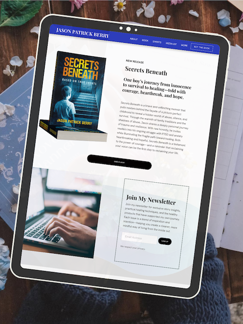
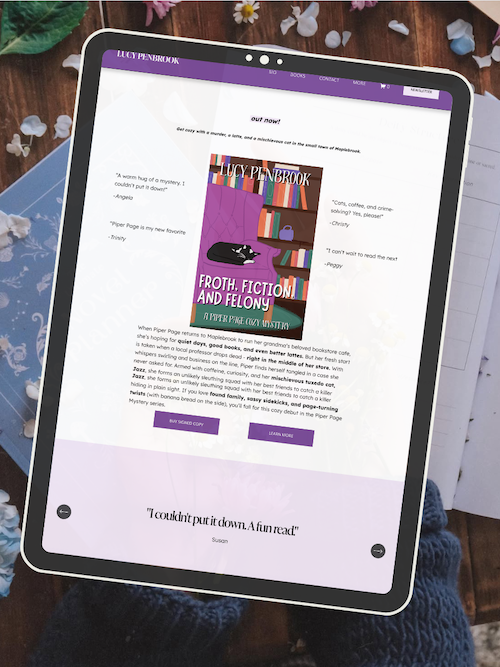
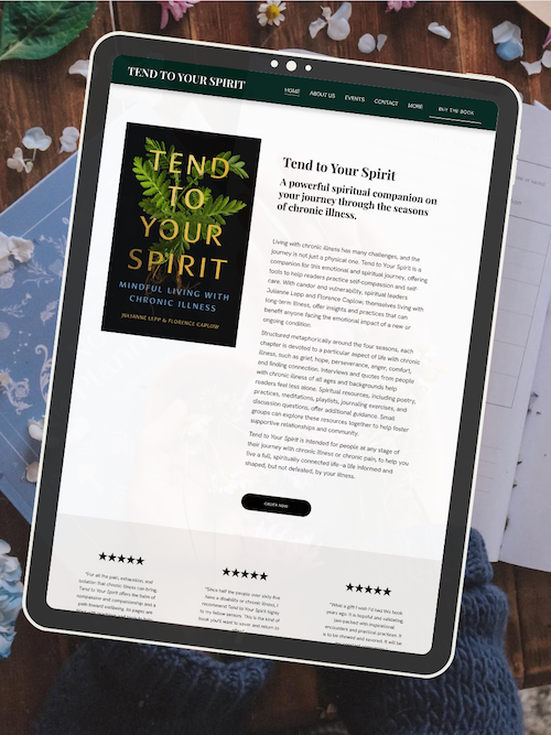
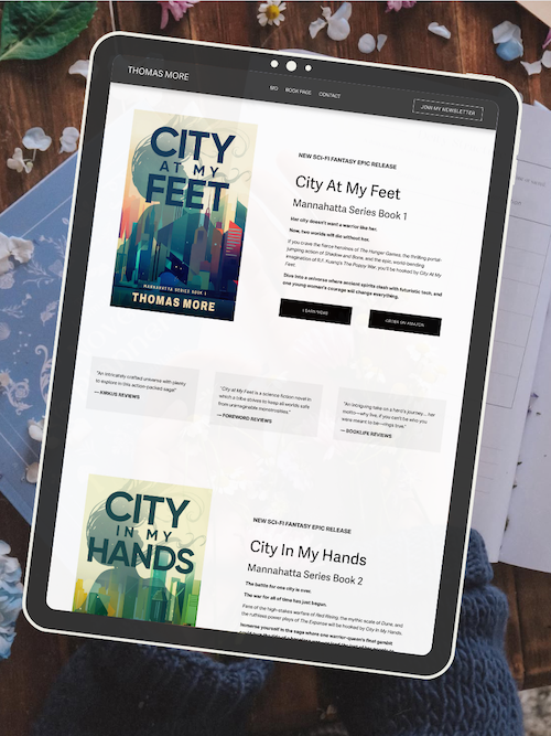
Here’s how real authors are using these Squarespace author website templates:


Minimal author websites use simple design to highlight your books and bio without distracting readers with flashy graphics or complicated menus. You don't need a dozen pages or fancy animations to make an impact. In fact, less is often more. A strong minimal site includes your name, a short bio, your books, and a clear way to join your email list or buy your work. That's it.
The best part? You don't need to be a designer to pull this off. Minimal websites are easier to build, faster to load, and simpler to maintain. Whether you're a debut author or you've published multiple books, a clean and focused website helps readers find what they need and keeps them coming back.
Key Takeaways
Minimal author websites use clean design to showcase your books and bio without overwhelming visitors
Simple layouts with clear navigation help readers connect with your work faster and more effectively
Less design means easier maintenance and quicker load times for a better user experience
AUTHOR WEBSITE EXAMPLES

Minimal Author Website Examples: Design, Features, and Implementation
Minimalist author websites strip away clutter and focus on what matters most—your books, your story, and your readers. They rely on clean layouts, intentional use of white space, and simple navigation to create professional, high-converting sites that feel effortless to explore.
What Defines a Minimal Author Website?
A minimal author website uses only what's essential. No flashy animations. No crowded sidebars. Just your books, your bio, and a clear path for readers to take action.
Minimalist design focuses on one core idea: subtract until it breaks. You keep stripping away elements until removing anything else would hurt functionality or clarity. That's your sweet spot.
Most minimalist author websites feature a clean layout with plenty of negative space. They use a limited color palette—often just two or three colors—and simple typography that's easy to read. You'll see lots of white space around text and images, which helps guide the reader's eye exactly where you want it to go.
A one-page website works beautifully for this approach. Everything lives on a single scrolling page: your hero image, author photo, book covers, bio, and newsletter signup. No hunting through menus. No confusion about where to click next.
Visual Hierarchy and the Power of Negative Space
Visual hierarchy means arranging elements so readers naturally know what to look at first, second, and third. Your most important content gets the most visual weight.
On a minimalist author website, you might use a bold hero image of your latest book cover at the top of the page. Below that, a clean author bio in simple typography. Then a call-to-action button for your mailing list integration.
Negative space (also called white space) is the empty area around your content. It's not wasted space—it's working space. It gives your content room to breathe and makes your site feel calm instead of chaotic.
When you embrace white space, you make everything else more powerful. A single book cover surrounded by white space draws more attention than ten book covers crammed together. Your CTA buttons stand out more when they're not competing with a busy background.
The best minimalist websites use a 60-30-10 rule for visual balance: 60% white space, 30% content, 10% accents or calls-to-action.
Typography, Color Palette, and High-Quality Visuals
Your font choices make or break minimalist web design. Sans serif fonts work best because they're clean and modern. Fonts like Helvetica, Open Sans, or Proxima Nova feel professional without drawing too much attention to themselves.
Use bold typography sparingly—maybe for your name or book titles. Keep body text simple and readable. Stick to two fonts maximum: one for headings, one for body text.
Your color palette should be just as restrained. A neutral color palette with black, white, and one accent color works beautifully. Or try a monochromatic color palette using different shades of the same color.
Effective Minimalist Color Schemes:
Black text, white background, one brand color for buttons
Navy, cream, and gold for a sophisticated feel
Charcoal gray, off-white, and sage green for a calming vibe
High-quality images matter more in minimalist design because there are fewer of them. Every photo needs to earn its place. Use professional author photos and crisp book covers. Avoid low-resolution images or stock photos that feel generic.
Best Website Builders and Tools for Minimalist Author Sites
You don't need coding skills to build a minimal author website. The right website builder makes it simple.
Squarespace is perfect for minimalist author websites. Their templates already lean clean and modern. You get beautiful, responsive design right out of the box. Plus, everything—hosting, email campaigns, and your site—lives in one place.
Wix offers more flexibility with its drag-and-drop website builder. You can position elements anywhere on the page. Their customizable templates include several minimal options, though you'll need to resist the temptation to add too much.
Divi and Elementor are WordPress plugins for authors who want more control. Both use drag-and-drop editing and work well for minimalist portfolio websites. Divi has cleaner default styling, while Elementor gives you more granular control.
Best builders for specific needs:
Easiest for beginners: Squarespace
Most customization: Elementor
Best templates: Squarespace or Divi
Most affordable: Wix (free plan available)
All of these tools offer responsive design, so your site looks good on phones and tablets without extra work.
Key Features for Author Engagement and Book Sales
A minimalist website still needs to convert readers into fans and buyers. Focus on these essential features.
Newsletter signup is non-negotiable. Place a simple form above the fold (visible without scrolling) or use a subtle popup. Keep the form minimal—just email address and first name. Your mailing list integration should connect to tools like ConvertKit, Mailchimp, or Squarespace Email Campaigns.
Clear CTA buttons guide readers toward action. Use phrases like "Read Chapter One," "Get My Free Story," or "Join My Newsletter." Make buttons stand out with your accent color, but keep the design clean—no drop shadows or gradients.
Author bio should be short and scannable. Three to four sentences max. Focus on what readers care about: the types of books you write and why they should care.
Book sales links need to be obvious but not obnoxious. Display book covers as clickable images that link to retailers. Or use simple text links under each cover: "Buy on Amazon | Apple Books | Barnes & Noble."
Simple navigation keeps readers from getting lost. Use a hamburger menu (those three horizontal lines) if you have multiple pages, or stick to a one-page layout with smooth scrolling to different sections.
Standout Examples: Real Minimalist Author Websites
Linda Tharp's website shows how powerful minimalist design can be. Her landing page uses a single still image with her name, followed by a brief bio, then her books. No distractions. No confusion about what to do next.
Neil Gaiman's minimalist approach puts content first. His site uses lots of white space, simple typography, and a clean layout that makes his books and blog posts easy to find. The neutral color palette—mostly black text on white—feels timeless.
Many Australian and indie authors embrace minimalist portfolio websites with one-page layouts. These sites typically feature a hero image at the top (often an author photo or book cover), followed by scrolling sections for bio
Frequently Asked Questions
Minimalist author websites raise practical questions about design choices, functionality, and how to balance simplicity with effectiveness. These answers help you understand what works, what doesn't, and how to build a clean site that still does the heavy lifting for your writing career.
What are the essential elements to include in a minimalist author website?
Your minimalist author website needs four core elements: a clear homepage with your name and what you write, an about page that connects readers to you as a person, a books page with cover images and buy links, and a simple contact or newsletter signup form.
Skip the extras that don't serve your readers. You don't need complex navigation menus, animated widgets, or multiple sidebars. A clean header with 3-5 menu items keeps things focused.
Your author photo should appear somewhere visible—usually the homepage or about page. Readers want to see who's behind the words. Make sure your email signup is easy to spot without being pushy.
How can an author create an effective homepage design with minimal content?
Start with a hero section that includes your name, a one-sentence description of what you write (like "thriller author" or "YA fantasy novelist"), and your latest book cover or author photo. This takes up just the top portion of your page but tells visitors everything they need to know in three seconds.
Below that, add one or two short sections. You might feature your newest release with a single paragraph and a "Learn More" button. Or include a brief welcome message with a newsletter signup.
White space is your friend. Let your content breathe by leaving generous margins and padding around elements. This doesn't mean your page looks empty—it means each element gets room to stand out.
Stick to one or two fonts maximum. Use size and weight (bold vs. regular) to create hierarchy instead of switching typefaces constantly.
Which website platform is best for authors seeking a minimalist design?
Squarespace leads the pack for minimalist author websites because its templates already lean clean and modern. You get professional design built in, and the drag-and-drop editor makes it simple to strip away anything you don't need. The templates are mobile-responsive from the start, which matters since many readers browse on phones.
WordPress with a minimal theme gives you more control if you're comfortable with a learning curve. You can customize every detail, but you'll spend more time on setup and maintenance. It works well if you want specific features or plan to grow your site significantly.
Wix offers simplicity and affordability with decent minimal templates. The interface is beginner-friendly, though you have slightly less design polish than Squarespace. For authors just starting out or on a tight budget, it gets the job done without overwhelming you with options.
How do minimalist website designs impact the readability and engagement for visitors?
Minimalist designs improve readability by removing visual clutter that competes for attention. When you limit colors, fonts, and design elements, readers focus on your actual content—your book descriptions, your bio, your writing samples. Their eyes don't have to fight through busy backgrounds or confusing layouts.
Load times get faster with minimal designs because there's less code, fewer images, and simpler styling to process. Readers don't wait around, and search engines reward faster sites with better rankings.
Clear calls-to-action stand out more when they're not buried in sidebar widgets and pop-ups. A single "Buy Now" button on a clean page converts better than five different buttons competing for clicks on a cluttered one.
Mobile users especially benefit from minimal design. Simpler layouts adapt better to small screens, and readers can navigate without pinching, zooming, or accidentally tapping the wrong link.
Can a minimalist author website still be effective for book promotion and sales?
Yes, minimal websites often outperform busy ones for book sales because they guide readers straight to buying decisions without distraction. When someone lands on your books page and sees clean cover images with clear "Buy" buttons, they know exactly what to do next.
Your homepage can spotlight your latest release with a compelling book description and direct purchase links. Without competing elements pulling attention away, that single book gets maximum focus. You can rotate featured titles as you publish new work.
Newsletter signups convert better on minimal sites. A simple form with clear benefit language ("Get free chapters" or "Join for book news") performs well when it's not fighting against a dozen other page elements. You build your reader list faster, which drives long-term sales.
Author branding actually strengthens with minimalism. A cohesive color palette, consistent fonts, and thoughtful layout choices make you look professional and established—even if you're a debut author. Readers trust clean, well-designed sites more than cluttered ones.
What are some best practices for maintaining a clean and uncluttered author website?
Update content strategically instead of constantly adding new sections. When you publish a new book, replace an older featured title on your homepage rather than stacking them all together. Keep your books page to current releases and notable backlist titles instead of listing every short story you've ever written.
Limit your navigation menu to essential pages only. Home, About, Books, and Contact cover what most readers need. If you blog regularly, add a Blog link. Beyond that, you're probably adding complexity without value.
Choose one or two primary colors beyond black and white. Use them consistently for buttons, links, and accents. This creates visual coherence without needing elaborate design work.
Audit your site every few months. Ask yourself what you can remove without hurting the visitor experience. Old event announcements, outdated blog posts you're not proud of, and "coming soon" placeholders all create clutter. Delete or archive them.
Resist the urge to add every social media icon, review widget, and analytics badge you come across. Each addition makes your site busier and slower. Stick to elements that directly help readers connect with your books or reach you.
Keep forms short. Newsletter signups should ask for email only—maybe first name if you want to personalize messages. Contact forms need name, email, and message fields. Anything more creates friction that stops people from completing them.
Ready to launch your author website?
Explore my Squarespace website templates designed specifically for authors — easy to customize, beautifully designed, and built to help you sell more books.

SHOP THE AUTHOR WEBSITE TEMPLATES
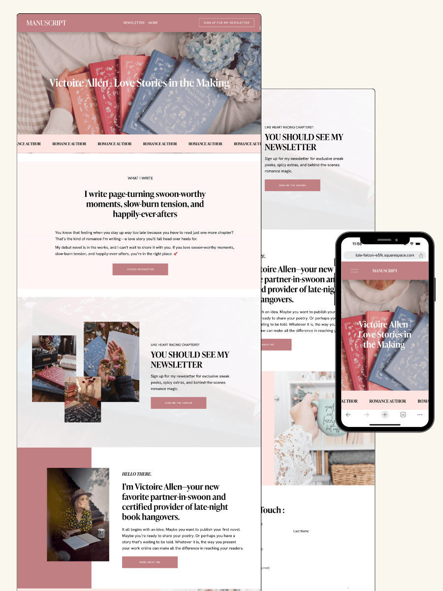
THE MANUSCRIPT AUTHOR WEBSITE TEMPLATE — perfect for authors launching their first professional website with a simple, polished layout
THE DEBUT AUTHOR WEBSITE TEMPLATE — designed to highlight your first book, build your email list, and grow an audience from day one
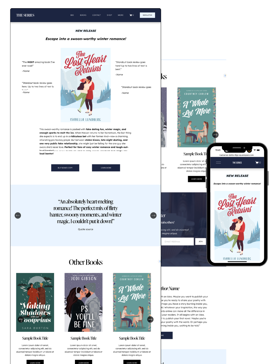
THE SERIES AUTHOR WEBSITE TEMPLATE — ideal for showcasing multiple books with clear series pages and strong reader flow
THE ONE-PAGE AUTHOR AUTHOR WEBSITE TEMPLATE — a streamlined one-page site for authors who want something beautiful, fast, and easy
THE DONE-FOR-YOU AUTHOR WEBSITE EXPERIENCE — your author website built for you so you can launch without touching design or tech
MOST POPULAR BLOG POSTS
Authors Guide to Website Design & Branding
Squarespace Email Campaigns: A Guide for Authors
How to Create an Author Website on Squarespace (Step-by-Step)