Author Website Layout Ideas: Best Designs With Real Author Examples
Your author website is more than just a digital business card. It's where readers discover your books, connect with your story, and decide whether to join your email list or hit the buy button. But if your layout feels cluttered, confusing, or outdated, you're losing potential fans before they even scroll down.
Want a beautiful author website without spending weeks designing it from scratch? These Squarespace website templates for authors are designed to showcase your books, grow your email list, and look professional instantly.

Here’s how real authors are using these Squarespace author website templates:


A well-organized author website layout combines essential sections like your homepage, about page, book catalog, and contact form into a design that reflects your brand and makes it easy for visitors to take action. The best layouts don't just look good—they guide readers through your site naturally, from "Who is this author?" to "Where can I buy their book?" without friction or guesswork.
In this post, you'll see real examples of author website layouts that work, plus practical ideas you can use to build or refresh your own site. Whether you're starting from scratch or tweaking what you already have, these layouts will help you create a website that turns visitors into loyal readers.
Key Takeaways
A strong author website layout includes essential pages like a homepage, about section, book catalog, and contact form
Effective layouts guide visitors naturally toward actions like buying books or joining your email list
Using real author website examples helps you build a site that matches your brand and connects with readers
AUTHOR WEBSITE EXAMPLES

Author Website Layout Ideas (With Examples)
An effective author website design combines clean navigation, reader-focused content, and strategic calls-to-action that turn visitors into fans. The best author websites use proven layouts that showcase books, build trust through well-crafted bios, and guide readers toward joining your mailing list.
Essential Elements of an Author Website
Your author website needs a few core elements to work. Every professional author website should include a homepage, book showcase, author bio, contact page, and newsletter signup. These basics give readers what they're looking for without overwhelming them.
Your homepage should load quickly and make it obvious what you write. Include your name, genre, and a clear visual—whether that's book covers or a professional headshot. Add social media icons in the header or footer so readers can connect with you on their preferred platform.
A mailing list signup should appear on every page. Place it in your header, sidebar, or footer. Some authors use pop-ups, but a simple embedded form works just as well. Make the benefit clear: early access, free chapters, or exclusive updates.
Your contact page doesn't need to be fancy. A simple form or email address works. Many authors add their agent's contact info here too. Keep it straightforward so readers, event planners, and media can reach you easily.
Proven Homepage Layouts That Convert
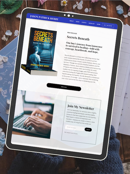
The single-page layout works great for newer authors. Everything lives on one scrolling page: hero image, book showcase, bio, and newsletter signup. This approach uses visual hierarchy to guide readers through your content without clicking around.
The traditional multi-page layout gives you more room to breathe. Your homepage acts as a hub with clear navigation to Books, About, Blog, and Contact. This works well if you have multiple series, a large backlist, or want to share writing advice.
Some author website examples use a bold hero section with a full-screen book cover or author photo. Others prefer a clean, minimal approach with lots of white space. Both work—pick what fits your genre and brand. Romance authors often use darker, moodier designs while middle-grade authors lean toward bright, playful layouts.
Your homepage should answer three questions immediately: Who are you? What do you write? How can I get more? If visitors can't answer these in five seconds, simplify your layout.
Optimizing Your Book Showcase for Engagement
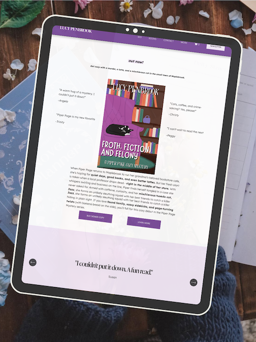
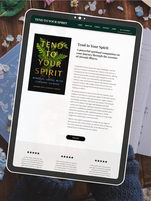
Your book showcase is where visitors become buyers. Create a dedicated Books page or section that displays your covers clearly. Large, high-quality images matter—blurry covers kill credibility.
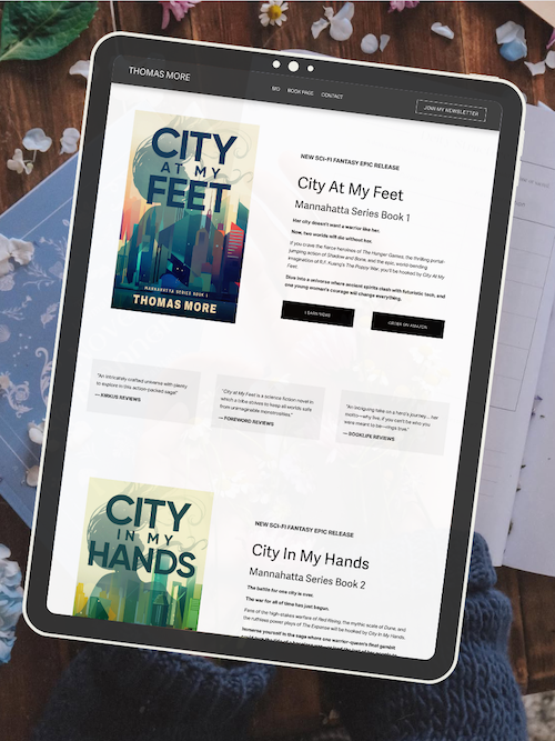
Organize books by series or publication date. If you write multiple series, create separate sections with clear headers. Include buy buttons for each retailer you're available on: Amazon, Apple Books, Barnes & Noble, Kobo, and your local indie bookstore.
Add short descriptions under each cover. Two to three sentences max. Readers who want more will click through to a dedicated book page with the full blurb, reviews, and sample chapters.
Some authors use a grid layout with covers side by side. Others prefer a list view with covers on the left and descriptions on the right. Test both and see what works for your backlist size. If you only have one or two books, feature them prominently on your homepage instead.
Include series reading order clearly. Number your books or create a visual flow chart. Confused readers don't buy, so make it obvious where to start.
High-Impact Bio and About Pages
Your author bio should feel personal without oversharing. Start with your writing credentials: what you write, what's published, any awards or recognition. Then add a personal touch—where you live, what you love, your pets, your hobbies.
Keep paragraphs short. One to three sentences each. Use a conversational tone like you're talking to a friend. Skip the stiff, formal language unless you write academic nonfiction.
Include a professional headshot. It doesn't need to be fancy, but it should be current and clear. Readers want to see the person behind the books. Some authors add candid photos of their writing space or personal life to build connection.
Break up your bio with subheadings if it runs long. "About My Writing," "My Journey to Publication," and "Personal Life" work well. This makes it scannable for readers who skim.
End with a call-to-action. Invite readers to join your newsletter, follow you on social media, or check out your books. Don't let your About page be a dead end.
Effective Calls-to-Action and Author Newsletters
Your author newsletter is your most valuable marketing tool. It's the only platform you truly own—social media algorithms can change overnight, but your email list is yours forever.
Place newsletter signups everywhere: homepage, sidebar, footer, blog posts, and your About page. Make the value clear. Instead of "Subscribe to my newsletter," try "Get free bonus chapters" or "Be first to know about new releases."
Keep your signup form simple. Ask for first name and email only. The more fields you add, the fewer people will sign up. You can always ask for more information later.
Use your author platform to promote upcoming events, book launches, and reader engagement opportunities. Create a dedicated Events page or section where you list book signings, virtual readings, and conference appearances. Update it regularly so readers know where to find you.
Your newsletter should provide value, not just promotion. Share behind-the-scenes writing updates, recommend books you love, or offer exclusive content. Mix promotional emails with relationship-building content.
Navigation and Reading Order for Series
Clear navigation makes or breaks reader experience. Your main menu should include four to six items max: Home, Books, About, Blog, Events, and Contact. Too many options overwhelm visitors.
Use dropdown menus sparingly. They work well for organizing series under a "Books" tab, but nested dropdowns confuse people. Keep your structure flat and obvious.
For series authors, reading order is critical. Create a dedicated series page that lists books in order with covers, titles, and descriptions. Number them clearly: "Book 1," "Book 2," etc.
Some authors create visual reading order guides with arrows or timelines. This works especially well for complex universes with multiple interconnected series. Readers appreciate knowing exactly where to start and what comes next.
Add "Start Here" buttons or badges to first-in-series books. Make it impossible to miss where a new reader should begin. This simple addition can dramatically increase your sales.
Promoting Events and Building Community
Your Events page keeps readers connected to your author brand beyond books. List upcoming book signings, virtual events, workshops, and conference appearances. Include dates, times, locations, and registration links.
Embed a calendar widget or create a simple list format. Update it monthly so readers always see current information. Archive past events or remove them entirely—nothing looks worse than outdated information.
Build community
Frequently Asked Questions
Building an author website involves planning your layout, choosing what to highlight, and making sure readers can find what they need. These questions cover the essential design choices, homepage strategy, and navigation structure that help turn visitors into fans.
What are the key elements to include in an author website layout?
Your author website needs a clear homepage that tells visitors who you are and what you write. Include your author bio front and center so readers connect with you right away. Your book covers should be visible above the fold with links to buy or learn more.
A newsletter signup form is non-negotiable. Place it in your header, sidebar, or as a popup so you can build your email list from day one.
Don't forget an "About" page that goes deeper into your story and writing journey. A "Books" page should showcase all your titles with descriptions, reviews, and purchase links. If you blog or share writing updates, include a dedicated blog section that's easy to navigate.
Contact information matters too. Whether it's a simple form or an email address, give readers and industry professionals a way to reach you.
How can authors optimize their website's homepage to attract more readers?
Start with a hero section that features your latest book or biggest announcement. Use a high-quality image and a single, clear call-to-action like "Read Chapter One" or "Get Your Copy."
Keep your homepage focused. Don't try to show everything at once—pick your top three priorities and design around those.
Use social proof strategically. Add one or two strong testimonials or review quotes near your book covers. This builds trust fast without cluttering the page.
Make your newsletter signup visible but not aggressive. A simple box with a compelling reason to subscribe works better than a full-screen popup that appears immediately. Consider offering a free chapter or exclusive content as an incentive.
Speed matters. Compress your images and avoid heavy animations that slow load times. Readers bounce quickly from slow sites.
What examples of effective author websites demonstrate successful layout and design?
Neil Gaiman's website uses a clean, minimal design that puts his books and blog front and center. The navigation is simple, and his personality comes through in the content without overwhelming the design.
Brandon Sanderson's site organizes his extensive catalog with clear categories and series groupings. His homepage highlights new releases and upcoming projects, making it easy for both new readers and longtime fans to find what they want.
Roxane Gay's website balances her work as an author with her other projects. The layout is straightforward with distinct sections for books, essays, and speaking engagements.
What these sites share is clarity. They don't try to be flashy—they make information easy to find and put the author's work first.
Can you suggest strategies for authors to showcase their work and grow their audience through their website?
Create a "Start Here" page that guides new visitors to your best content. This could include your most popular blog posts, a reading order for your series, or a welcome video that introduces you and your books.
Offer exclusive content only available on your website. This could be deleted scenes, character interviews, or behind-the-scenes looks at your writing process. Give readers a reason to visit regularly instead of just following you on social media.
Build an email list from the start. Use lead magnets like free short stories, sample chapters, or printable book club guides. Your email list is the only audience you truly own—social media platforms can change algorithms or disappear entirely.
Feature reader reviews and testimonials throughout your site. Real reactions from readers help new visitors decide if your books are right for them.
Keep your content fresh. Regular blog posts about your writing journey, book recommendations, or industry insights show you're active and engaged with your readers.
What are some best practices for structuring a website's navigation menu to enhance user experience?
Keep your main navigation menu short—five to seven items maximum. Too many options overwhelm visitors and make decisions harder.
Use clear, descriptive labels. "Books" is better than "Bibliography." "Newsletter" is clearer than "Subscribe." Don't make visitors guess what they'll find.
Put your most important pages in the main menu. Your books, about page, and newsletter signup should be easy to access from anywhere on your site. Less critical pages like your privacy policy can go in the footer.
Consider your reader's journey. New visitors might want your books or bio first. Returning fans might look for your blog or events page. Organize your menu to serve both groups.
Use dropdown menus sparingly. They're useful for organizing book series or different types of content, but too many levels make navigation confusing. Stick to one dropdown level if you use them at all.
Mobile matters. Test your navigation on phones and tablets. Make sure menu items are easy to tap and that dropdowns work smoothly on smaller screens.
How can an author integrate social media and blogging into their website layout for maximum engagement?
Place social media icons in your header or footer, but don't let them dominate your design. You want readers to stay on your site, not immediately leave for Instagram.
Embed your latest social posts directly on your homepage or blog. This keeps content fresh and shows you're active without requiring visitors to leave your site.
Your blog should have its own dedicated section with clear categories. If you write about writing craft, book reviews, and personal updates, let readers filter by topic. This makes your content more useful and easier to navigate.
Add social sharing buttons to your blog posts so readers can easily share content they love. Place them at the top and bottom of posts for maximum visibility.
Create a content strategy that connects your blog and social media. Write longer, deeper posts on your blog, then share excerpts or key points on social platforms with links back to your site. This drives traffic where you want it—your own platform.
Consider a monthly newsletter that rounds up your best blog posts and social updates. This gives subscribers value while directing them back to your website regularly.
Ready to launch your author website?
Explore my Squarespace website templates designed specifically for authors — easy to customize, beautifully designed, and built to help you sell more books.

SHOP THE AUTHOR WEBSITE TEMPLATES
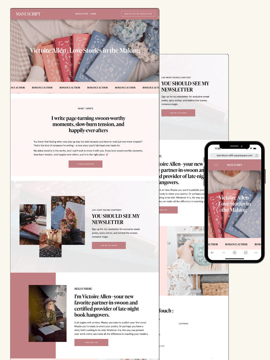
THE MANUSCRIPT AUTHOR WEBSITE TEMPLATE — perfect for authors launching their first professional website with a simple, polished layout
THE DEBUT AUTHOR WEBSITE TEMPLATE — designed to highlight your first book, build your email list, and grow an audience from day one
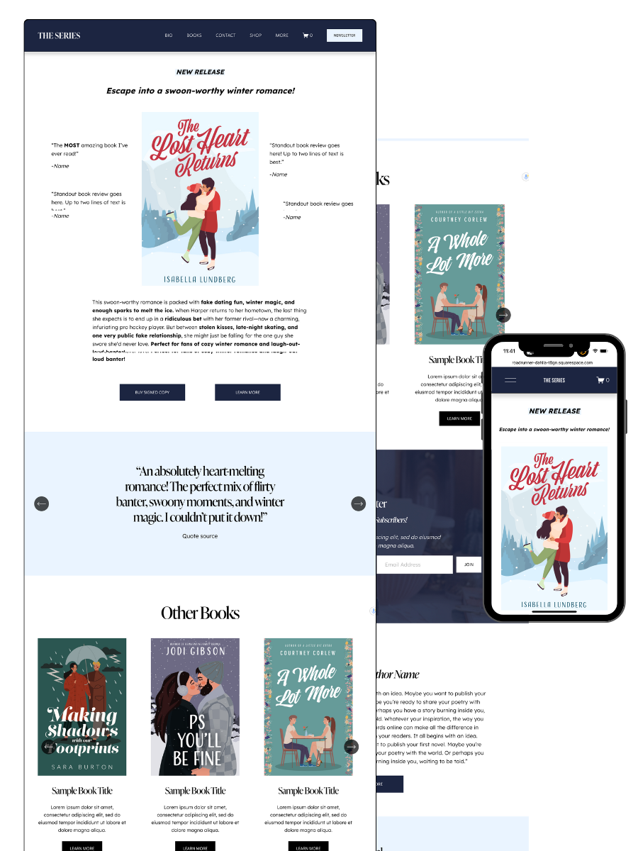
THE SERIES AUTHOR WEBSITE TEMPLATE — ideal for showcasing multiple books with clear series pages and strong reader flow
THE ONE-PAGE AUTHOR AUTHOR WEBSITE TEMPLATE — a streamlined one-page site for authors who want something beautiful, fast, and easy
THE DONE-FOR-YOU AUTHOR WEBSITE EXPERIENCE — your author website built for you so you can launch without touching design or tech
MOST POPULAR BLOG POSTS
Authors Guide to Website Design & Branding
Squarespace Email Campaigns: A Guide for Authors
How to Create an Author Website on Squarespace (Step-by-Step)