Modern Author Website Design Examples: Inspiration and Best Practices for Building Your Platform
Your website is the front door to your author career. It's where readers discover your books, sign up for your newsletter, and decide whether they trust you enough to hit "buy." A well-designed modern author website combines clean visuals, easy navigation, and smart marketing features that turn casual visitors into loyal fans. But what does that actually look like in practice?
Want a beautiful author website without spending weeks designing it from scratch? These Squarespace website templates for authors are designed to showcase your books, grow your email list, and look professional instantly.

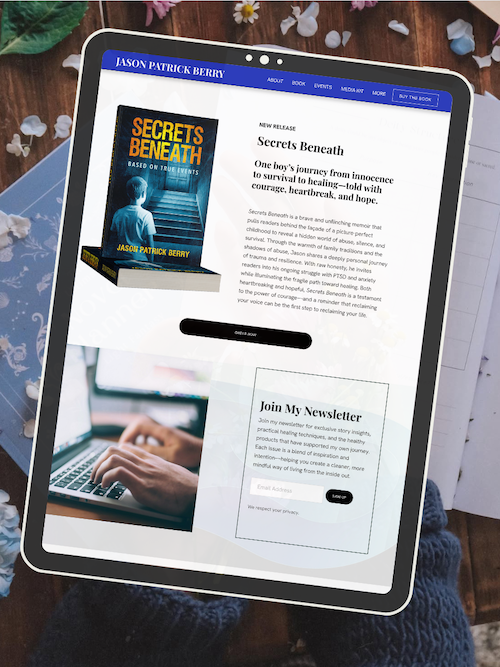
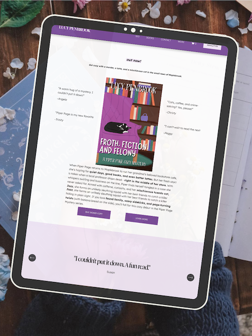
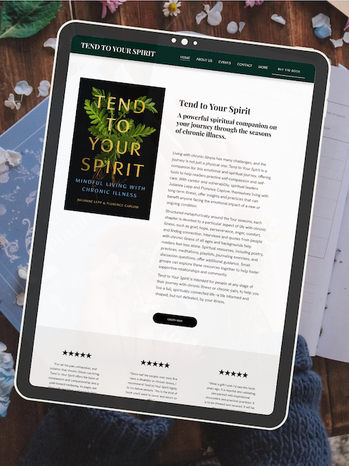
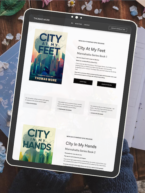
Here’s how real authors are using these Squarespace author website templates:


The best author websites in 2026 aren't just pretty—they work. They load fast, make it easy to find books, and guide readers toward taking action. Whether you're launching your first site or giving your current one a refresh, seeing real examples can help you understand what actually connects with readers. You'll notice patterns in how successful authors structure their pages, showcase their work, and build their email lists.
This guide walks you through modern author website designs that are working right now. You'll see what makes them effective, which features drive the most engagement, and how you can apply these ideas to your own site without needing a degree in web design.
Key Takeaways
Modern author websites balance visual appeal with functionality to convert visitors into readers and subscribers
Successful author sites include clear navigation, prominent book displays, email signup forms, and consistent branding
You can build an effective author website using beginner-friendly platforms with templates designed specifically for writers
Key Elements of Modern Author Website Design
Modern author website design balances visual appeal with practical function. Your site needs clean navigation, mobile-friendly layouts, strong hero sections with clear calls to action, and polished typography paired with quality visuals that reflect your brand.
User-Centric Navigation & Clear Content Hierarchy
Your navigation should make it easy for readers to find what they need in two clicks or less. Keep your main menu simple—usually five to seven items max. Think "Books," "About," "Blog," "Contact," and maybe "Events" or "Newsletter."
Clear navigation isn't just about the menu bar. It's about organizing your entire site so visitors know where to look next. Use visual weight to guide eyes down the page. Put your most important content at the top. Break up text with headings and white space.
Content hierarchy means showing what matters most through size, placement, and contrast. Your book cover should be bigger than your social icons. Your email signup should stand out more than your footer links. If everything screams for attention, nothing gets it.
Consider using breadcrumbs on deeper pages so readers can backtrack easily. Add a search function if you have lots of content. Label things clearly—no cute names that confuse visitors about where they'll land.
Responsive Web Design and Mobile Optimization
More than half of web traffic comes from phones and tablets. Your author website design must work perfectly on every screen size. Responsive web design automatically adjusts your layout, images, and text to fit any device.
Test your site on actual phones, not just by shrinking your browser window. Tap every button. Fill out every form. Make sure images load quickly and text stays readable without zooming.
Mobile users behave differently than desktop visitors. They scroll more and click less. They want information fast. So your mobile site needs bigger tap targets (at least 44x44 pixels), shorter paragraphs, and faster load times.
Responsive design also affects your search rankings. Google prioritizes mobile-friendly sites. If your pages don't work on phones, you'll lose both readers and visibility.
Hero Section and Calls to Action
Your hero section is the first thing visitors see—usually a large image or video with text overlay at the top of your homepage. This space should immediately communicate who you are and what readers get from being there.
Use a high-quality photo (preferably of you or your book) as your hero background. Add a short, punchy headline that captures your brand. Include one clear call to action—usually your most important goal, like "Read Chapter One" or "Join My Newsletter."
Calls to action tell visitors exactly what to do next. Make them specific and action-oriented. Instead of "Learn More," try "Download Free Sample Chapter." Instead of "Click Here," use "Get My Reading Guide."
Effective CTA elements:
Contrast: Buttons should pop against the background
Size: Big enough to notice, not so big they overwhelm
Placement: Above the fold and at natural decision points
Copy: Start with verbs and focus on benefits
Don't clutter your hero section with multiple competing CTAs. Pick one primary action and make it obvious.
Elegant Typography and Engaging Visuals
Typography sets the mood for your entire site. Choose fonts that match your genre and brand. A thriller writer might use bold, sharp typefaces. A romance author might pick something softer and more flowing.
Stick to two or three fonts maximum—one for headings, one for body text, maybe one for accents. Make sure they're readable at different sizes. Body text should be at least 16 pixels on desktop, bigger on mobile.
Pay attention to line spacing and paragraph width. Text that's too cramped or too wide gets hard to read. Aim for 50-75 characters per line for comfortable reading.
Engaging visuals include book covers, author photos, and images that reflect your writing style. Use high-quality images only—blurry or pixelated photos hurt your credibility. Show your book covers prominently. Include professional author photos that feel authentic to your brand.
Visual best practices:
Optimize image file sizes for fast loading
Use alt text for accessibility and SEO
Maintain consistent color schemes across pages
Choose images that evoke the right emotional tone
Your visuals and typography should work together to create a cohesive look. Everything should feel intentional and aligned with your author brand.
AUTHOR WEBSITE EXAMPLES

Standout Modern Author Website Design Examples
Modern author websites blend visual storytelling with strategic design elements that reflect genre, tone, and reader expectations. The best examples use color schemes, typography, and layout choices that immediately communicate what kind of books readers will discover.
Cutting-Edge Literary Fiction Websites
Literary fiction authors tend to favor sophisticated, minimalist designs that let their words take center stage. Zadie Smith's website uses clean typography and ample white space to create an elegant, uncluttered experience. The focus stays on her books and essays without distracting visuals.
Brit Bennett's site exemplifies modern literary fiction design with its understated color palette and professional photography. You'll notice how the navigation stays simple—books, events, and contact information arranged in an intuitive hierarchy.
Key design elements in literary fiction sites include:
Serif fonts that convey tradition and literary credibility
Neutral color schemes (blacks, whites, grays, soft earth tones)
High-quality author photography with natural lighting
Prominent display of awards and critical acclaim
John Green balances accessibility with literary sophistication. His website uses a clean layout that appeals to both young adult readers and literary audiences. The design feels current without chasing trends, making it age well over time.
Thriller & Suspense Author Website Inspiration
Thriller authors often embrace dark theme designs that create immediate atmosphere. Deep blacks, blood reds, and shadowy imagery set the mood before readers even click through to book descriptions.
Your thriller website should create tension through visual choices. High-contrast color schemes, bold typography, and dramatic photography all work together to signal the genre. Many successful thriller sites use full-screen background images that hint at danger or mystery.
Navigation on thriller sites needs to be clear despite darker aesthetics. White or light-colored text on dark backgrounds maintains readability while preserving the moody atmosphere. Consider how shadows, textures, and layered design elements can add depth without sacrificing usability.
Effective thriller website features:
Full-width hero images with atmospheric photography
Dark backgrounds with strategic pops of color (often red)
Bold, attention-grabbing headlines
Easy access to series order and reading guides
Minimalist and Playful Children's Book Sites
Children's book author websites walk a delicate line between appealing to young readers and convincing parent purchasers. The Moyle Sisters demonstrate this balance with bright, cheerful colors and playful design elements that feel fun without becoming chaotic.
Youthful design doesn't mean unprofessional. Your children's book site should use vibrant colors, rounded fonts, and illustration samples that showcase your book's artwork. Emma Davies uses character illustrations throughout her navigation, making the browsing experience feel like part of the story world.
Taylor Tyng's site exemplifies imaginative storytelling through design. Interactive elements, animated features, and illustrated backgrounds create an immersive experience that matches the whimsy of children's literature.
White space matters even in colorful designs. The best children's book sites avoid overwhelming visitors by grouping related content and using color strategically to guide attention rather than fill every pixel.
Romance and Contemporary Author Design Trends
Romance fiction websites embrace warmer color palettes—think blush pinks, soft purples, deep reds, and gold accents. Sally Thorne's site uses romantic imagery and flowing design elements that feel feminine without being stereotypical.
Contemporary romance authors often opt for cleaner, more modern aesthetics than historical romance writers. Your design choices should match your subgenre. Leigh Bardugo's site demonstrates how epic fantasy romance can blend dark, mystical elements with romantic themes through color and imagery choices.
Karen Kingsbury represents contemporary romance with a bright, welcoming design that feels accessible and optimistic. Soft photography, script fonts for accents, and warm color temperatures create an inviting atmosphere.
Romance sites benefit from prominent series displays. Readers often want to know reading order immediately, so clear navigation to series pages and book order guides improves user experience. Consider using visual series markers like color-coded spines or numbered badges.
Rupi Kaur's minimalist approach shows that romance and contemporary fiction don't require elaborate designs. Her simple black-and-white aesthetic with delicate typography proves that restraint can be just as effective as elaborate styling when it matches your author brand.
Features That Drive Reader Engagement and Marketing
Your author website needs more than good design—it needs features that turn visitors into loyal readers. Email capture tools, multimedia displays, and social proof elements work together to grow your audience and increase book sales.
Book Showcases and Multimedia Content
A strong book showcase puts your work front and center without overwhelming visitors. Display your book covers in a grid or carousel layout that's easy to scan. Include clear titles, short descriptions, and direct links to buy on Amazon or Barnes & Noble.
Multimedia content takes your book pages beyond static images. Book trailers give readers a cinematic preview of your story in 30-90 seconds. Author readings let them hear your voice before committing to a purchase. Behind-the-scenes videos about your writing process build connection and trust.
Keep your multimedia organized and fast-loading. Embed videos directly from YouTube or Vimeo rather than uploading massive files to your site. Add captions or transcripts for accessibility. Test loading speeds on mobile devices—most readers will view your content on their phones.
Use these elements strategically:
Homepage hero: Feature your latest release with a trailer or cover reveal
Individual book pages: Include chapter previews, character art, or mood boards
Media gallery: Collect all your video content in one browsable section
Book Landing Pages and Excerpts
Dedicated book landing pages convert browsers into buyers. Create a separate page for each title with all the information a reader needs to make a purchase decision. Include the cover, blurb, buy links, praise quotes, and trigger warnings if relevant.
Book excerpts are your most powerful sales tool. Let readers sample your writing before they buy. Post the first chapter or a compelling scene that hooks without spoiling. Format excerpts with readable fonts and generous spacing—cramped text drives people away.
Smart buy button placement matters. Add purchase links above the fold and again after your excerpt. Link to multiple retailers so readers can choose their preferred platform. Use clear button text like "Buy on Amazon" instead of vague phrases like "Click Here."
Your landing page should answer these questions:
What's this book about?
Who's it for?
Where can I buy it?
Can I read a sample?
Track which pages get the most traffic and which buy buttons get clicked. This data shows you what's working and where to focus your marketing efforts.
Newsletter Opt-In and Email List Growth
Your email list is the most valuable marketing asset you own. Newsletter opt-in forms should appear on every major page of your site—homepage, about page, book pages, and blog posts. Make signup simple with just an email field and one clear button.
Offer an incentive that appeals to your target readers. Free chapters, exclusive short stories, character guides, or early access to cover reveals all work well. The key is giving something valuable in exchange for an email address.
Place email sign-up forms strategically:
Pop-up or slide-in: Appears after 30 seconds or when scrolling
Header or footer bar: Always visible as readers browse
Inline forms: Embedded within blog posts or book pages
Exit-intent: Triggers when someone's about to leave your site
Write compelling copy that tells readers exactly what they'll get. "Join my newsletter" is boring. "Get free bonus chapters and new release alerts" tells them what's in it for them.
Connect your opt-in forms to an email service like Mailchimp, ConvertKit, or Squarespace Email Campaigns. Set up an automated welcome sequence that delivers your promised freebie and introduces your books. This turns new subscribers into engaged readers from day one.
Blog, Reviews, and Social Proof
An active blog keeps readers coming back and helps new people find you through search engines. Write about your writing process, book research, character development, or topics related to your genre. Post consistently—even once a month builds momentum better than sporadic bursts.
Book reviews provide social proof that convinces hesitant buyers. Feature starred reviews from professional outlets like Kirkus or Publishers Weekly prominently on your homepage and book pages. Pull compelling quotes rather than displaying full reviews that readers might skip.
Reader testimonials add authenticity that professional reviews can't match. Ask your advance readers or loyal fans for short quotes about what they loved. Include first names and locations to make them feel real. Rotate different testimonials on different pages to show variety.
Display social proof in multiple formats:
Star ratings: Visual shorthand for quality
Pull quotes: One-sentence praise in large text
Review roundups: Collections of positive snippets
Video testimonials: Readers talking about your books
Your events page connects with readers in real time. List upcoming book signings, author talks, virtual launches, and conference appearances. Include dates, locations, and registration links. Update this page regularly and archive past events to show you're active in the author community.
Link your blog posts to your email list and book pages. End each post with a call to action that moves readers deeper into your ecosystem. This might be joining your newsletter, reading an excerpt, or checking out a related book.
Design Tools, Templates, and Best Practices for Authors
Building a professional author website doesn't require coding skills or a massive budget anymore. Modern website builders offer drag-and-drop editors and pre-made templates that let you launch a polished site in hours, not weeks.
Choosing Website Builders and Drag-And-Drop Editors
The best website builders for authors include Squarespace, Wix, WordPress with Elementor, and Showit. Each platform offers a drag-and-drop editor that lets you move elements around your page visually without touching code.
Squarespace works well if you want clean design and don't need much customization. The templates look modern right out of the box. Wix gives you more creative freedom with its editor but can feel overwhelming at first. WordPress with Elementor offers the most flexibility but comes with a steeper learning curve.
Your choice depends on your comfort level and needs. If you want something simple that looks good fast, go with Squarespace or Wix. If you need specific features like custom membership areas or complex integrations, WordPress might be worth the extra effort.
Most drag-and-drop editors let you preview your site on mobile while you build. This matters because over 60% of web traffic comes from phones. Make sure text is readable and buttons are easy to tap on smaller screens.
Utilizing Author Website Templates
Author website templates give you a starting framework so you're not staring at a blank screen. These templates come pre-designed with sections for your bio, book covers, newsletter signup, and contact info.
Look for templates that highlight your books front and center. Your homepage should make it obvious you're an author and show your latest or most popular titles within the first scroll. Templates with large hero images work well for fiction authors, while non-fiction writers might prefer layouts that emphasize credibility and expertise.
Most platforms offer templates specifically labeled for authors or creatives. These usually include galleries for displaying book covers, blog sections for content marketing, and prominent calls-to-action for newsletter signups. You can customize colors, fonts, and images to match your author branding without starting from scratch.
Don't pick a template just because it looks pretty. Make sure it has the structure you need. Can you easily add new book pages? Is there space for testimonials or reviews? Does it have a blog section if you plan to post content regularly?
Brand Consistency & Author Platform Growth
Your author website is the hub of your author platform, and everything should look like it came from the same person. Use the same fonts, colors, and logo across your website, social media profiles, email newsletters, and book marketing materials.
Pick two or three brand colors maximum and stick with them. Choose one font for headings and another for body text. This creates visual consistency without making your site feel boring. Your professional author website becomes more memorable when readers see the same visual identity everywhere.
Brand consistency builds trust. When someone sees your Instagram post, then clicks to your website, then signs up for your email list, the experience should feel seamless. If everything looks different, it signals amateur hour.
Your author platform grows when your website works with your other marketing efforts. Add social media icons that link to your profiles. Include newsletter signup forms on multiple pages. Make it easy for readers to move from discovering you to staying connected with your work.
Use your website to capture email addresses through lead magnets like free chapters, short stories, or exclusive content. Your email list is the most valuable part of your author platform because you own it. Social media algorithms change, but your email list stays yours.
Frequently Asked Questions
Author websites come with unique design challenges that differ from other business sites. These questions cover everything from must-have features and mobile design to SEO tactics and brand building through visual choices.
What are the essential components of a modern author website?
Your author website needs a homepage that hooks visitors immediately with your book covers, a clear tagline, and a strong call-to-action. An about page builds connection with readers through your bio, author photo, and writing journey. A books page showcases your titles with covers, descriptions, buy links, and reader reviews.
You also need an email signup form—preferably on every page—so you can build your mailing list. A blog or news section keeps your site active and gives readers fresh content between book releases. Contact information or a contact form makes it easy for readers, media, and industry professionals to reach you.
Don't forget the basics: clear navigation, fast load times, and a professional design that matches your author brand.
How does mobile responsiveness impact author website design?
Over half of web traffic comes from mobile devices, which means most of your readers will view your site on their phones. If your website doesn't work well on mobile, you're losing potential fans and book sales every single day.
Mobile responsive design automatically adjusts your layout, images, and text to fit any screen size. Your book covers stay crisp, your navigation stays accessible, and your buy buttons remain clickable. Readers can sign up for your newsletter, browse your books, and read your blog without pinching, zooming, or getting frustrated.
Google also ranks mobile-friendly sites higher in search results. A site that doesn't work on phones will drop in rankings, making it harder for new readers to find you. Modern website builders like Squarespace and WordPress automatically include mobile responsiveness, but you should still test your site on actual phones to make sure everything works smoothly.
What integrations are important for an author's website?
Email marketing integration is non-negotiable. Tools like Mailchimp, ConvertKit, or Squarespace Email Campaigns connect directly to your website so every new subscriber automatically joins your mailing list. This lets you build relationships with readers and promote new releases without manual data entry.
Bookstore integrations let you link directly to retailers where readers can buy your books. You can use tools like BookLinker or Books2Read to create universal book links that work globally. Some authors also integrate Gumroad or Payhip to sell signed copies or digital products directly from their site.
Social media feeds can display your latest Instagram posts or tweets right on your homepage. Analytics tools like Google Analytics track visitor behavior so you know which pages perform best. Calendar or booking plugins help if you do author events, school visits, or coaching calls.
Payment processors like Stripe or PayPal matter if you sell anything directly—books, courses, or merchandise. The key is choosing integrations that actually support your goals, not just adding tools because they exist.
How can authors use website design to enhance their brand identity?
Your website design should reflect your genre and writing style immediately. A thriller author might use dark colors, bold fonts, and dramatic imagery. A romance author could choose softer colors, elegant typography, and warm photography. Your design choices tell visitors what kind of books you write before they read a single word.
Consistent branding across your site builds recognition and trust. Use the same fonts, color palette, and visual style on every page. Your book covers, author photos, and graphics should all feel like they belong together. This creates a cohesive experience that makes you look professional and memorable.
Your homepage headline and tagline communicate your unique author brand. Instead of generic phrases, use language that captures your voice and genre. Add personality through your writing style in bios and blog posts. The way you present yourself visually and verbally creates an emotional connection with readers who will become loyal fans.
What should authors consider when selecting visual elements for their website?
Choose high-quality images that match your genre and brand. Blurry photos or generic stock images make your site look unprofessional. Your author photo should be current, well-lit, and reflect how you want readers to see you. Book cover images need to be high-resolution so they look sharp on all devices.
Typography matters more than most authors realize. Select fonts that are readable and appropriate for your genre. Stick to two or three fonts maximum—one for headings, one for body text, and maybe one for accents. Fancy or overly decorative fonts can be hard to read, especially on mobile devices.
Color psychology plays a role in how readers perceive your brand. Dark blues and blacks suggest mystery or sophistication. Bright colors feel energetic and contemporary. Pastels evoke softness and calm. Your color choices should align with your genre expectations while still feeling authentic to you.
White space gives your content room to breathe. Don't cram too much onto one page. Let your book covers, text, and images have space around them. This makes your site easier to scan and less overwhelming for visitors.
How can SEO best practices be implemented in author website design?
Start with keyword research to understand what readers search for when looking for books in your genre. Use tools like Google Keyword Planner or Ubersuggest to find relevant terms. Include these keywords naturally in your page titles, headings, and body content—but never stuff them awkwardly just to hit a number.
Your page titles and meta descriptions should be unique and descriptive. Instead of just "Books," try "Cozy Mystery Books by [Your Name]." Write compelling meta descriptions that make people want to click through from search results. Keep titles under 60 characters and descriptions under 160 characters so they don't get cut off.
Create quality content regularly through blog posts about your writing process, genre topics, or book research. Search engines favor websites that update consistently with valuable content. Each blog post is another opportunity to rank for keywords and attract new readers.
Optimize your images by compressing them for faster load times and adding descriptive alt text. Alt text helps search engines understand what your images show and makes your site accessible to visually impaired visitors. Use descriptive file names like "author-name-headshot.jpg" instead of "IMG_1234.jpg."
Build internal links between your pages. Link from blog posts to your books page, from your about page to your newsletter signup, and between related content. This helps search engines crawl your site and keeps visitors engaged longer. External links to reputable sources also boost your credibility in search rankings.
Ready to launch your author website?
Explore my Squarespace website templates designed specifically for authors — easy to customize, beautifully designed, and built to help you sell more books.

SHOP THE AUTHOR WEBSITE TEMPLATES
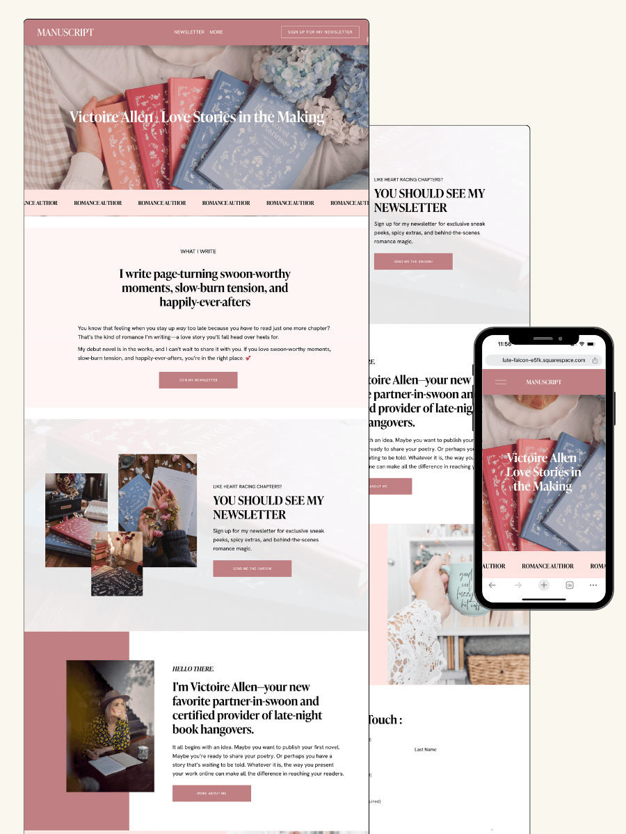
THE MANUSCRIPT AUTHOR WEBSITE TEMPLATE — perfect for authors launching their first professional website with a simple, polished layout
THE DEBUT AUTHOR WEBSITE TEMPLATE — designed to highlight your first book, build your email list, and grow an audience from day one
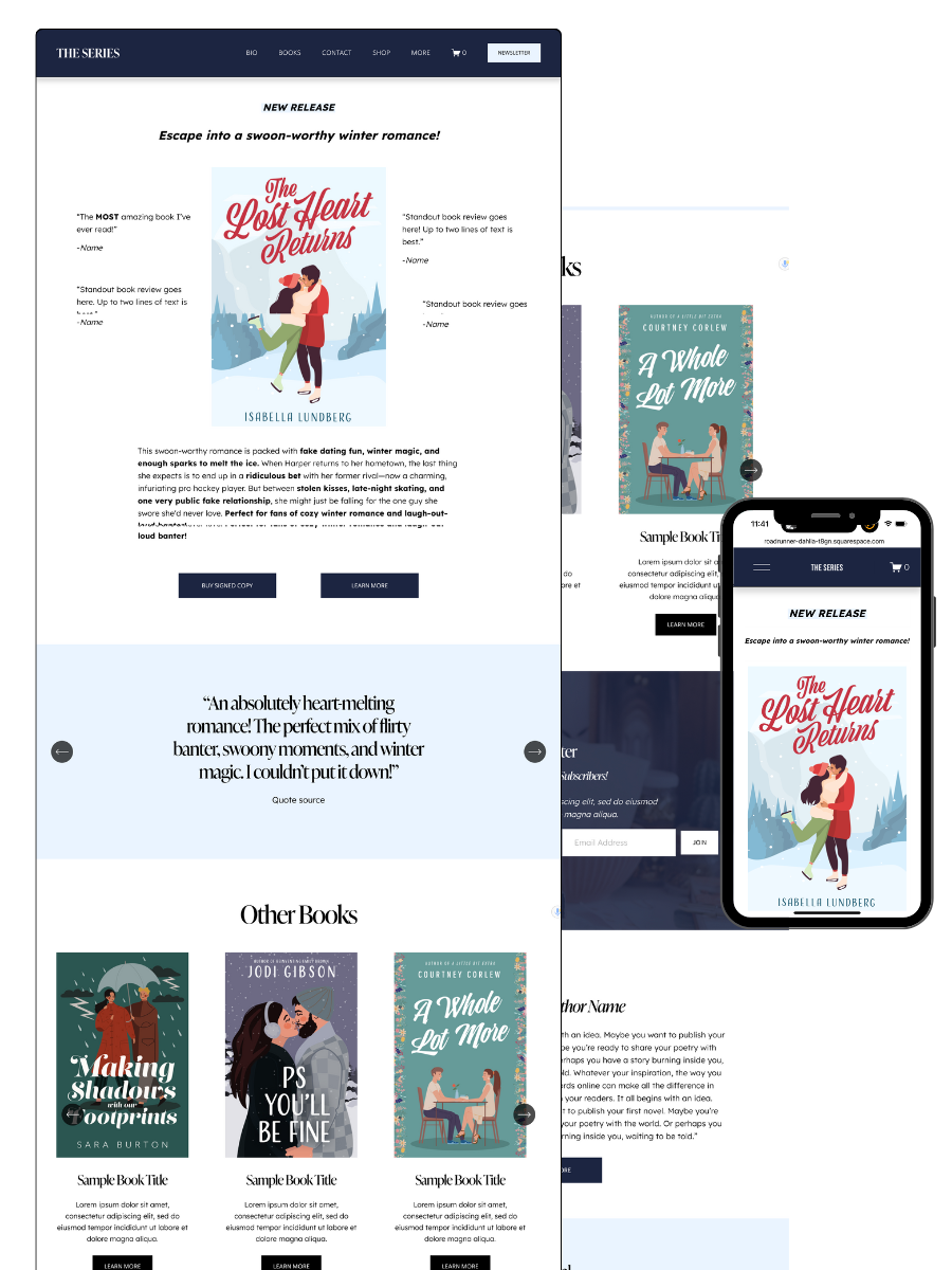
THE SERIES AUTHOR WEBSITE TEMPLATE — ideal for showcasing multiple books with clear series pages and strong reader flow
THE ONE-PAGE AUTHOR AUTHOR WEBSITE TEMPLATE — a streamlined one-page site for authors who want something beautiful, fast, and easy
THE DONE-FOR-YOU AUTHOR WEBSITE EXPERIENCE — your author website built for you so you can launch without touching design or tech
MOST POPULAR BLOG POSTS
Authors Guide to Website Design & Branding
Squarespace Email Campaigns: A Guide for Authors
How to Create an Author Website on Squarespace (Step-by-Step)