High-Converting Author Website Layouts: 5 Proven Designs That Turn Readers Into Fans
Your author website can look amazing and still not sell books. The difference comes down to layout. A high-converting author website layout guides visitors to take action—whether that's buying your book, joining your email list, or following you on social media—by using strategic design choices that make the next step obvious.
Most authors focus on pretty designs but miss the small tweaks that actually turn visitors into readers. Things like where your call-to-action button sits, how fast someone understands what you write, and whether your site works on phones all play a role. The good news? You don't need to be a designer or tech expert to get this right.
This guide walks you through the exact elements your author website needs to convert browsers into buyers. You'll learn what to put above the fold, how to organize your content so people actually read it, and which features make the biggest difference in getting people to click. No fluff, no overwhelm—just clear steps you can take today.
Want a beautiful author website without spending weeks designing it from scratch? These Squarespace website templates for authors are designed to showcase your books, grow your email list, and look professional instantly.

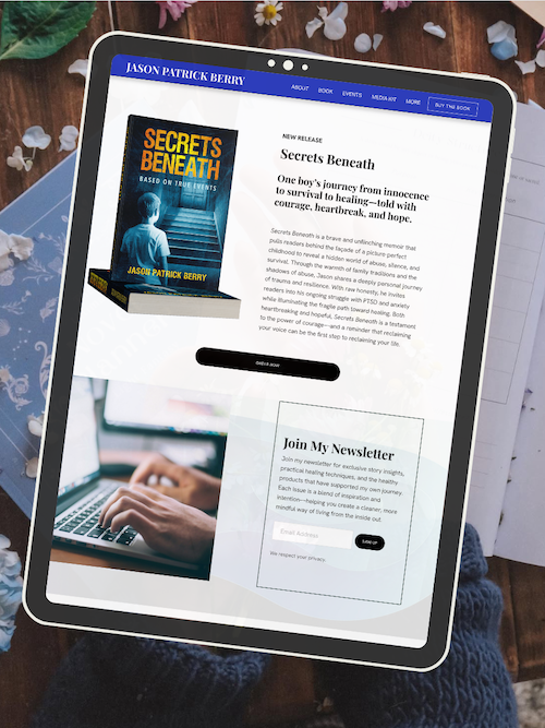
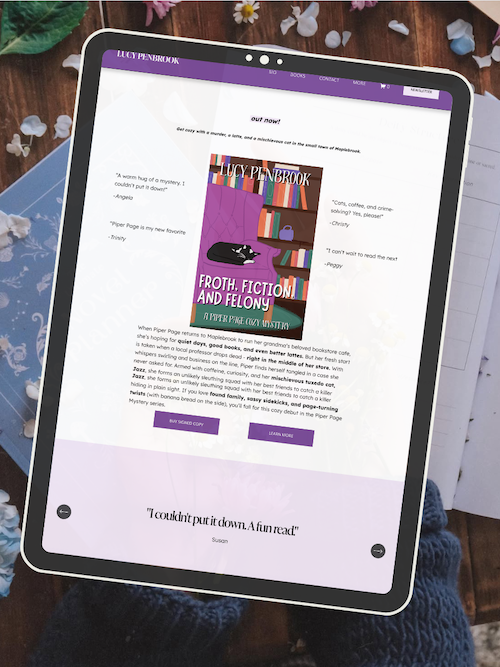
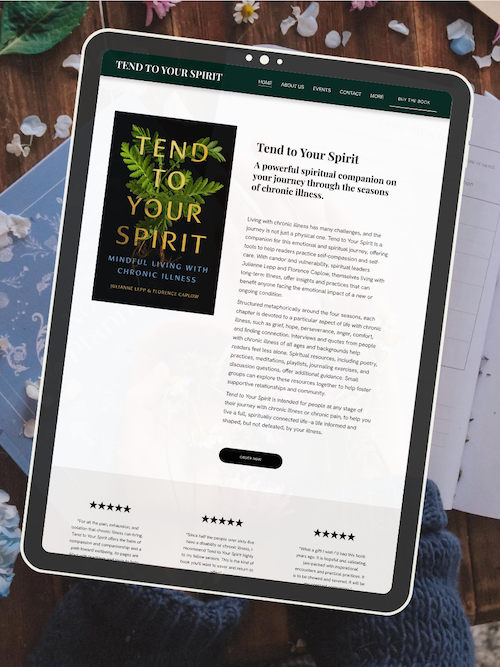
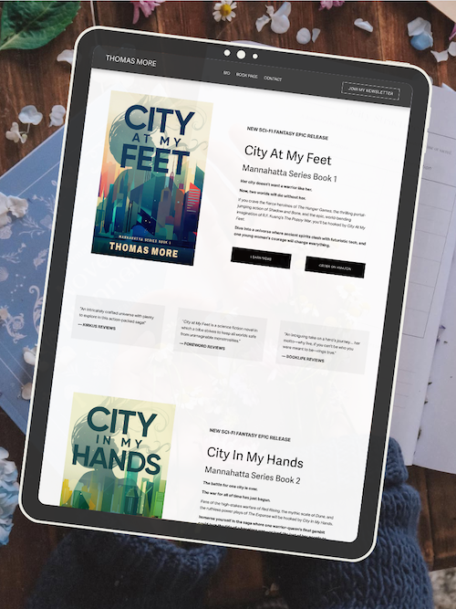
Here’s how real authors are using these Squarespace author website templates:


Key Takeaways
Your website layout should make it clear what you write and what action visitors should take within seconds of landing on your page
Strategic placement of calls-to-action, mobile-friendly design, and easy navigation are essential elements that convert visitors into readers
A professional author website combines clean design with clear messaging to build trust and drive book sales
AUTHOR WEBSITE EXAMPLES

Building a High-Converting Author Website Layout
A high-converting author website layout combines strategic design with reader psychology to turn visitors into fans and subscribers. Your layout should prioritize clear messaging, intuitive navigation, and compelling calls to action that guide readers toward your books and newsletter.
Crafting Your Value Proposition and Above-the-Fold Experience
Your value proposition needs to tell visitors exactly who you are and why they should care within three seconds. Place this message above the fold—the area visible before scrolling—along with your author photo, genre, and most recent or bestselling book.
Above the fold is your most valuable real estate. Your primary CTA should live here, whether that's "Get My Free First Chapter" or "Join 5,000+ Readers." Don't waste this space on generic welcomes or navigation clutter.
Test your above-the-fold section by asking a friend what you write and what action you want them to take. If they can't answer in seconds, your layout isn't working. Your author bio can be brief here—save the full story for your About page.
Showcasing Books with Strategic Book Covers and Mockups
Book covers are visual magnets. Display them prominently using high-quality mockups that show your books as physical or digital products. A simple grid or slider works better than cramming every title onto one screen.
Your book showcase should include:
Cover images at consistent sizes
One-line hook for each book
Buy buttons for each retailer
Series order if applicable
Book mockups (your cover on a 3D book, tablet, or in a reader's hands) convert better than flat covers alone. They help readers visualize owning your book. Keep mockups clean and professional—overly busy backgrounds distract from your cover design.
Link each book cover to a dedicated landing page with excerpts, reviews, and multiple purchase options. Don't force readers to hunt for buy links.
Optimizing Calls to Action and Lead Magnet Placement
Every page needs one clear call to action. Your homepage should push your primary CTA—usually your lead magnet or newest release. Secondary CTAs (like social follows or your back catalog) come after.
Your lead magnet—a free chapter, short story, or reader guide—belongs above the fold and in your sidebar or footer. Make the opt-in offer specific: "Download the First Three Chapters" beats "Join My Newsletter" every time.
CTAs must stand out visually. Use contrasting colors, white space around buttons, and action-oriented text. "Send Me the Free Book" converts better than "Submit." Test button copy using tools like Hotjar to see what readers actually click.
Place your newsletter signup in multiple spots: header, after blog posts, pop-up (sparingly), and footer. But keep the same offer consistent so you're not confusing readers.
Harnessing Social Proof and Reader Testimonials
Social proof turns skeptical visitors into buyers. Reader testimonials, review snippets, and media mentions prove your books deliver what you promise.
Display testimonials strategically:
Pull quotes with star ratings on your homepage
Full reviews on individual book pages
Media mentions in a dedicated press section
Reader praise near CTAs to reduce hesitation
Keep testimonials specific. "This book changed how I see the world" means nothing. "The plot twist in chapter 12 made me gasp out loud on the subway" shows real reader experience. Include first names or initials for authenticity.
Media mentions add credibility fast. If you've been featured in publications, podcasts, or blogs, create a simple logo grid or quote carousel. Even small mentions count—readers trust authors who've been vetted by others.
Design Principles: Visual Hierarchy, White Space, and Responsive Design
Visual hierarchy guides readers through your content using size, color, and placement. Your book covers and primary CTA should be the largest elements. Body text stays smaller and consistent. Headlines use your brand fonts at attention-grabbing sizes.
White space isn't wasted space. It gives your content room to breathe and makes your author website feel professional, not cluttered. Don't pack every inch with text, images, or buttons.
Responsive design means your layout adapts to phones, tablets, and desktops automatically. Over 60% of web traffic comes from mobile devices. Test your author website on your phone—if you're pinching to zoom or buttons are too small to tap, you're losing readers.
Mobile optimization checklist:
Tap-friendly button sizes (minimum 44x44 pixels)
Readable font sizes without zooming
Single-column layouts on small screens
Fast-loading images under 200KB
Use author website templates that handle responsive design automatically. Squarespace, WordPress with author themes, and dedicated author platforms build this in by default.
Guiding the Reader Journey and Minimizing Bounce Rate
Your reader journey is the path from landing on your site to taking action. Map it deliberately: Homepage → Lead Magnet → Thank You Page → First Email → Book Launch Page. Remove friction at every step.
Bounce rate measures visitors who leave without clicking anything. High bounce rates signal confusion, slow loading, or mismatched expectations. Reduce bounce by:
Matching your homepage message to how readers found you
Loading pages in under three seconds
Making your primary CTA obvious
Using clear navigation labels
Navigation should be simple. Stick to: Home, Books, About, Blog, Contact. Readers shouldn't puzzle over where to find your latest release. A contact page with a simple form keeps communication easy.
Landing Pages and A/B Testing for Author Websites
Landing pages are single-purpose pages designed to convert. Create dedicated landing pages for each book launch, lead magnet, or promotion. Strip away navigation and focus entirely on one goal: getting the click.
Your landing page needs:
Compelling headline matching your ad or social post
Book cover or lead magnet image
3-5 bullet points of benefits
One clear CTA button
Optional: short video or testimonial
A/B testing means showing two versions of a page to see which converts better. Test your book preview length, CTA button color, headline variations, or testimonial placement. Tools like Google Optimize (free) or Hotjar let you run simple tests.
Test one element at a time. Changing your headline and button color simultaneously won't tell you which actually improved your conversion rate. Run tests for at least two weeks or 100 visitors before drawing conclusions.
Effective Book Marketing and Promotion Integration
Your author website should work as your book marketing hub. Integrate promotional elements naturally into your layout without turning every page into a sales pitch.
Create a prominent homepage section for your newest release with countdown timers for pre
Frequently Asked Questions
Author websites need to balance creativity with conversion goals, and smart design choices make all the difference. The right mix of trust signals, clear calls-to-action, and strategic content placement can turn casual visitors into loyal readers and buyers.
What are the essential elements to include in an author website for high conversion rates?
Your author website needs a clear value proposition above the fold. This means visitors should know who you are, what you write, and why they should care within three seconds of landing on your homepage.
Include a prominent email signup form on every page. Put it in your header, sidebar, or as a banner at the bottom. Make the offer specific—like "Get the first chapter free" instead of just "Subscribe."
Your book covers should be visible and clickable. Add buy buttons that link directly to retailers or your own sales page. Don't make readers hunt for ways to buy from you.
A professional author photo and short bio build trust. Keep the bio focused on your writing credentials and what makes your books unique.
Contact information or a contact form belongs in your footer or on a dedicated page. Readers, media, and potential collaborators need an easy way to reach you.
How should authors structure their website content for the best user engagement?
Start with a homepage that acts as your hub. Feature your latest or most popular book, a brief welcome message, and clear navigation to other key pages.
Your navigation menu should be simple. Include Home, Books, About, Blog (if you have one), and Contact. Anything beyond five or six main menu items overwhelms visitors.
Create individual pages for each book or series. Include the cover, description, buy links, reviews, and any bonus content like character art or maps.
Put your most important content in the top third of each page. Most visitors won't scroll past the first screen unless you give them a reason to.
Use white space generously. Dense blocks of text drive readers away, even if they love reading books.
What are the best practices for designing an author website to showcase a portfolio effectively?
Feature your books with high-quality cover images. Covers should be large enough to read the title and author name clearly, usually at least 300 pixels wide.
Group books logically if you write in multiple genres or series. Use separate pages or clearly labeled sections so readers can find what interests them quickly.
Include short descriptions for each book on your main books page. Save the full back cover copy for individual book pages.
Add reader testimonials or review quotes near your book covers. Social proof increases conversion rates by showing new visitors that others enjoyed your work.
Keep your design consistent across all book pages. Use the same layout template so visitors know what to expect and can focus on the content.
Link to all available purchase options. Some readers prefer Amazon, others want direct sales or library options.
What strategies can authors use on their websites to effectively capture email leads?
Offer a reader magnet that delivers immediate value. A free short story, the first book in a series, or exclusive bonus scenes work better than generic newsletter signups.
Place your signup form in multiple locations. Test a popup, header banner, sidebar widget, and end-of-blog-post placement to see what converts best.
Keep your signup form simple. Ask only for an email address, or add a first name field if you want to personalize emails later.
Write compelling copy for your signup button. "Get my free story" converts better than "Submit" or "Join."
Create a dedicated landing page for your reader magnet. Drive traffic from social media and ads to this focused page instead of your homepage.
Use exit-intent popups strategically. These appear when someone is about to leave your site and can capture visitors who might otherwise disappear forever.
Test different reader magnets for different audiences. Romance readers might want bonus scenes while thriller readers prefer a standalone prequel story.
Which Squarespace templates are most suited for authors looking to increase their online presence?
The Clune template works well for authors who want a clean, book-focused design. It features large images and plenty of white space that puts your covers front and center.
Forte offers a traditional layout with a sidebar that's perfect for blog-focused author sites. The sidebar keeps your email signup and book covers visible while readers browse your content.
Paloma provides an elegant, minimalist design that works for literary fiction and memoir writers. Its simple navigation and centered layout create a sophisticated feel.
The Waverly template includes portfolio features that adapt perfectly for showcasing multiple books or series. Its grid layout makes it easy to display many titles without overwhelming visitors.
Skye works for authors who want bold, full-screen imagery. Use it if you have professional photos or branded graphics that support your author brand.
Choose a template with mobile responsiveness as a priority. Over half of website visitors browse on phones, and a template that looks broken on mobile kills conversions.
How can authors integrate social proof elements into their website design for greater credibility?
Display review quotes prominently on your homepage and book pages. Pull the best lines from reader reviews and professional publications.
Add star ratings near your book covers. Visual ratings register faster than text and immediately signal quality to new visitors.
Show actual sales numbers if they're impressive. "Over 50,000 copies sold" or "Amazon bestseller" badges build instant credibility.
Include logos of publications that featured you or your work. Media mentions from recognizable outlets boost your authority.
Create a dedicated praise page if you have extensive reviews. Link to it from your navigation menu and individual book pages.
Embed social media feeds that show real reader engagement. Active comments and shares prove people care about your work.
List any writing awards or recognition you've received. Place these on your About page and consider adding badge graphics to your homepage.
Ready to launch your author website?
Explore my Squarespace website templates designed specifically for authors — easy to customize, beautifully designed, and built to help you sell more books.

SHOP THE AUTHOR WEBSITE TEMPLATES
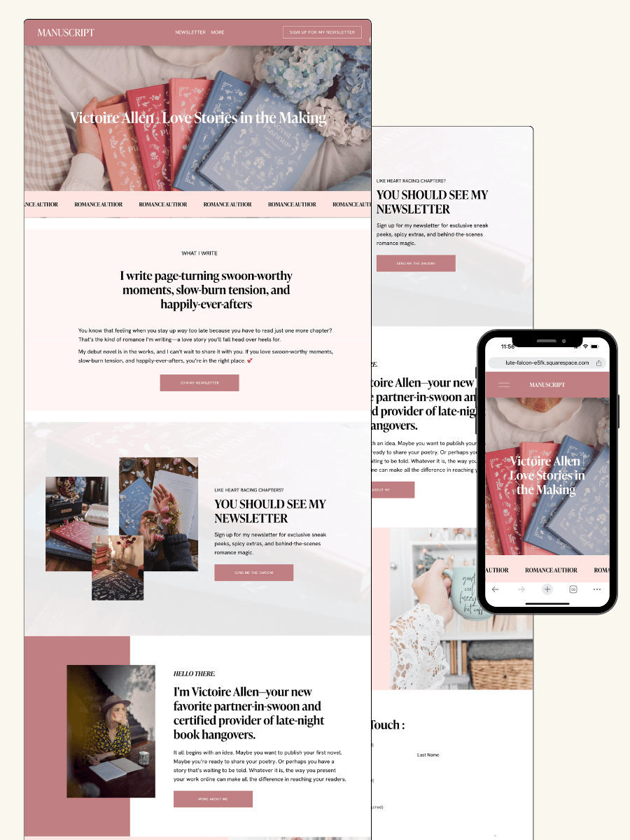
THE MANUSCRIPT AUTHOR WEBSITE TEMPLATE — perfect for authors launching their first professional website with a simple, polished layout
THE DEBUT AUTHOR WEBSITE TEMPLATE — designed to highlight your first book, build your email list, and grow an audience from day one
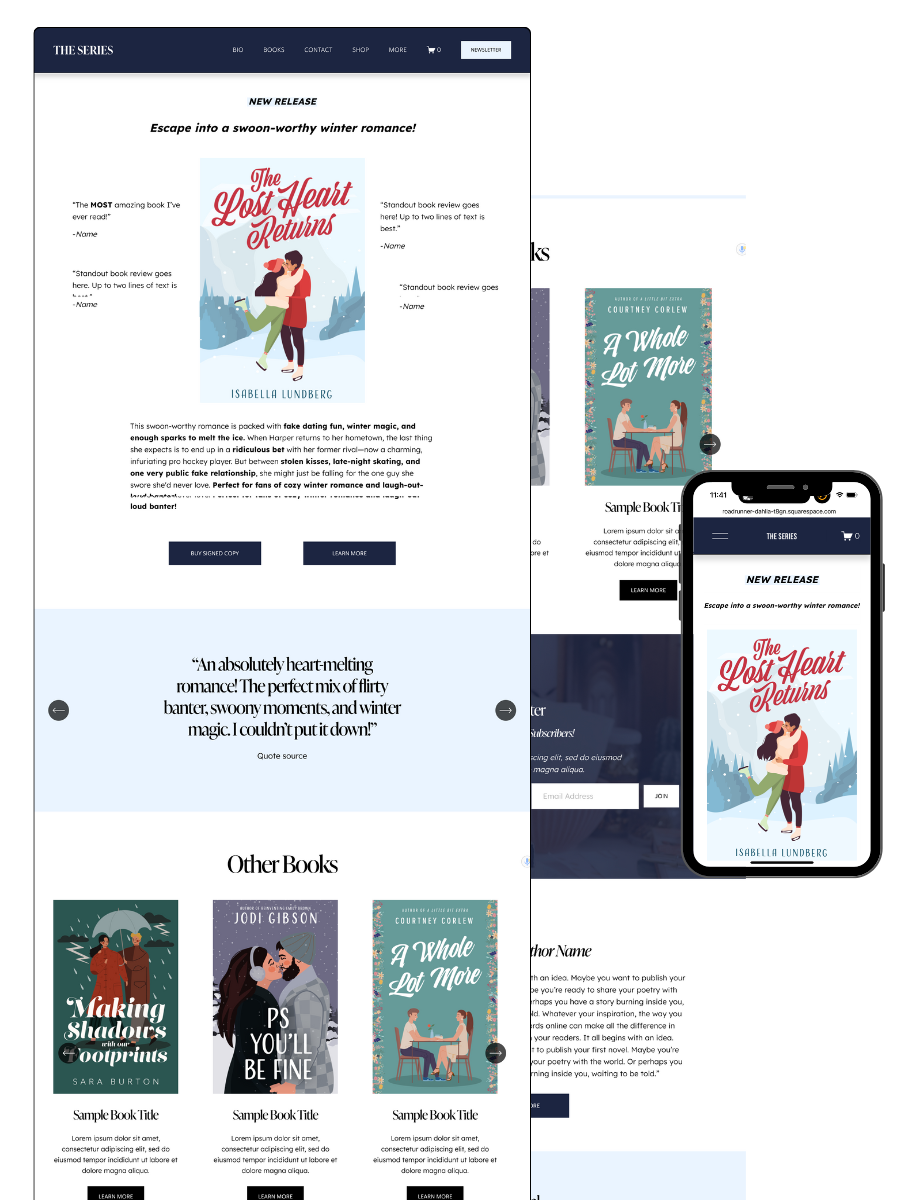
THE SERIES AUTHOR WEBSITE TEMPLATE — ideal for showcasing multiple books with clear series pages and strong reader flow
THE ONE-PAGE AUTHOR AUTHOR WEBSITE TEMPLATE — a streamlined one-page site for authors who want something beautiful, fast, and easy
THE DONE-FOR-YOU AUTHOR WEBSITE EXPERIENCE — your author website built for you so you can launch without touching design or tech
MOST POPULAR BLOG POSTS
Authors Guide to Website Design & Branding
Squarespace Email Campaigns: A Guide for Authors
How to Create an Author Website on Squarespace (Step-by-Step)