Best Homepage Layouts for Author Websites: Design Ideas That Convert Readers Into Fans
Your homepage is the first thing readers see when they visit your author website. It needs to make a strong impression fast. A good homepage layout guides visitors to your books, newsletter signup, and about page without making them hunt for anything. The best homepage layouts for author websites use a clear visual hierarchy, feature your latest book or series above the fold, and include an email signup form that's easy to spot.
Most authors struggle with homepage design because they're not sure what to include or where to put it. You might wonder if you need a big photo, what size your book cover should be, or where the newsletter signup should go. The good news is that effective author homepages follow a few simple patterns that work across all genres. Once you understand these layouts, you can pick the one that fits your goals and start connecting with more readers.
This guide breaks down the most effective homepage layouts used by successful authors. You'll learn exactly what elements to include, where to place them, and how to make your homepage work harder for you. Whether you're building your first author website or redesigning an existing one, these layouts will help you create a homepage that turns visitors into fans.
Want a beautiful author website without spending weeks designing it from scratch? These Squarespace website templates for authors are designed to showcase your books, grow your email list, and look professional instantly.

Here’s how real authors are using these Squarespace author website templates:


Key Takeaways
A strong author homepage features your latest book prominently and includes a clear email signup form
Effective layouts follow proven patterns that guide readers naturally from one section to the next
Simple design choices like visual hierarchy and strategic placement make your homepage convert better
AUTHOR WEBSITE EXAMPLES

The Anatomy of the Best Homepage Layouts for Author Websites
A strong homepage layout combines strategic positioning of key elements, clear visual flow, and reader-focused content that drives action. Your homepage needs to capture attention immediately, guide visitors naturally through your content, and make it easy for them to connect with your books.
Above the Fold Essentials
Above the fold refers to everything visitors see before scrolling. This space is your most valuable real estate on your entire author website.
Your name and clear navigation should appear at the top. Visitors need to know whose site they're on within seconds. Best author websites place the author's name prominently in the header, often as a logo or clean typography.
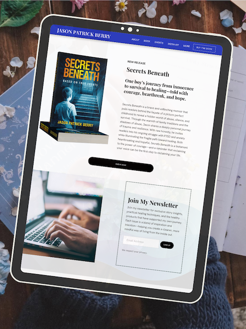
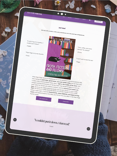
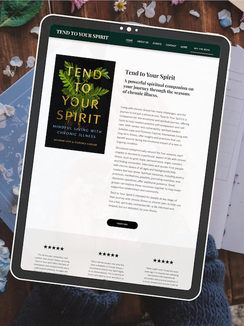
Include a hero image or banner that sets the mood for your work. This could be a professional author photo, your latest book cover, or branded imagery that reflects your genre. The image should be high-quality and optimized for fast loading.
Add a single, clear call-to-action (CTA) in this space. This might be "Get My Latest Book," "Join My Newsletter," or "Read Free Chapter." Don't overwhelm visitors with multiple competing CTAs. Pick the one action that matters most to you right now.
Keep text minimal but impactful. A short tagline or one-sentence hook about your books works well. Think "Award-winning fantasy author" or "Thrillers that keep you up all night."
Visual Hierarchy and First Impressions
Visual hierarchy guides visitors' eyes through your homepage in a deliberate order. You want readers to see your most important content first, then naturally flow to secondary elements.
Size matters for hierarchy. Your largest elements draw attention first. Make your book covers and CTAs larger than supporting text. Your author name should be more prominent than your navigation links.
Use contrast to highlight key information. A bright CTA button on a neutral background stands out. Dark text on light backgrounds (or vice versa) ensures readability.
White space prevents your homepage from feeling cluttered. Don't fill every pixel with content. Give your book covers, text, and images room to breathe. This makes your homepage layouts feel professional and easy to scan.
Color psychology plays a role too. Stick to 2-3 main colors that match your brand and genre. Mystery authors might use darker tones, while romance authors often choose warmer palettes.
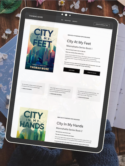
Position your book covers strategically. Most successful author websites place cover images in the upper third of the homepage or immediately below the hero section.
Crafting a High-Converting Author Bio
Your author bio on the homepage should be shorter than your full about page. Think 2-4 sentences maximum. This isn't your full life story—it's a hook to make readers want to learn more.
Focus on reader benefits, not just credentials. Instead of "I've written 12 books," try "I write heart-pounding thrillers that readers finish in one sitting." Tell them what they'll experience, not just what you've accomplished.
Include a professional photo. High-quality images of you help readers connect with the person behind the books. The photo should match your genre's tone—formal for literary fiction, approachable for contemporary romance, edgy for thriller writers.
Add credibility markers strategically. If you're a bestseller, award winner, or featured in major publications, mention it. But keep it to one or two impressive facts. Save the full list for your about page.
Link to your complete bio. A simple "Learn more about me" link gives interested readers a path to dive deeper without cluttering your homepage.
Showcasing Books with Clarity and Impact
Your books deserve prominent placement on your homepage. This section directly impacts book sales, so don't hide your covers in a footer or sidebar.
Display cover images at a size where readers can see details clearly. Covers should be clickable, leading to individual book pages or purchase links. Never use blurry or pixelated images—invest in high-quality images of your covers.
Organize books logically. If you have multiple series, group them together. If you write in different genres, separate them visually. For authors with many books, showcase your latest releases or bestsellers on the homepage.
Include clear "Buy Books" buttons. Use direct language like "Buy Now," "Get Your Copy," or "Order Here." Make these buttons stand out with contrasting colors. Link directly to purchase pages, not generic "books" pages that require extra clicks.
Add brief context for each book. A one-sentence hook or tagline helps readers understand what each book offers. "A small-town romance with a second-chance twist" tells readers more than just a title and cover.
Keep this section scannable. Use a grid layout for multiple books rather than long lists. Three books per row works well on desktop, stacking to one column on mobile.
Update this section regularly. When you release a new book, feature it prominently. Rotate which books get top billing to keep your homepage fresh for returning visitors.
Frequently Asked Questions
Author website homepages need strategic layouts that convert visitors into readers and subscribers. These questions address the most common design and functionality concerns authors face when building an effective homepage.
What are the key elements to include in an author's website homepage layout?
Your homepage should feature a clear hero section at the top with your name, a professional photo, and a brief tagline that tells visitors what you write. This section needs to grab attention in the first three seconds someone lands on your site.
Include a prominent email signup form above the fold. Place it where visitors can see it without scrolling, ideally in your hero section or right below it.
Your navigation menu should be simple and easy to use. Stick to 4-6 main menu items like Home, Books, About, Blog, and Contact. Too many options confuse visitors and make them leave.
Add a books section that showcases your latest or most popular titles with clear cover images. Each book should have a visible call-to-action button that leads to purchase links or a dedicated book page.
Include social proof like reader testimonials, reviews, or award badges. These build trust and show new visitors that other readers enjoy your work.
How can authors effectively showcase their books on their homepage?
Display your book covers large enough for visitors to see the details clearly. Small thumbnails don't work well because readers want to see what your books actually look like.
Place your newest or most important book first in the layout. Use a featured book section that gives this title extra space and attention with a larger image and more description text.
Add "Buy Now" or "Get Your Copy" buttons directly under each book cover. Don't make readers hunt for where to purchase. Link these buttons to a page with multiple retailer options so readers can choose their preferred store.
Write short, punchy book descriptions of 2-3 sentences maximum for your homepage. Save the longer descriptions for individual book pages. You want to spark interest, not overwhelm visitors with details.
Consider using a carousel or grid layout if you have multiple books. A grid works better for large catalogs because visitors can see several books at once without clicking through slides.
What strategies can authors use to improve homepage SEO and attract more readers?
Start with a clear page title that includes your name and what you write. Something like "Jane Smith - Romance Author" or "John Doe - Mystery & Thriller Writer" helps search engines understand your page.
Write unique meta descriptions for your homepage that include relevant keywords. Mention your genre, any bestseller status, and what makes your books special. Keep it under 160 characters.
Use header tags properly throughout your homepage. Your name or main headline should be an H1 tag, and other section headers should be H2 or H3 tags. This helps search engines organize and understand your content.
Add alt text to all images on your homepage. Describe what's in each photo or book cover using natural language. This helps with image search rankings and makes your site accessible.
Link to your other important pages from the homepage. Connect to your books page, about page, and blog using descriptive anchor text that tells visitors and search engines what they'll find.
Update your homepage regularly with new content like recent book releases or blog posts. Search engines favor websites that stay current and active.
Which homepage features can help authors build their email subscriber lists?
Place your email signup form in multiple spots on your homepage. Put one in the header area, another in the middle of the page, and one at the bottom. Different visitors scroll to different points.
Offer a specific freebie or incentive for signing up. Generic "subscribe to my newsletter" messages don't convert well. Instead, offer a free short story, sample chapters, or a reader guide that relates to your books.
Keep your signup form simple with minimal fields. Ask only for an email address at first. Adding too many required fields like name, birthday, or preferences reduces signups significantly.
Use clear, benefit-focused copy near your signup form. Tell readers exactly what they'll get and how often you'll email them. "Get free bonus chapters and new release alerts every month" works better than "Join my mailing list."
Add a popup or banner that appears after visitors spend 30-60 seconds on your site. This catches people who are already interested but might miss a static form. Just make sure it's easy to close and doesn't block content.
How can authors balance visual appeal and functionality in their homepage design?
Choose one or two fonts maximum for your homepage. Using too many different typefaces makes your site look messy and unprofessional. Stick with one for headings and one for body text.
Leave plenty of white space around your content sections. Cramming too much information into a small area overwhelms visitors and makes your site hard to scan. Space helps readers focus on what matters.
Make your buttons and links large enough to click easily on mobile devices. Small text links and tiny buttons frustrate mobile visitors who make up more than half of web traffic.
Limit your color palette to 3-4 colors that reflect your brand and genre. Romance authors might use soft pinks and golds while thriller writers might choose darker blues and grays. Consistent colors build brand recognition.
Test your homepage on actual phones and tablets before launching. What looks good on your computer screen might not work on smaller devices. Check that images load properly, text is readable, and buttons are clickable.
What are the best practices for selecting and using images on an author's homepage?
Use high-quality images that are at least 1200 pixels wide for full-width sections. Blurry or pixelated photos make your site look unprofessional and outdated. Invest in good images or hire a photographer.
Choose images that match your genre and brand. If you write cozy mysteries, use warm, inviting photos. If you write dark fantasy, select moodier, atmospheric images. Your visuals should instantly communicate what you write.
Optimize all images before uploading them to your site. Large file sizes slow down your page load time, which frustrates visitors and hurts your search rankings. Use compression tools to reduce file sizes without losing quality.
Include your author photo on your homepage. Readers want to see the person behind the books. Use a professional headshot that looks friendly and approachable, not a casual selfie or vacation photo.
Make sure all images have proper contrast with any text placed over them. Light text needs dark backgrounds and dark text needs light backgrounds. Visitors should be able to read everything easily without straining.
Ready to launch your author website?
Explore my Squarespace website templates designed specifically for authors — easy to customize, beautifully designed, and built to help you sell more books.

SHOP THE AUTHOR WEBSITE TEMPLATES
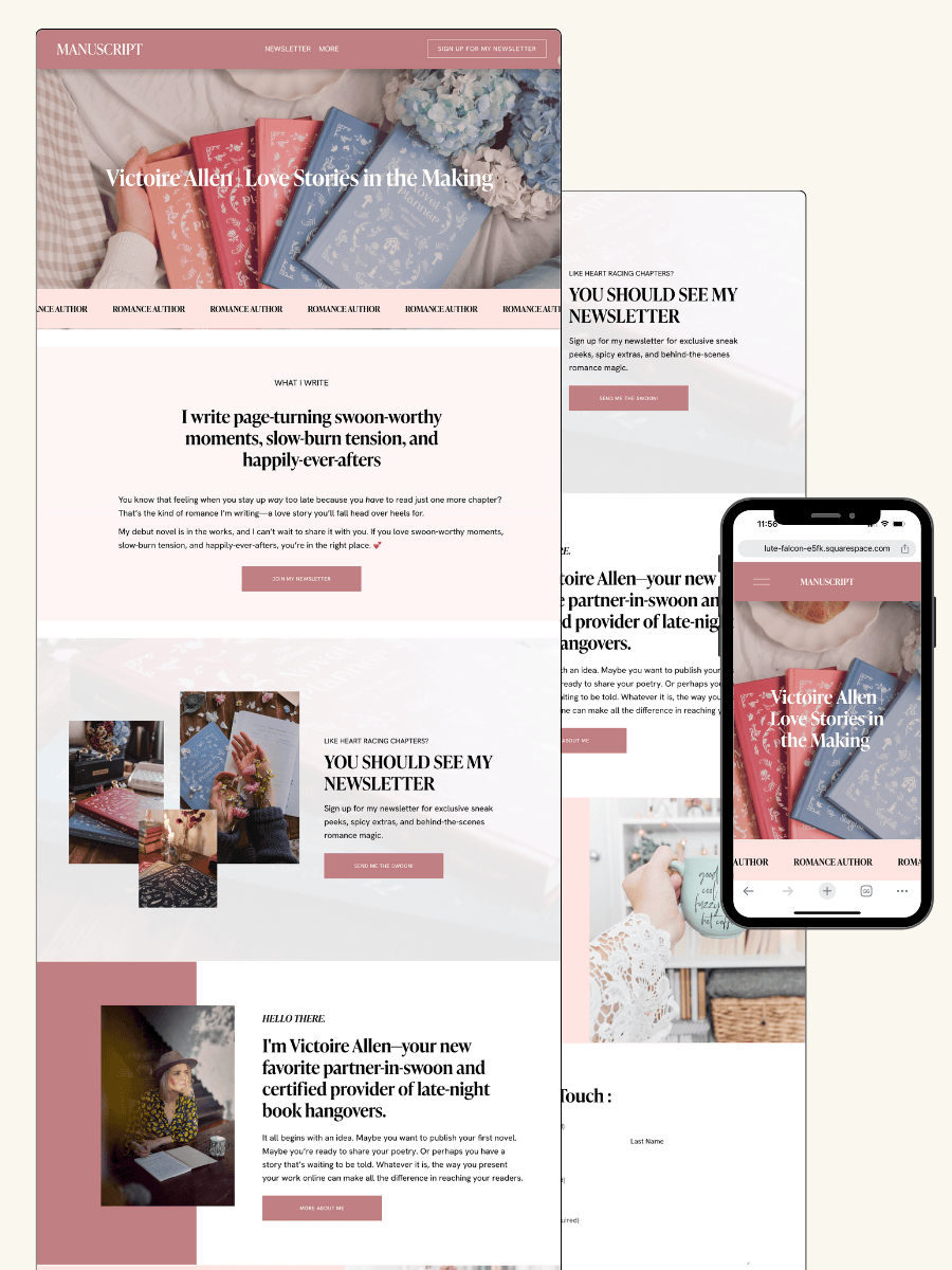
THE MANUSCRIPT AUTHOR WEBSITE TEMPLATE — perfect for authors launching their first professional website with a simple, polished layout
THE DEBUT AUTHOR WEBSITE TEMPLATE — designed to highlight your first book, build your email list, and grow an audience from day one
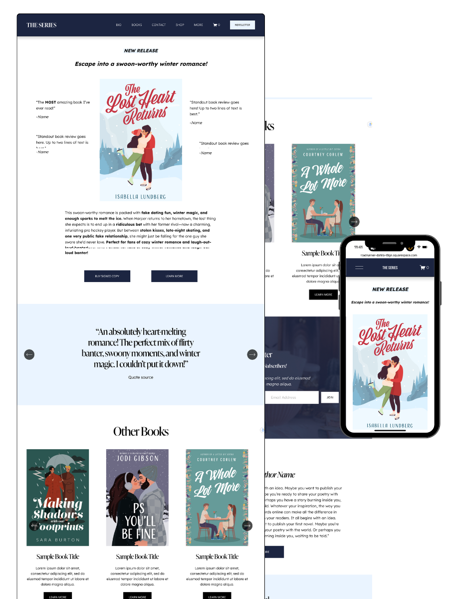
THE SERIES AUTHOR WEBSITE TEMPLATE — ideal for showcasing multiple books with clear series pages and strong reader flow
THE ONE-PAGE AUTHOR AUTHOR WEBSITE TEMPLATE — a streamlined one-page site for authors who want something beautiful, fast, and easy
THE DONE-FOR-YOU AUTHOR WEBSITE EXPERIENCE — your author website built for you so you can launch without touching design or tech
MOST POPULAR BLOG POSTS
Authors Guide to Website Design & Branding
Squarespace Email Campaigns: A Guide for Authors
How to Create an Author Website on Squarespace (Step-by-Step)