Author Website Mistakes to Avoid: Common Pitfalls That Kill Conversions and How to Fix Them
Your author website should be working hard to connect you with readers and sell your books. But many authors unknowingly make simple mistakes that push visitors away instead of drawing them in.
The most common author website mistakes include confusing navigation, missing calls-to-action, outdated content, and websites that don't work well on phones. These issues can cost you readers, subscribers, and book sales. The good news is that most of these problems are easy to fix once you know what to look for.
This guide walks you through the biggest website mistakes authors make and shows you exactly how to avoid them. You'll learn what's hurting your site's performance and get clear steps to make it work better for you.
Want a beautiful author website without spending weeks designing it from scratch? These Squarespace website templates for authors are designed to showcase your books, grow your email list, and look professional instantly.

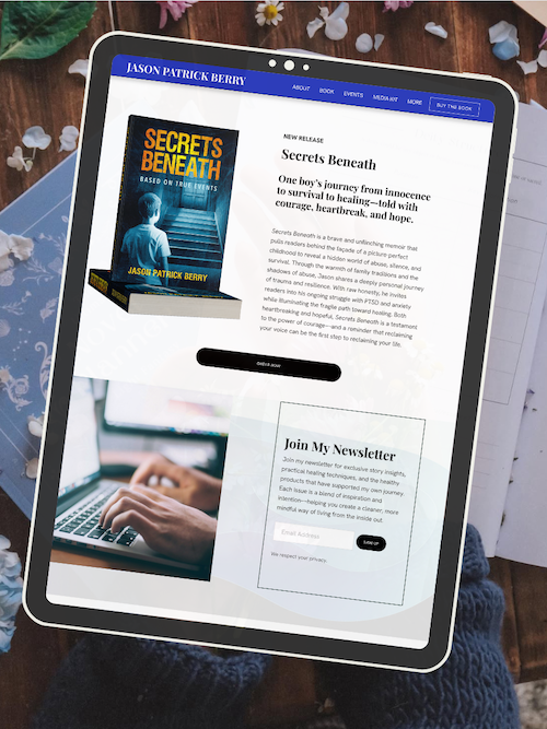
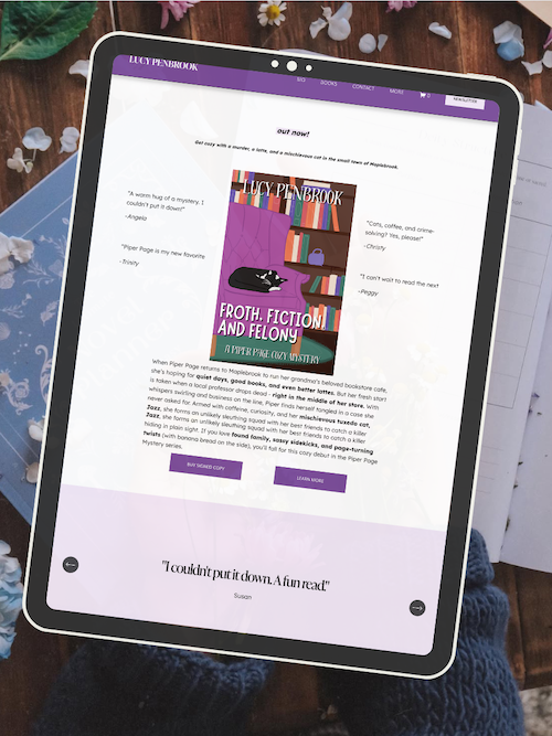
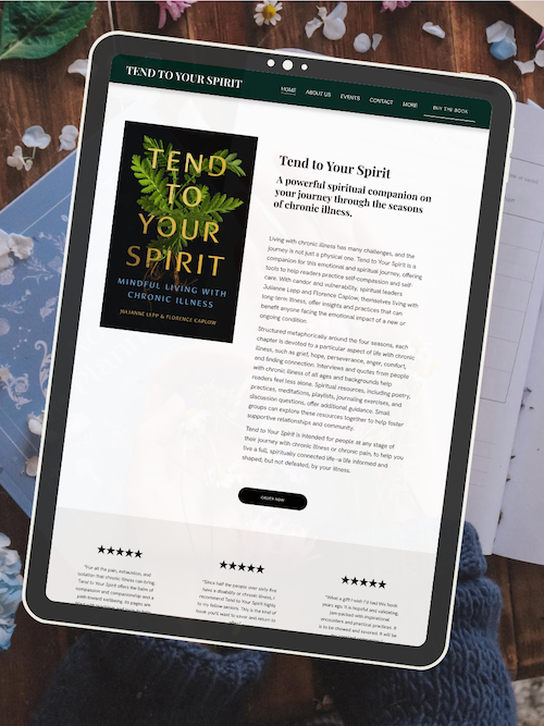
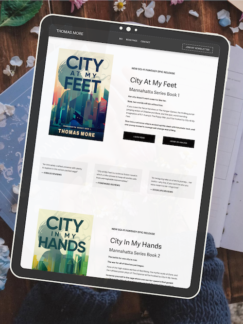
Here’s how real authors are using these Squarespace author website templates:


Key Takeaways
Poor navigation and unclear calls-to-action prevent visitors from finding your books or signing up for your email list
Mobile-unfriendly websites and slow loading speeds drive potential readers away before they explore your content
Regular updates to your bio, blog, and book information keep your website professional and help build trust with readers
AUTHOR WEBSITE EXAMPLES

Top Author Website Mistakes to Avoid
Your author website can be your most powerful book marketing tool—or the reason readers click away in seconds. Simple mistakes like hard-to-tap buttons on phones or missing buy links can quietly cost you book sales, newsletter signups, and loyal readers.
Ignoring Mobile Optimization
Most readers will visit your author website on their phone. If your site isn't mobile-friendly, they'll leave before ever finding your books.
Mobile optimization means your website automatically adjusts to fit smaller screens. Text should be readable without zooming. Images should resize properly. Touch targets like buttons and links need to be big enough to tap easily.
Check your site on your phone right now. Can you read everything clearly? Do buttons work on the first tap? Is your navigation menu easy to open and use?
Squarespace templates are mobile-responsive by default, but you still need to test them. Long paragraphs that look fine on desktop become walls of text on mobile. Large images can slow load times and increase your bounce rate.
A mobile-friendly website isn't optional anymore. It affects your SEO, your user experience, and whether readers actually buy your books.
Unclear or Missing Call to Action
You need to tell readers exactly what to do next. Without a clear call to action (CTA), visitors wander around your site and leave without taking action.
Every page should have a purpose. Your homepage might feature a "Buy Now" button for your latest release. Your about page could include a "Subscribe to My Newsletter" CTA. Book pages need obvious purchase links.
Don't make readers hunt for next steps. Use buttons, not just text links. Make them stand out with contrasting colors. Use specific language like "Get Your Copy" or "Read Chapter One" instead of vague phrases like "Click Here."
Place your most important CTA above the fold—the part visitors see without scrolling. Add secondary CTAs throughout longer pages to catch readers at different points in their journey.
Hard-to-Find or Outdated Contact Information
Literary agents, event coordinators, and readers need to reach you. Burying your contact information or leaving it outdated makes you look unprofessional and costs you opportunities.
Create a dedicated contact page. Link to it from your main navigation menu—not hidden in your footer. Include an email address or contact form. Add links to your social media profiles if you're active on platforms like Twitter, Facebook, or Instagram.
Keep this information current. If you change your email or stop using a social platform, update your site immediately.
Some authors worry about spam and hide their contact info entirely. That's a mistake. Use a contact form instead of displaying your email directly, or write it out in a way bots can't scrape easily (like "yourname [at] email [dot] com").
Your contact page also helps SEO by giving search engines another page to index with relevant keywords.
Lack of Book Purchase Links and Descriptions
If readers can't quickly find and buy your books, you're losing sales. Every book on your site needs clear purchase links and compelling book descriptions.
Create individual book pages for each title. Include the cover image, a full description, purchase buttons for major retailers, and reader reviews or blurbs. Don't just link to one retailer—readers have preferences. Include Amazon, Barnes & Noble, Apple Books, and any other platforms where your books are available.
Use actual buttons with clear text like "Buy on Amazon" or "Order Paperback." Make them visually prominent. Don't bury links in paragraphs of text.
Your book descriptions should hook readers, not just summarize the plot. Lead with what makes your book unique or exciting. Format descriptions with short paragraphs and line breaks for easy scanning.
Update these pages when you run promotions or receive new reviews. Fresh content helps with SEO and shows readers you're actively managing your writer platform.
Unprofessional Website Design Choices
Your website design tells readers whether to take you seriously. Amateur mistakes like clashing colors, too many fonts, or low-quality images make you look unprofessional.
Professional design doesn't mean complicated. Clean, simple layouts work better than busy pages packed with elements. Stick to two or three fonts maximum. Choose colors that match your book covers and brand.
Use high-quality visuals. Blurry book covers or pixelated author photos damage your credibility. Invest in professional images or use high-resolution versions of everything.
Pay attention to typography. Make sure your text is readable—good contrast between text and background, appropriate font sizes, and proper line spacing. Avoid light gray text on white backgrounds.
Your layout should guide readers naturally from one section to the next. Use white space to prevent pages from feeling cramped. Align elements consistently.
Squarespace templates provide solid design foundations, but you still need to customize thoughtfully. Don't add elements just because you can.
Broken Links and Outdated Content
Broken links frustrate visitors and hurt your SEO. Search engines see them as signs of a neglected website.
Check your site regularly for broken links—especially after updating pages or changing your site structure. Test all purchase links, contact forms, and external links to social media profiles.
Remove or update outdated content. Old event announcements, references to "upcoming" books that released years ago, or outdated author bio details make your site feel abandoned.
Set a reminder to review your entire site every few months. Click every link. Read every page as if you're a first-time visitor. Fix anything that's broken or stale.
Dead links increase your bounce rate because readers give up and leave. They also waste the SEO value you've built by creating content in the first place.
Overly Complex or Confusing Navigation
If readers can't figure out where to find information, they won't stay long. Your navigation menu should be simple and predictable.
Keep your main menu to five or six items maximum: Home, Books, About, Blog, Newsletter, Contact. Use clear labels that tell visitors exactly what they'll find.
Avoid nested dropdown menus with multiple levels. They work poorly on mobile and confuse visitors. If you have many books, create one "Books" page that lists them all rather than individual menu items for each title.
Your homepage should clearly direct readers to your most important pages. Use visual cues like buttons, clear headings, and logical layout to guide them.
Test your navigation by asking someone unfamiliar with your site to find specific information. If they struggle, simplify.
Good navigation improves user experience and helps search engines crawl your site effectively, boosting your SEO.
Frequently Asked Questions
Authors often have specific questions about building and maintaining an effective website. These answers cover design pitfalls, essential features, content presentation, mobile optimization, social media integration, and search visibility strategies.
What are some common design errors authors should avoid on their websites?
Cluttered layouts push readers away fast. When you cram too much onto your homepage—book covers, blog posts, social feeds, and newsletter popups all competing for attention—visitors don't know where to look first. Keep your design clean with plenty of white space.
Using too many fonts is another mistake that makes your site look unprofessional. Stick to two or three fonts maximum—one for headings, one for body text, and maybe one for accents. Your website should feel cohesive, not chaotic.
Poor color contrast makes your text hard to read. If you're using light gray text on a white background because it looks "modern," you're actually making visitors work too hard. Choose colors that create clear contrast so people can actually read your content.
Slow-loading images will drive people away before they even see your work. Compress your photos and book covers before uploading them. Your site should load in under three seconds, or most visitors will bounce.
Which elements should be included on an author website for enhanced user engagement?
Your homepage needs a clear headline that tells visitors exactly who you are and what you write. Don't make people hunt for basic information. Put "Award-winning thriller author" or "YA fantasy writer" right up top where everyone can see it.
An email signup form should appear on every page of your site. This is how you build your reader list—the people who will actually buy your next book. Offer something valuable in exchange, like a free short story or the first chapter of your book.
A dedicated books page showcases all your published works with covers, descriptions, and buy links. Each book should have its own space where readers can learn more and click through to purchase.
An about page lets readers connect with you personally. Share your writing journey, what inspires you, and maybe a photo. People buy books from authors they feel they know.
Contact information or a contact form makes it easy for agents, event organizers, and readers to reach you. Don't hide this—put it in your main navigation menu.
How can authors effectively showcase their published works on their websites?
Create individual pages for each book instead of listing everything on one cramped page. Each book deserves its own spotlight with a high-quality cover image, full description, reader reviews, and multiple purchase links.
Put buy buttons prominently on every book page. Link to Amazon, Barnes & Noble, Apple Books, Kobo, and your local bookstore. Don't make readers search for where to buy—give them options right there.
Include reader reviews and endorsements near the top of each book page. Social proof sells books. When visitors see that others loved your work, they're more likely to buy.
Use your best book or newest release as the hero on your homepage. Feature it with a large cover image and clear call-to-action button that says "Order Now" or "Read Chapter One."
What are best practices for optimizing an author's website for mobile users?
Test your site on your actual phone before you launch it. What looks good on your computer might be a mess on mobile. Check that buttons are easy to tap, text is readable without zooming, and images load quickly.
Make your navigation menu simple on mobile devices. Those elaborate dropdown menus you love on desktop turn into confusing stacks on phones. Stick to your most important pages: Home, Books, About, Blog, Contact.
Keep your paragraphs short on all pages. Big blocks of text are hard to read on small screens. Break your content into one to three sentence paragraphs with subheadings that let people scan quickly.
Use large, tappable buttons for your calls-to-action. A tiny "Buy Now" link that's perfect for a mouse cursor is impossible to tap accurately on a phone screen. Make buttons at least 44 pixels tall.
Squarespace templates are already mobile-responsive, which means they automatically adjust to different screen sizes. But you still need to preview and adjust your content for mobile viewing.
How can authors integrate social media on their website without causing distractions?
Put social media links in your footer instead of making them the first thing people see. Your goal is to keep visitors on your site reading about your books, not sending them off to scroll Instagram.
Add social sharing buttons to your blog posts so readers can easily share your content. This spreads your work without pulling people away from your site prematurely.
Avoid embedding full social media feeds that autoplay or constantly update. These slow down your site and distract from your main message. If you want to show recent posts, limit it to three or four static images.
Link to your social profiles from your about page where it makes sense contextually. When you mention "Follow me on Instagram for behind-the-scenes writing updates," that's the natural place for the link.
Don't use popup windows asking people to follow you on social media. These interrupt the reading experience and feel pushy. Let visitors discover your social presence naturally as they explore your site.
What are the key SEO strategies authors must implement on their website for better discoverability?
Include your author name and genre in your page titles and descriptions. Search engines need clear signals about who you are and what you write. Your homepage title should be something like "Jane Smith - Historical Fiction Author" instead of just "Welcome."
Write blog posts about topics your readers actually search for. If you write cozy mysteries, create content about "best cozy mystery series" or "small-town detective books." This brings new readers to your site through search engines.
Use descriptive alt text for all your images, especially book covers. When you upload your cover, describe it as "Cover of The Dark Woods, a thriller by Jane Smith" instead of leaving it as "IMG_1234.jpg."
Create individual book pages with full descriptions that include relevant keywords naturally. Write about themes, settings, and similar authors readers might search for. But don't stuff keywords awkwardly—write for humans first.
Get other websites to link to yours by guest posting on author blogs, getting featured in book roundups, or earning spots in "authors to watch" lists. These backlinks tell search engines your site is trustworthy.
Make sure your site loads quickly by compressing images and avoiding unnecessary plugins. Page speed is a ranking factor for search engines, and slow sites also frustrate real visitors.
Ready to launch your author website?
Explore my Squarespace website templates designed specifically for authors — easy to customize, beautifully designed, and built to help you sell more books.

SHOP THE AUTHOR WEBSITE TEMPLATES
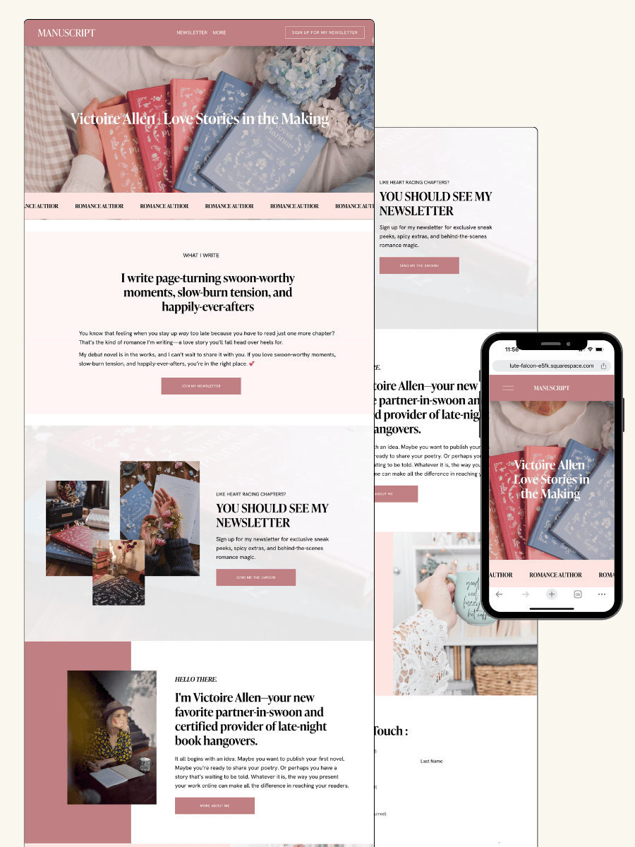
THE MANUSCRIPT AUTHOR WEBSITE TEMPLATE — perfect for authors launching their first professional website with a simple, polished layout
THE DEBUT AUTHOR WEBSITE TEMPLATE — designed to highlight your first book, build your email list, and grow an audience from day one
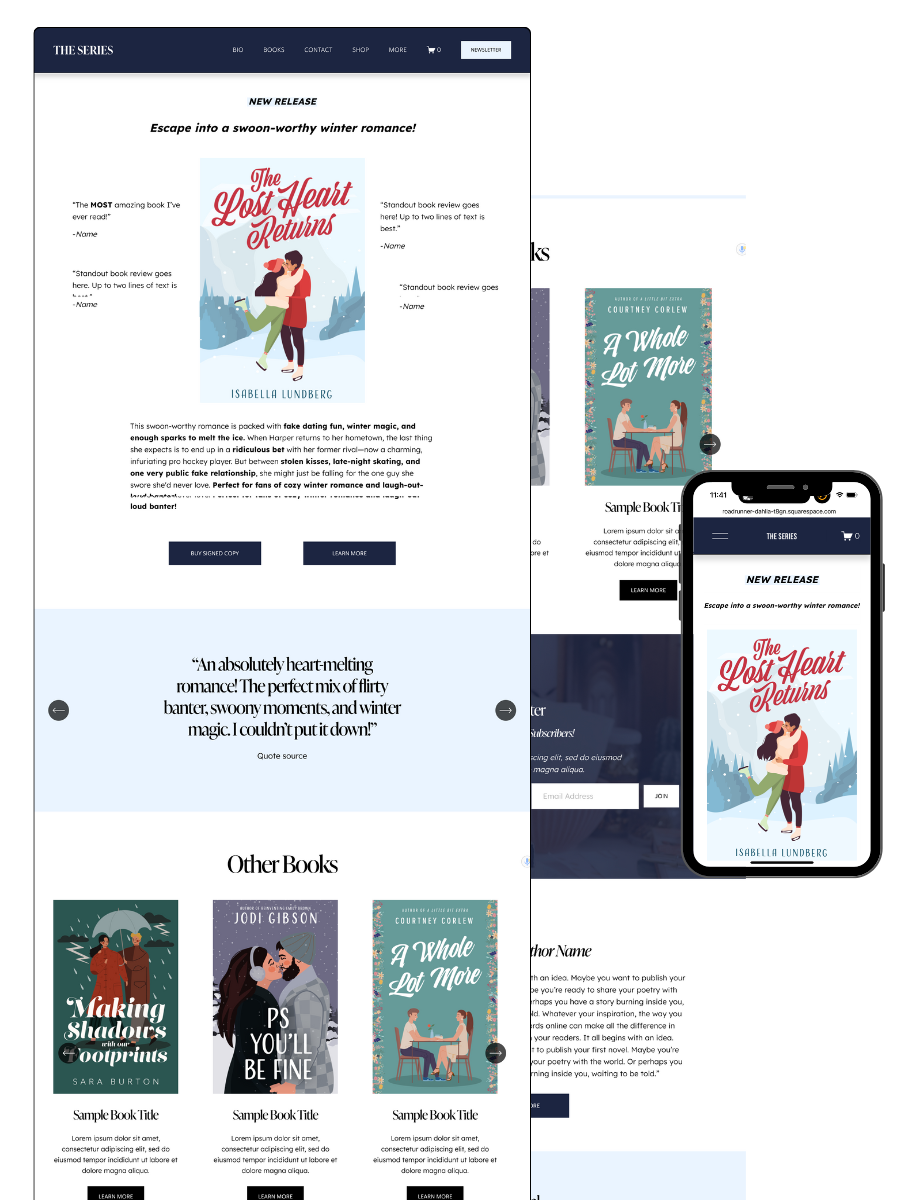
THE SERIES AUTHOR WEBSITE TEMPLATE — ideal for showcasing multiple books with clear series pages and strong reader flow
THE ONE-PAGE AUTHOR AUTHOR WEBSITE TEMPLATE — a streamlined one-page site for authors who want something beautiful, fast, and easy
THE DONE-FOR-YOU AUTHOR WEBSITE EXPERIENCE — your author website built for you so you can launch without touching design or tech
MOST POPULAR BLOG POSTS
Authors Guide to Website Design & Branding
Squarespace Email Campaigns: A Guide for Authors
How to Create an Author Website on Squarespace (Step-by-Step)