Author Website Navigation Best Practices: A Step-by-Step Guide for Building Reader-Friendly Menus
Your author website might have amazing content, but if readers can't find what they're looking for in a few clicks, they'll leave. Good navigation isn't just about looking professional—it's about making sure your visitors can easily discover your books, sign up for your newsletter, and connect with you. A well-organized navigation menu keeps readers on your site longer and turns casual visitors into loyal fans.
Most authors overthink their website structure or cram too many links into their menu. The truth is, simple navigation works best. When someone lands on your site, they should know exactly where to click to find your books, read your blog, or learn more about you. Clear labels and a clean layout make all the difference between a reader who explores your site and one who bounces after five seconds.
This guide walks you through the exact steps to set up navigation that works for authors. You'll learn which pages to prioritize, how to organize your menu, and what mistakes to avoid. By the end, you'll have a navigation system that helps readers find what they need while showcasing your work in the best light possible.
Want a beautiful author website without spending weeks designing it from scratch? These Squarespace website templates for authors are designed to showcase your books, grow your email list, and look professional instantly.

Here’s how real authors are using these Squarespace author website templates:


Key Takeaways
Simple, clear navigation menus help readers find your books and content faster
Prioritize your most important pages and use straightforward labels
Good navigation improves both user experience and your site's search engine performance
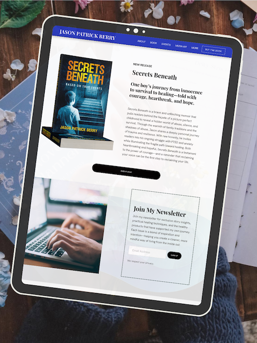
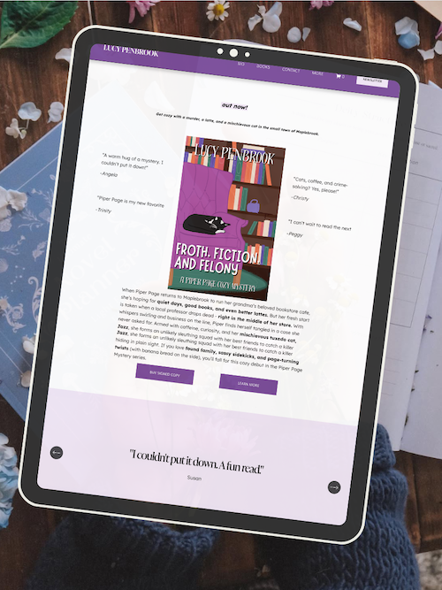
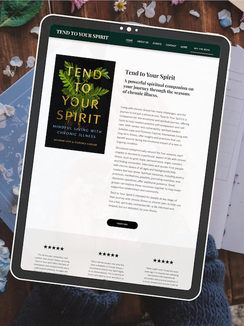
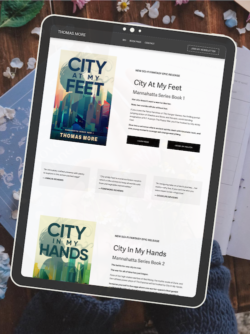
AUTHOR WEBSITE EXAMPLES

Core Author Website Navigation Best Practices
Your navigation menu is the roadmap readers use to explore your author brand, and getting it right means choosing a style that works on all devices, organizing your main and secondary navigation clearly, labeling links in a way readers instantly understand, and adding calls to action that guide visitors toward meaningful next steps.
Choose the Right Navigation Menu Style
Your navigation bar sits at the top of your author website and comes in several styles. The most common is header navigation with a horizontal menu showing your main links like Home, Books, About, and Contact Us. This works great on desktop but needs a mobile-friendly alternative.
For mobile visitors, the hamburger menu (those three stacked lines) is standard. It hides your navigation behind a tap-able icon, keeping your site clean on small screens. If you have many book series or resources, consider a dropdown menu or mega menu. Dropdown menus reveal additional links when you hover or click a parent item. Mega menus show multiple columns of links at once—useful if you need to organize lots of content by category.
A sticky header keeps your navigation bar visible as readers scroll down. This improves navigation performance because visitors can jump to other pages without scrolling back to the top. Just make sure it doesn't cover too much screen space on mobile devices.
Pick one primary navigation style and stick with it across your entire site structure. Consistency helps readers know exactly where to look.
Design Intuitive Main and Secondary Navigation
Your main menu should include only your most important pages—typically four to seven links maximum. These are your primary navigation items that support your author brand and help readers find what they came for. Think Books, About, Blog, and Contact button.
Secondary navigation handles everything else. This might be a footer menu with links to your sitemap, privacy policy, or media kit. You could also use sidebar navigation on your blog or a resources section with related links to interviews, press photos, or speaking topics.
Keep your site hierarchy simple. Readers should reach any page in three clicks or less. Use internal linking to connect related content, which also helps with pagerank flow and SEO. For example, link from your About page to your latest book, or from a blog post to your newsletter signup.
Breadcrumbs (the trail showing Home > Books > Series Name) work well if you have multiple book series or a deep site structure. They show readers where they are and provide backward navigation to parent pages.
Use Clear and Descriptive Navigation Labels
Your navigation labels should tell readers exactly what they'll find when they click. Avoid vague terms like "Explore" or "Stuff." Instead, use descriptive labels like "Mystery Series," "Author Events," or "Free Chapter."
Descriptive navigation labels improve both user experience and SEO. Search engines use these labels as internal links to understand your site structure. Clear wording also increases click-through rate because visitors know what to expect.
Keep labels short—one to three words usually works best. Long labels crowd your navigation bar and look cluttered on mobile menu layouts. Compare these examples:
Weak Label Strong Label More Books Info About the Author Get in Touch Contact Stuff Resources
Match your labels to words your readers actually use. If you write romance novels, "Books" makes more sense than "Bibliography." If you offer writing advice, "Blog" or "Writing Tips" beats "Musings."
Enhance Navigation With Calls to Action
Your navigation design should guide readers toward conversion goals, not just move them around your site. Add one or two calls to action (CTA) directly in your navigation menu to boost conversion rates.
The most common navigation CTA is a contact button or newsletter signup. Make it stand out visually—use a button style with contrasting color instead of plain text. This draws attention and increases click-through rate compared to standard navigation links.
Position your call to action at the end of your navigation bar (far right on desktop). This follows natural reading patterns and puts your CTA where eyes land after scanning other options. On mobile navigation, place it at the top or bottom of your hamburger menu.
Choose CTAs that match your author goals. Want more newsletter subscribers? Add "Join My Readers" or "Free Book." Selling directly? Try "Shop Books" or "Latest Release." Offering services like speaking or coaching? Use "Work With Me" or "Book a Call."
Test different CTA wording and placement to see what improves conversion rate. Your navigation menu appears on every page, so even small improvements in click-through rate add up fast across your entire site.
Frequently Asked Questions
Author website navigation can feel tricky to get right, especially when you're trying to balance creativity with usability. These questions cover the most common concerns about building a user-friendly site structure that helps readers find your books, connect with you, and actually stick around.
How can I effectively structure my author website to improve user engagement?
Start with a simple, flat hierarchy that gets visitors where they need to go in two clicks or less. Your main navigation should include no more than five to seven menu items—think Home, Books, About, Blog, and Contact.
Group related content under dropdown menus when needed. For example, put individual book pages under a "Books" parent menu instead of cluttering your main nav with every title you've written.
Place your most important pages in the primary navigation at the top. Secondary pages like your press kit, speaking page, or newsletter archive can live in your footer navigation.
Use clear, simple labels that tell visitors exactly what they'll find. Skip creative names like "My World" or "The Journey" and stick with straightforward terms people actually search for.
What should I include on the homepage of my author website to capture reader interest?
Your homepage needs a clear headline that tells visitors who you are and what you write. Something like "NYT Bestselling Romance Author" or "Writer of Dark Fantasy & Magical Realism" works better than just your name.
Add a hero image or book cover above the fold. This visual anchor should represent your brand and genre within the first three seconds of landing on your site.
Include a single, prominent call-to-action button that leads to your most important goal. Whether that's joining your newsletter, buying your latest book, or reading a sample chapter, make it obvious and clickable.
Feature your newest or most popular book with a short description and buy links. Don't make readers hunt for what you want them to see.
Add a brief author bio or welcome message that connects with your ideal reader. Keep it to two or three sentences that highlight your credentials and writing style.
What navigation features are essential for a seamless user experience on an author website?
A sticky header that stays visible as readers scroll keeps your navigation accessible at all times. This lets visitors jump to other pages without scrolling back to the top.
Include a search function if you have a large blog or extensive content library. Readers should be able to find specific posts, books, or topics quickly.
Add a visible newsletter signup form in multiple locations. Put it in your header, sidebar, footer, and as a pop-up or banner to capture email addresses without being pushy.
Use breadcrumbs on deeper pages to show visitors where they are in your site structure. This helps them backtrack or explore related content without getting lost.
Make sure all clickable elements look clickable. Use consistent button styles, underline text links, and add hover states so visitors know what's interactive.
How do I organize my book portfolio on my website for easy accessibility?
Create a dedicated Books page that displays all your titles in a grid or list format. Show covers, titles, and a one-sentence hook for each book at a glance.
Sort your books by series, genre, or publication date depending on what makes sense for your catalog. Add filter buttons if you write across multiple genres or have a large backlist.
Give each book its own dedicated page with a full description, buy links, reviews, and series information. Link these individual pages from your main Books page so readers can dive deeper.
Display your latest release prominently at the top of your Books page. Add a "New Release" badge or featured section so it stands out from your backlist.
Include universal buy links or a retailer list on every book page. Tools like Books2Read or direct links to Amazon, Apple Books, and other stores make purchasing frictionless.
What are some best practices for integrating social media into my author website navigation?
Place social media icons in your website footer rather than your main navigation menu. This keeps your primary nav focused on your site content while still making your profiles accessible.
Use recognizable platform icons instead of text links. Readers know what the Facebook or Instagram logo means without needing a label.
Link to only the social platforms you actively use. Three or four active profiles are better than seven abandoned ones that make you look inactive.
Add social sharing buttons to your blog posts and book pages. Make it easy for visitors to share your content with their own networks.
Consider adding a live social feed widget to your homepage or sidebar. This shows recent posts from Instagram or Twitter and proves you're active without requiring visitors to leave your site.
Can you share tips for optimizing the mobile experience for visitors to my author website?
Use a responsive website template that automatically adjusts your layout for smaller screens. Squarespace templates handle this by default, but always test your site on your phone.
Simplify your mobile menu to include only essential pages. Mobile users won't scroll through long dropdown menus, so prioritize your Books, About, and Contact pages.
Make buttons and clickable elements large enough to tap with a thumb. Aim for at least 44x44 pixels for any interactive element on mobile screens.
Reduce text blocks and image sizes for faster loading on cellular connections. Mobile users bounce quickly if your site takes more than three seconds to load.
Test your forms and newsletter signups on mobile devices. Make sure text fields are easy to tap, keyboards appear correctly, and submit buttons are thumb-friendly.
Stack content vertically on mobile instead of using side-by-side layouts. Single-column designs are easier to read and navigate on small screens.
Ready to launch your author website?
Explore my Squarespace website templates designed specifically for authors — easy to customize, beautifully designed, and built to help you sell more books.

SHOP THE AUTHOR WEBSITE TEMPLATES
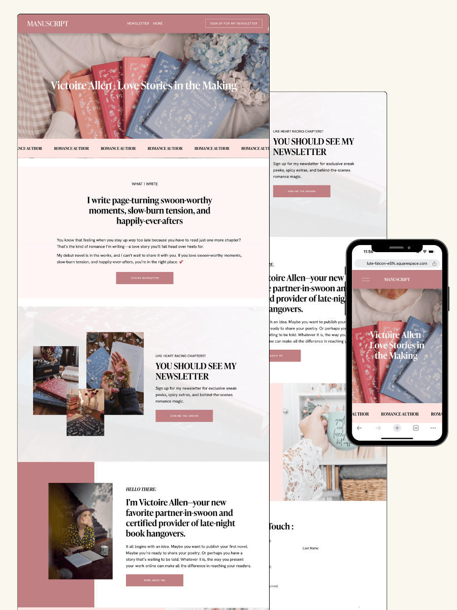
THE MANUSCRIPT AUTHOR WEBSITE TEMPLATE — perfect for authors launching their first professional website with a simple, polished layout
THE DEBUT AUTHOR WEBSITE TEMPLATE — designed to highlight your first book, build your email list, and grow an audience from day one
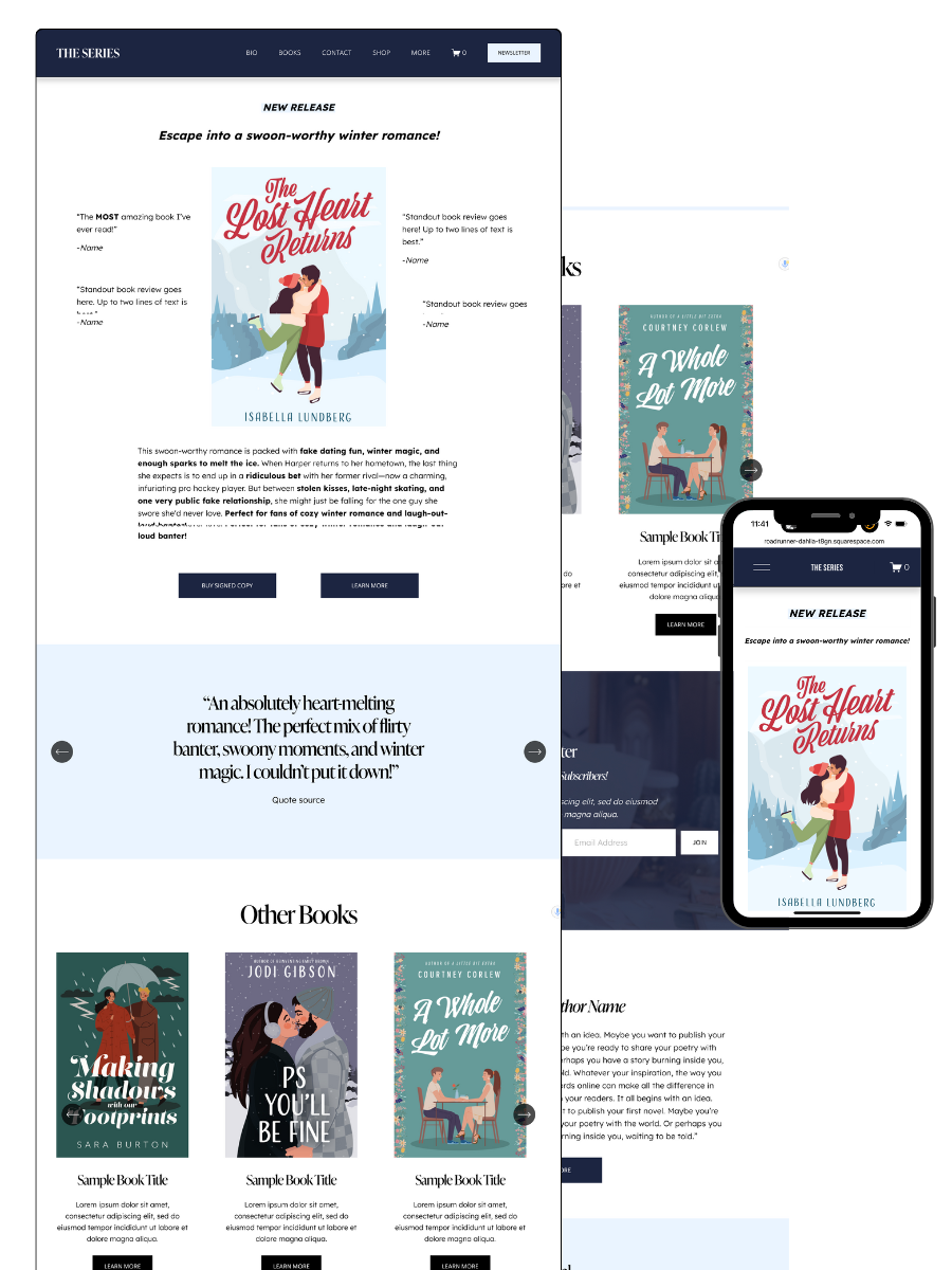
THE SERIES AUTHOR WEBSITE TEMPLATE — ideal for showcasing multiple books with clear series pages and strong reader flow
THE ONE-PAGE AUTHOR AUTHOR WEBSITE TEMPLATE — a streamlined one-page site for authors who want something beautiful, fast, and easy
THE DONE-FOR-YOU AUTHOR WEBSITE EXPERIENCE — your author website built for you so you can launch without touching design or tech
MOST POPULAR BLOG POSTS
Authors Guide to Website Design & Branding
Squarespace Email Campaigns: A Guide for Authors
How to Create an Author Website on Squarespace (Step-by-Step)